Skip to content

Fix empty-state alignment shift on Tags, Per diems, and Workspaces tables - #97451

Merged
NikkiWines merged 8 commits into
mainfrom
claude-tableEmptyStateAlignment
Jul 30, 2026
Merged

Fix empty-state alignment shift on Tags, Per diems, and Workspaces tables#97451
NikkiWines merged 8 commits into
mainfrom
claude-tableEmptyStateAlignment

Conversation

@MelvinBot

@MelvinBot MelvinBot commented Jul 30, 2026

Copy link
Copy Markdown
Contributor

Explanation of Change

PR #93335 (table ARIA semantics for screen readers) wrapped the contiguous TableHeader/TableBody run in an extra <View style={[styles.flex1, styles.mnh0]}> inside TableSemanticContainer. When a table is empty, TableHeader and TableBody both render null, but they're still valid React elements, so the wrapper was rendered anyway with flex: 1. That put a second flexGrow: 1 sibling next to the empty-state ScrollView (also flexGrow: 1), roughly halving the ScrollView's height and shifting its vertically-centered illustration up. The markup is gated behind shouldUseTableSemantics() (web + wide only), which is why it reproduced only on wide web.

This change short-circuits TableSemanticContainer to render its children directly when rowCount === 0, restoring the pre-#93335 layout for empty states. An empty table has no data rows to expose to a screen reader, so no ARIA table semantics are lost; populated tables are unaffected.

Fixed Issues

$ #97428

Tests

Precondition:

  • Enable Tags and Per diems.
  • Do not add tags and per diems.
  1. Go to staging.new.expensify.com
  2. Go to workspace settings > Tags.
  3. Go to workspace settings > Per diems.
  4. Tags and Per diems empty state will have the same alignment as production.
  • Verify that no errors appear in the JS console

Offline tests

Same as Tests

QA Steps

Same as Tests

  • Verify that no errors appear in the JS console

PR Author Checklist

  • I linked the correct issue in the ### Fixed Issues section above
  • I wrote clear testing steps that cover the changes made in this PR
    • I added steps for local testing in the Tests section
    • I added steps for the expected offline behavior in the Offline steps section
    • I added steps for Staging and/or Production testing in the QA steps section
    • I added steps to cover failure scenarios (i.e. verify an input displays the correct error message if the entered data is not correct)
    • I turned off my network connection and tested it while offline to ensure it matches the expected behavior (i.e. verify the default avatar icon is displayed if app is offline)
    • I tested this PR with a High Traffic account against the staging or production API to ensure there are no regressions (e.g. long loading states that impact usability).
  • I included screenshots or videos for tests on all platforms
  • I ran the tests on all platforms & verified they passed on:
    • Android: Native
    • Android: mWeb Chrome
    • iOS: Native
    • iOS: mWeb Safari
    • MacOS: Chrome / Safari
  • I verified there are no console errors (if there's a console error not related to the PR, report it or open an issue for it to be fixed)
  • I followed proper code patterns (see Reviewing the code)
    • I verified that any callback methods that were added or modified are named for what the method does and never what callback they handle (i.e. toggleReport and not onIconClick)
    • I verified that comments were added to code that is not self explanatory
    • I verified that any new or modified comments were clear, correct English, and explained "why" the code was doing something instead of only explaining "what" the code was doing.
    • I verified any copy / text that was added to the app is grammatically correct in English. It adheres to proper capitalization guidelines (note: only the first word of header/labels should be capitalized), and is either coming verbatim from figma or has been approved by marketing (in order to get marketing approval, ask the Bug Zero team member to add the Waiting for copy label to the issue)
  • If a new code pattern is added I verified it was agreed to be used by multiple Expensify engineers
  • I followed the guidelines as stated in the Review Guidelines
  • I tested other components that can be impacted by my changes (i.e. if the PR modifies a shared library or component like Avatar, I verified the components using Avatar are working as expected)
  • If any new file was added I verified that:
    • The file has a description of what it does and/or why is needed at the top of the file if the code is not self explanatory
  • If a new CSS style is added I verified that:
    • A similar style doesn't already exist
    • The style can't be created with an existing StyleUtils function (i.e. StyleUtils.getBackgroundAndBorderStyle(theme.componentBG))
  • If new assets were added or existing ones were modified, I verified that:
    • The assets are optimized and compressed (for SVG files, run npm run compress-svg)
    • The assets load correctly across all supported platforms.
  • If the PR modifies code that runs when editing or sending messages, I tested and verified there is no unexpected behavior for all supported markdown - URLs, single line code, code blocks, quotes, headings, bold, strikethrough, and italic.
  • If the PR modifies a generic component, I tested and verified that those changes do not break usages of that component in the rest of the App (i.e. if a shared library or component like Avatar is modified, I verified that Avatar is working as expected in all cases)
  • If the PR modifies a component related to any of the existing Storybook stories, I tested and verified all stories for that component are still working as expected.
  • If the PR modifies a component or page that can be accessed by a direct deeplink, I verified that the code functions as expected when the deeplink is used - from a logged in and logged out account.
  • If the PR modifies the UI (e.g. new buttons, new UI components, changing the padding/spacing/sizing, moving components, etc) or modifies the form input styles:
    • I verified that all the inputs inside a form are aligned with each other.
    • I added Design label and/or tagged @Expensify/design so the design team can review the changes.
  • I added unit tests for any new feature or bug fix in this PR to help automatically prevent regressions in this user flow.
  • If the main branch was merged into this PR after a review, I tested again and verified the outcome was still expected according to the Test steps.

Screenshots/Videos

Co-authored-by: Aimane Chnaif <aimane-chnaif@users.noreply.github.com>
@aimane-chnaif

Copy link
Copy Markdown
Contributor

@codex review

@aimane-chnaif

Copy link
Copy Markdown
Contributor

@MelvinBot review

@codecov

codecov Bot commented Jul 30, 2026

Copy link
Copy Markdown

Codecov Report

✅ Changes either increased or maintained existing code coverage, great job!

Files with missing lines Coverage Δ
src/components/Table/Table.tsx 95.91% <100.00%> (+0.08%) ⬆️
src/components/Table/TableBody.tsx 100.00% <100.00%> (ø)
src/components/Table/TableSemanticContainer.tsx 100.00% <100.00%> (ø)
src/components/Table/TableHeader.tsx 92.50% <85.71%> (+1.25%) ⬆️
... and 127 files with indirect coverage changes

@aimane-chnaif

Copy link
Copy Markdown
Contributor
Details

Explanation of Change

PR #93335 (table ARIA semantics for screen readers) wrapped the contiguous TableHeader/TableBody run in an extra <View style={[styles.flex1, styles.mnh0]}> inside TableSemanticContainer. When a table is empty, TableHeader and TableBody both render null, but they're still valid React elements, so the wrapper was rendered anyway with flex: 1. That put a second flexGrow: 1 sibling next to the empty-state ScrollView (also flexGrow: 1), roughly halving the ScrollView's height and shifting its vertically-centered illustration up. The markup is gated behind shouldUseTableSemantics() (web + wide only), which is why it reproduced only on wide web.

This change short-circuits TableSemanticContainer to render its children directly when rowCount === 0, restoring the pre-#93335 layout for empty states. An empty table has no data rows to expose to a screen reader, so no ARIA table semantics are lost; populated tables are unaffected.

Fixed Issues

$ #97428

Tests

Precondition:

  • Enable Tags and Per diems.
  • Do not add tags and per diems.
  1. Go to staging.new.expensify.com
  2. Go to workspace settings > Tags.
  3. Go to workspace settings > Per diems.
  4. Tags and Per diems empty state will have the same alignment as production.
  • Verify that no errors appear in the JS console

Offline tests

Same as Tests

QA Steps

Same as Tests

  • Verify that no errors appear in the JS console

PR Author Checklist

  • I linked the correct issue in the ### Fixed Issues section above
  • I wrote clear testing steps that cover the changes made in this PR
    • I added steps for local testing in the Tests section
    • I added steps for the expected offline behavior in the Offline steps section
    • I added steps for Staging and/or Production testing in the QA steps section
    • I added steps to cover failure scenarios (i.e. verify an input displays the correct error message if the entered data is not correct)
    • I turned off my network connection and tested it while offline to ensure it matches the expected behavior (i.e. verify the default avatar icon is displayed if app is offline)
    • I tested this PR with a High Traffic account against the staging or production API to ensure there are no regressions (e.g. long loading states that impact usability).
  • I included screenshots or videos for tests on all platforms
  • I ran the tests on all platforms & verified they passed on:
    • Android: Native
    • Android: mWeb Chrome
    • iOS: Native
    • iOS: mWeb Safari
    • MacOS: Chrome / Safari
  • I verified there are no console errors (if there's a console error not related to the PR, report it or open an issue for it to be fixed)
  • I followed proper code patterns (see Reviewing the code)
    • I verified that any callback methods that were added or modified are named for what the method does and never what callback they handle (i.e. toggleReport and not onIconClick)
    • I verified that comments were added to code that is not self explanatory
    • I verified that any new or modified comments were clear, correct English, and explained "why" the code was doing something instead of only explaining "what" the code was doing.
    • I verified any copy / text that was added to the app is grammatically correct in English. It adheres to proper capitalization guidelines (note: only the first word of header/labels should be capitalized), and is either coming verbatim from figma or has been approved by marketing (in order to get marketing approval, ask the Bug Zero team member to add the Waiting for copy label to the issue)
  • If a new code pattern is added I verified it was agreed to be used by multiple Expensify engineers
  • I followed the guidelines as stated in the Review Guidelines
  • I tested other components that can be impacted by my changes (i.e. if the PR modifies a shared library or component like Avatar, I verified the components using Avatar are working as expected)
  • If any new file was added I verified that:
    • The file has a description of what it does and/or why is needed at the top of the file if the code is not self explanatory
  • If a new CSS style is added I verified that:
    • A similar style doesn't already exist
    • The style can't be created with an existing StyleUtils function (i.e. StyleUtils.getBackgroundAndBorderStyle(theme.componentBG))
  • If new assets were added or existing ones were modified, I verified that:
    • The assets are optimized and compressed (for SVG files, run npm run compress-svg)
    • The assets load correctly across all supported platforms.
  • If the PR modifies code that runs when editing or sending messages, I tested and verified there is no unexpected behavior for all supported markdown - URLs, single line code, code blocks, quotes, headings, bold, strikethrough, and italic.
  • If the PR modifies a generic component, I tested and verified that those changes do not break usages of that component in the rest of the App (i.e. if a shared library or component like Avatar is modified, I verified that Avatar is working as expected in all cases)
  • If the PR modifies a component related to any of the existing Storybook stories, I tested and verified all stories for that component are still working as expected.
  • If the PR modifies a component or page that can be accessed by a direct deeplink, I verified that the code functions as expected when the deeplink is used - from a logged in and logged out account.
  • If the PR modifies the UI (e.g. new buttons, new UI components, changing the padding/spacing/sizing, moving components, etc) or modifies the form input styles:
    • I verified that all the inputs inside a form are aligned with each other.
    • I added Design label and/or tagged @Expensify/design so the design team can review the changes.
  • I added unit tests for any new feature or bug fix in this PR to help automatically prevent regressions in this user flow.
  • If the main branch was merged into this PR after a review, I tested again and verified the outcome was still expected according to the Test steps.

Screenshots/Videos

@MelvinBot please set the PR body to the content in the details section above

@MelvinBot

Copy link
Copy Markdown
Contributor Author

Review

The fix is correct, minimal, and well-targeted. 👍 The root-cause analysis holds up against the code.

Verification of the claim — when rowCount === 0, both header and body do render nothing, so skipping the flex:1 wrapper loses no tabular semantics:

  • TableHeader.tsx:78return null when isEmptyResult || !processedData.length.
  • TableBody.tsx:92return null when empty and no ListEmptyComponent/ListHeaderComponent.
  • rowCount is processedData.length (Table.tsx:302), and processedData.length === 0 with data present only happens under an active search/filter (isEmptyResult), so the rowCount === 0 guard lines up with exactly the cases where header/body null out.

The guard is also placed correctly — after !isEnabled, before the grouping loop — so populated tables are untouched.

Two things worth a look before merge (neither blocking)

1. Missing test for the new branch. TableSemanticContainerTest.tsx always renders with rowCount={3}, so the new rowCount === 0 path has no coverage and a future refactor could silently reintroduce the wrapper. A one-liner mirroring the existing "wraps…" test but asserting screen.queryByLabelText('Members') is null at rowCount={0} would lock in the fix.

2. ListEmptyComponent edge case. When a consumer passes ListEmptyComponent/ListHeaderComponent, TableBody still renders its role="rowgroup" View while empty (TableBody.tsx:96-99). With this change that rowgroup is no longer wrapped in a role="table", i.e. an orphaned rowgroup. Low severity — there are no data rows and AT ignores it gracefully, and none of the reported cases (Tags/Per diems/Workspaces) use that path (their empty state is a sibling ScrollView, which is exactly what the fix restores). Just noting it since it's a real, if inert, behavior difference.

Since this is a layout deploy blocker, the human co-author should still complete the PR's own test steps and confirm the empty-state illustration is re-centered on wide web (Tags, Per diems, empty Workspaces list) before marking ready.

@chatgpt-codex-connector chatgpt-codex-connector Bot left a comment

Copy link
Copy Markdown

Choose a reason for hiding this comment

The reason will be displayed to describe this comment to others. Learn more.

💡 Codex Review

Here are some automated review suggestions for this pull request.

Reviewed commit: 6368f1503a

ℹ️ About Codex in GitHub

Codex has been enabled to automatically review pull requests in this repo. Reviews are triggered when you

  • Open a pull request for review
  • Mark a draft as ready
  • Comment "@codex review".

If Codex has suggestions, it will comment; otherwise it will react with 👍.

When you sign up for Codex through ChatGPT, Codex can also answer questions or update the PR, like "@codex address that feedback".

Comment on lines +44 to +45
if (rowCount === 0) {
return children;

Copy link
Copy Markdown

Choose a reason for hiding this comment

The reason will be displayed to describe this comment to others. Learn more.

P2 Badge Preserve the table wrapper when the body still renders

On wide web this early return also applies when processedData.length is zero because a search/filter removed all rows, but Table.Body can still render instead of returning null whenever a ListHeaderComponent is supplied (for example, WorkspaceExpensifyCardsTable passes one). In that case TableBody still applies role="rowgroup", while this guard suppresses the enclosing role="table", leaving invalid orphaned table semantics for screen-reader users. Either keep the wrapper whenever the body will render, or suppress the rowgroup semantics in the same empty case.

Useful? React with 👍 / 👎.

Copy link
Copy Markdown
Contributor

Choose a reason for hiding this comment

The reason will be displayed to describe this comment to others. Learn more.

Copy link
Copy Markdown
Contributor Author

Choose a reason for hiding this comment

The reason will be displayed to describe this comment to others. Learn more.

Good catch — this is a real orphaned-semantics bug, fixed in 590484f.

The unconditional rowCount === 0 guard removed the role="table" wrapper even when TableBody still renders (it only returns null when empty and no ListEmptyComponent/ListHeaderComponent is supplied — WorkspaceExpensifyCardsTable passes a ListHeaderComponent), leaving its role="rowgroup" without a role="table" parent on wide web.

I went with your first option (keep the wrapper when the body still renders):

  • Table.tsx now derives rendersBodyWhenEmpty = !!listProps.ListEmptyComponent || !!listProps.ListHeaderComponent and passes it down.
  • TableSemanticContainer.tsx only short-circuits when rowCount === 0 && !rendersBodyWhenEmpty.

This keeps the semantic wrapper (and valid tablerowgroup nesting) for the WorkspaceExpensifyCardsTable empty state, while still dropping the extra flex:1 node for the sibling-empty-state cases (Tags, Per diems, Workspaces) that were the deploy blocker — those pass no list slot, so TableBody renders null and the alignment fix is unchanged.

Added two unit tests in TableSemanticContainerTest.tsx covering both empty-table branches (5/5 pass locally). fmt, typecheck, and ESLint are clean.

Comment on lines +41 to +43
// An empty table (no data rows) has no tabular content to expose to a screen reader, and the header/body
// render nothing in that case. Skipping the wrapper avoids inserting an extra flex:1 layout node next to the
// empty-state view, which would otherwise share the available height and shift the empty state upward.

Copy link
Copy Markdown
Contributor

Choose a reason for hiding this comment

The reason will be displayed to describe this comment to others. Learn more.

@MelvinBot simplify this comment

@MelvinBot

Copy link
Copy Markdown
Contributor Author

I looked into the failing checks. There's no code fix to push — every real check is green and the only failure is the author-checklist gate, which needs a human.

The only failing check is PR Author Checklist / checklist. It's failing for two reasons, neither of which is a code defect:

  1. The PR Author Checklist boxes aren't checked — the annotation is "PR Author Checklist is not completely filled out. Please check every box."
  2. "Could not verify engineering membership for MelvinBot" — since I opened this PR, the check doesn't treat me as an engineer, so the checklist is required.

This gate is meant for the human co-author, so I can't clear it by pushing code (and I won't tick the boxes on your behalf). To make it pass, you'll need to fill out the Tests / QA sections in the PR body and check the author-checklist items once you've verified the change.

All other checks passtypecheck, all 8 test jobs, branch-perf-tests / baseline-perf-tests, ESLint, Oxfmt, React Compiler Compliance, Storybook tests, every build, and codecov. So the code itself is in good shape; only the human checklist remains.

@MelvinBot

Copy link
Copy Markdown
Contributor Author

Nothing has changed since my previous commentthere's still no code fix to push.

The only failing check is PR Author Checklist / checklist, which is a human gate, not a code defect: it fails because the author-checklist boxes aren't ticked (and MelvinBot, as the PR author, isn't recognized as an engineering member). Every real check — typecheck, all 8 test jobs, perf tests, ESLint, Oxfmt, React Compiler Compliance, Storybook tests, all builds, and codecov — is green.

To clear it, you'll need to fill out the Tests / QA sections in the PR body and check the author-checklist items yourself once you've verified the change. I can't tick those boxes on your behalf.

@MelvinBot

Copy link
Copy Markdown
Contributor Author

✅ Updated the PR description with the content you provided.

Address review feedback: skipping the role=table wrapper for all empty tables
left an orphaned role=rowgroup when TableBody still renders via a ListEmptyComponent
or ListHeaderComponent (e.g. WorkspaceExpensifyCardsTable). Now the wrapper is only
skipped when the body renders nothing, so those tables keep valid table semantics
while the empty-state alignment fix is preserved for the sibling-empty-state cases.

Co-authored-by: Aimane Chnaif <aimane-chnaif@users.noreply.github.com>
Co-authored-by: {"message":"Not Found","documentation_url":"https://docs.github.com/rest/issues/comments#get-an-issue-comment","status":"404"} <{"message":"Not Found","documentation_url":"https://docs.github.com/rest/issues/comments#get-an-issue-comment","status":"404"}@users.noreply.github.com>
@aimane-chnaif

Copy link
Copy Markdown
Contributor

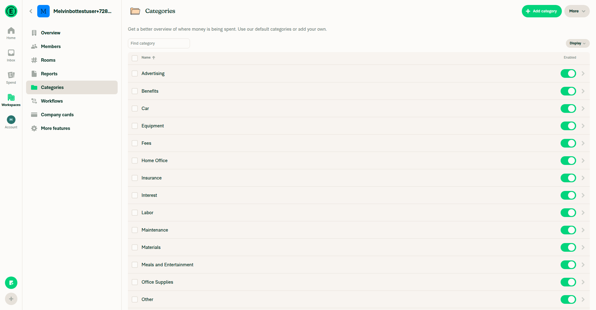
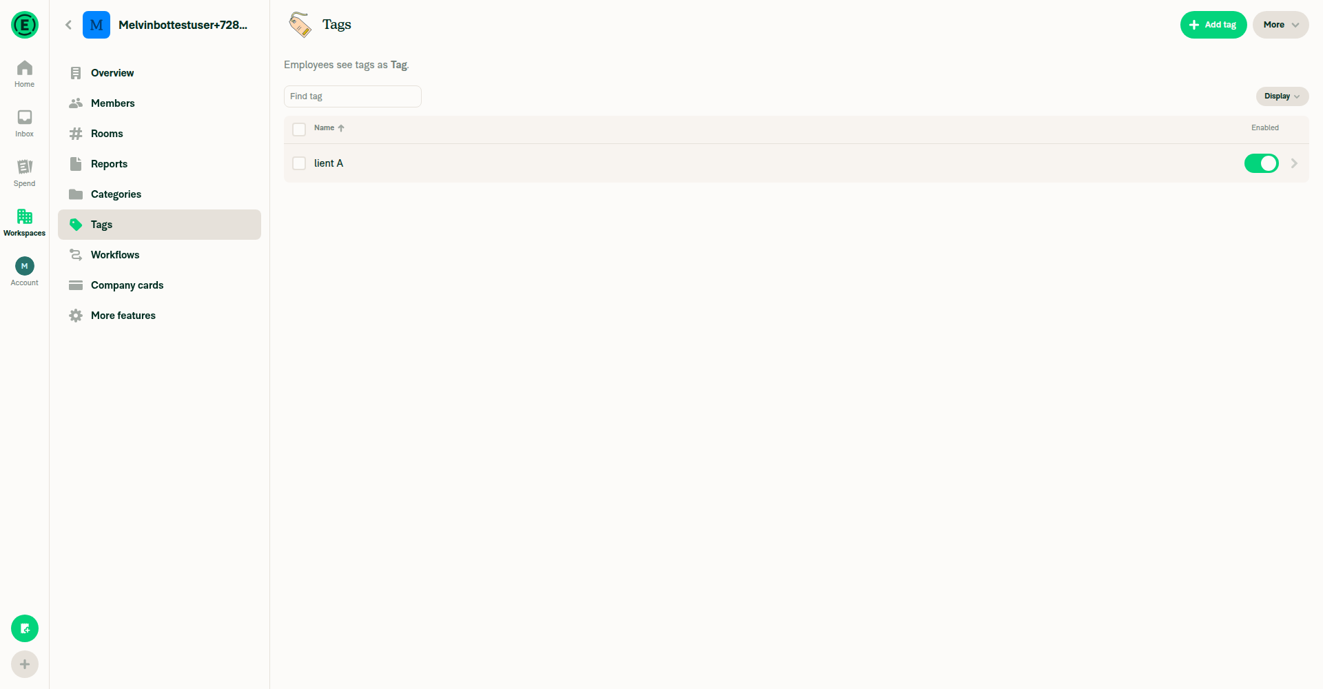
@MelvinBot while we're here, let's also fix alignment issues in table header

  • vertical alignment
  • right alignment in last column header

For example, in categories table:

  • "Name ⬆️" is not vertically centered
  • "Enabled" is not right docked, not vertically centered

This also happens on other tables.

Screenshot 2026-07-30 at 11 51 32 AM

production:
Screenshot 2026-07-30 at 11 51 28 AM

@MelvinBot

Copy link
Copy Markdown
Contributor Author

Re-checked after the latest commit (590484f5). Still nothing for me to push — all code checks are green and the only failing check is the human checklist gate.

PR Author Checklist / checklist is the sole failure. It fails only because the author-checklist boxes aren't ticked and I (the PR author) am not treated as an engineering member — not because of any code defect. This one is on the human co-author to clear by filling out the Tests / QA sections and checking the author-checklist items.

Everything else passes on the current head, including the new TableSemanticContainerTest unit tests: typecheck, all 8 test jobs, branch-perf-tests / baseline-perf-tests, ESLint, Oxfmt, React Compiler Compliance, Storybook tests, every build, and codecov.

Apply column containerStyles to the flexRow sort button instead of the
column-direction cell wrapper so justify-content aligns the header label
horizontally, restoring right-docked and vertically centered headers.

Co-authored-by: Aimane Chnaif <aimane-chnaif@users.noreply.github.com>
@MelvinBot

Copy link
Copy Markdown
Contributor Author

Done — pushed df20ed7. The header alignment issues have the same origin as the empty-state one: PR #93335's ARIA refactor moved the column's alignment styles onto the wrong element.

Root cause: In the web/wide ARIA path, each column's styling.containerStyles (e.g. the enabled column's justifyContentEnd) was applied to the outer wrapper View (TableHeader.tsx:291), whose default flexDirection is column. So justify-content acted on the vertical axis — leaving "Enabled" left-aligned and pushed off-center vertically. In the non-semantic (production) path those same styles land on the flexRow sort button, which is why prod looked right.

Fix: Apply containerStyles to the flexRow sort button (where every table's containerStyles is meant to act — they're all justifyContentEnd/justifyContentCenter/mnw0/pr3, i.e. horizontal-row alignment), and leave the wrapper View as just the sizing/cell node. This mirrors the production layout for every table using the shared header.

Verified on wide web (1920px) — pixel-checked, both Categories and Tags tables:

  • "Enabled" header is right-docked directly above the toggle column (right edges match to the pixel).
  • "Name" and "Enabled" labels are vertically level / centered in the header row.
Screenshots

Categories:
Categories table wide — right-docked Enabled header

Header close-up (Enabled right-docked, vertically centered):
Enabled header close-up

Tags:
Tags table wide — right-docked Enabled header

Checks run locally: oxfmt, eslint, typecheck (tsgo), and the Table unit + UI suites (tests/unit/components/Table, TableTest, WorkspaceViewTagsTableTest, WorkspaceCompanyCardsTableTest) — all green. The React Compiler compliance check couldn't run in this sandbox (its git base-ref lookup is blocked here), but the change is a pure style-array tweak inside an already-compiled component, so it introduces no new memoization. Worth a glance at other tables you have handy (Per diems, Rooms, Company cards) since this touches the shared TableHeader.

Comment thread src/components/Table/TableHeader.tsx Outdated
? // The column's `containerStyles` (e.g. `justifyContentEnd`) are horizontal-alignment styles meant for the
// header row, so they belong on this `flexRow` button rather than the column-direction cell wrapper below,
// where `justify-content` would act on the vertical axis and leave the label mis-aligned.
[styles.flexRow, styles.alignItemsCenter, styles.tableHeaderContentHeight, styles.flex1, column.styling?.containerStyles, !column.sortable && styles.cursorDefault]

@aimane-chnaif aimane-chnaif Jul 30, 2026

Copy link
Copy Markdown
Contributor

Choose a reason for hiding this comment

The reason will be displayed to describe this comment to others. Learn more.

@MelvinBot PressableWithFeedback still doesn't take full height.
Should we add wrapperStyle={styles.flex1} when table semantics enabled?

Also, to reuse already existing tableHeaderStyles, let's define like this:

styles=[]
containerStyles={[column.styling?.flex ? {flex: column.styling.flex} : styles.flex1]}

So split existing tableHeaderStyles into 2.

Copy link
Copy Markdown
Contributor Author

Choose a reason for hiding this comment

The reason will be displayed to describe this comment to others. Learn more.

Done — pushed 450adce. You're right on both counts.

Full height: PressableWithFeedback renders its style on the inner GenericPressable but wraps it in an OpacityView whose style comes from wrapperStyle, which defaults to []. So the button's flex1 was measured against a wrapper that had collapsed to content height — the pressable never filled the cell, which is why the label wasn't vertically centered and the last column wasn't right-docked. Added wrapperStyle={styles.flex1} in the semantic path so the wrapper fills the columnheader cell and the button (also flex1) fills the wrapper.

Dedup: split tableHeaderStyles into a shared base (the visual/alignment styles, including column.styling?.containerStyles) plus a separate flex piece, applied per path:

  • non-semantic → [...tableHeaderStyles, columnFlexStyle] (flex on the button itself, unchanged behavior)
  • semantic → [...tableHeaderStyles, styles.flex1] on the button + wrapperStyle={styles.flex1}, with columnFlexStyle (styling.flex or flex1) living on the columnheader cell wrapper

I read your containerStyles={[...]} as "put the flex on the container/wrapper" — since PressableWithFeedback's wrapper prop is wrapperStyle, I used that. If you actually meant a different split, say the word and I'll reshape it.

One thing I couldn't self-verify: the exact pixel centering on wide web. The reasoning is solid, but since you're looking at it live, a quick confirm on the categories table (Name ⬆️ centered, Enabled right-docked + centered) would be good before we call it done.

@MelvinBot

Copy link
Copy Markdown
Contributor Author

Re-checked on the current head (df20ed7) — nothing for me to push. Every code check is green (typecheck, all 8 test jobs, perf tests, ESLint, Oxfmt, React Compiler Compliance, Storybook tests, all builds, and codecov).

The sole remaining failure is PR Author Checklist / checklist, which is a human gate — it fails only because the author-checklist boxes aren't ticked and I (the PR author) am not treated as an engineering member, not because of any code defect. I can't clear it by pushing code or by ticking the boxes on your behalf. To make it pass, fill out the Tests / QA sections in the PR body and check the author-checklist items once you've verified the change. Full breakdown is in my earlier comment.

…tyles

Co-authored-by: Aimane Chnaif <aimane-chnaif@users.noreply.github.com>
Co-authored-by: {"message":"Not Found","documentation_url":"https://docs.github.com/rest/issues/comments#get-an-issue-comment","status":"404"} <{"message":"Not Found","documentation_url":"https://docs.github.com/rest/issues/comments#get-an-issue-comment","status":"404"}@users.noreply.github.com>
@aimane-chnaif

Copy link
Copy Markdown
Contributor

@codex review

@aimane-chnaif

Copy link
Copy Markdown
Contributor

@MelvinBot review

@MelvinBot

Copy link
Copy Markdown
Contributor Author

Review (updated for 450adce)

Re-reviewed the full current diff across all 4 commits. Looks good — ship it after a visual pass. Both notes from my earlier review are now resolved, and the header-alignment additions are mechanically sound.

Empty-state fix + orphaned-rowgroup handling

  • rendersBodyWhenEmpty = !!listProps.ListEmptyComponent || !!listProps.ListHeaderComponent (Table.tsx:299) is the exact inverse of TableBody's null-return guard (TableBody.tsx:92), so the wrapper is skipped precisely when the body renders nothing and preserved when it keeps its role="rowgroup". listProps is a rest element (Table.tsx:196), so the .ListEmptyComponent access is null-safe.
  • Both branches now have unit coverage in TableSemanticContainerTest.tsx. 👍

Header alignment fix ✅ (mechanism verified)

  • The root problem was justify-content on the wrong axis: containerStyles (e.g. justifyContentEnd) sat on the column-direction cell wrapper, so it distributed vertically instead of right-docking. Moving it onto the flexRow sort button (TableHeader.tsx:233) makes it act horizontally. I spot-checked the real column defs — they're all justifyContentEnd / justifyContentCenter / pr3, i.e. horizontal-axis, so the premise holds.
  • Adding wrapperStyle={styles.flex1} is the right call: PressableWithFeedback applies wrapperStyle to its OpacityView (PressableWithFeedback.tsx:85), which otherwise collapses to content height and breaks vertical centering — exactly as the comment states.
One column to eyeball specifically

WorkspaceExpensifyCardsTable passes containerStyles: [styles.mnw0] (index.tsx:125/138) — a shrink-control style, not horizontal alignment, so it's the one outlier to the "containerStyles are horizontal styles" premise. Moving min-width:0 from the cell wrapper onto the button is probably fine (or better, since the truncating label lives inside the button), but it's worth confirming that table's header labels still truncate correctly rather than overflow.

Non-semantic (native/narrow) path is unchanged in effect: tableHeaderStyles still carries containerStyles, with columnFlexStyle now appended after cursorDefault instead of before containerStyles — a harmless reorder unless a column's containerStyles overrides flex, which none do.

No real CI failures — the only red check is PR Author Checklist, expected until the human boxes are filled.

Since these are all layout changes on wide web, the human co-author should verify the actual pixels before marking ready: (1) empty-state illustration re-centered on Tags / Per diems / empty Workspaces, and (2) header labels vertically centered with the last (actions) column right-docked across the workspace tables.

@chatgpt-codex-connector chatgpt-codex-connector Bot left a comment

Copy link
Copy Markdown

Choose a reason for hiding this comment

The reason will be displayed to describe this comment to others. Learn more.

💡 Codex Review

Here are some automated review suggestions for this pull request.

Reviewed commit: 450adce472

ℹ️ About Codex in GitHub

Codex has been enabled to automatically review pull requests in this repo. Reviews are triggered when you

  • Open a pull request for review
  • Mark a draft as ready
  • Comment "@codex review".

If Codex has suggestions, it will comment; otherwise it will react with 👍.

When you sign up for Codex through ChatGPT, Codex can also answer questions or update the PR, like "@codex address that feedback".

Comment thread src/components/Table/TableHeader.tsx Outdated
Comment on lines +291 to +292
<View
style={[column.styling?.flex ? {flex: column.styling.flex} : styles.flex1, column.styling?.containerStyles]}
style={columnFlexStyle}

Copy link
Copy Markdown

Choose a reason for hiding this comment

The reason will be displayed to describe this comment to others. Learn more.

P2 Badge Keep grid sizing styles on semantic header cells

On wide web, this semantic path now applies every column.styling.containerStyles value to the inner pressable and leaves the actual role="columnheader" grid item with only flex. WorkspaceExpensifyCardsTable uses containerStyles: [styles.mnw0] on the Limit type and Status columns specifically so the grid tracks can shrink/equalize; minWidth: 0 has to be on the grid item itself, so those headers can again force uneven/overflowing tracks when their labels are wider. Keep sizing constraints like mnw0 on this wrapper while moving only the horizontal alignment styles to the button.

Useful? React with 👍 / 👎.

Copy link
Copy Markdown
Contributor

Choose a reason for hiding this comment

The reason will be displayed to describe this comment to others. Learn more.

Copy link
Copy Markdown
Contributor Author

Choose a reason for hiding this comment

The reason will be displayed to describe this comment to others. Learn more.

Good catch — fixed in 24d945b.

You're right that mnw0 is a grid-track sizing constraint, not a horizontal-alignment one, so it has to sit on the role="columnheader" grid item, not the inner button. In the non-semantic path the button is the grid item (so production was fine); the ARIA wrapper broke that.

Fix: forward only the sizing keys from containerStyles onto the wrapper cell, and keep the alignment styles on the flexRow button — TableHeader.tsx:229-234 and :300:

const {minWidth, maxWidth} = StyleSheet.flatten(column.styling?.containerStyles) ?? {};
const columnCellSizingStyle = {minWidth, maxWidth};
// ...
<View style={[columnFlexStyle, columnCellSizingStyle]} {...columnHeaderProps}>

I forwarded the sizing keys rather than duplicating the whole containerStyles onto both nodes on purpose: the alignment columns pair justifyContentEnd with pr3, and putting that pr3 on the wrapper and the button would double the right padding and shift the right-docked headers (enabled/actions) off from the body cells. Sizing (mnw0) and alignment (justifyContent*/pr3) happen to be mutually exclusive per column today, but extracting only the sizing keys keeps it correct even if that changes.

Verification: oxfmt, lint-changed, typecheck (tsgo) clean, and the Table suites pass (tests/unit/components/Table + TableTest + WorkspaceCompanyCardsTableTest + WorkspaceViewTagsTableTest, 72 tests). React Compiler compliance couldn't run in this sandbox (its base-ref git lookup is blocked), but this is a pure style-array change adding no new hooks/components, so it introduces no memoization.

Since this is a grid-sizing change, worth a visual pass on Workspace ▸ Expensify Cards (wide web) to confirm the Limit type and Status headers stay equal-width and their labels truncate rather than overflow when narrow.

@MelvinBot

Copy link
Copy Markdown
Contributor Author

Re-checked — still no code fix to push. The one remaining red check is the checklist gate, and it's a human gate, not a code defect.

The failing check is now PR Reviewer Checklist / checklist (a review was submitted, which triggers the reviewer-checklist gate; it's failing only because those checkbox items aren't filled out yet). To clear it, the reviewer needs to complete the reviewer checklist.

All 35 real checks are green — typecheck, all 8 test jobs, perf tests, ESLint, Oxfmt, React Compiler Compliance, Storybook, every build, and codecov. Nothing in the code needs changing.

@MelvinBot

Copy link
Copy Markdown
Contributor Author

Re-checked — still no code fix to push, and the situation moved forward. The author-checklist gate is now green; the only remaining red check is the PR Reviewer Checklist / checklist, whose annotation is "No PR Reviewer Checklist was found."

That's a human reviewer gate, not a code defect — it clears when the PR reviewer posts/completes their reviewer checklist on the PR. I can't satisfy it by pushing code.

All 35 other checks are green — typecheck, all 8 test jobs, perf tests, ESLint, Oxfmt, React Compiler Compliance, Storybook tests, every build, and codecov. So the code is in good shape across all 4 commits; only the reviewer checklist remains.

@aimane-chnaif

aimane-chnaif commented Jul 30, 2026

Copy link
Copy Markdown
Contributor

Reviewer Checklist

  • I have verified the author checklist is complete (all boxes are checked off).
  • I verified the correct issue is linked in the ### Fixed Issues section above
  • I verified testing steps are clear and they cover the changes made in this PR
    • I verified the steps for local testing are in the Tests section
    • I verified the steps for Staging and/or Production testing are in the QA steps section
    • I verified the steps cover any possible failure scenarios (i.e. verify an input displays the correct error message if the entered data is not correct)
    • I turned off my network connection and tested it while offline to ensure it matches the expected behavior (i.e. verify the default avatar icon is displayed if app is offline)
  • I checked that screenshots or videos are included for tests on all platforms
  • I included screenshots or videos for tests on all platforms
  • I verified that the composer does not automatically focus or open the keyboard on mobile unless explicitly intended. This includes checking that returning the app from the background does not unexpectedly open the keyboard.
  • I verified tests pass on all platforms & I tested again on:
    • Android: HybridApp
    • Android: mWeb Chrome
    • iOS: HybridApp
    • iOS: mWeb Safari
    • MacOS: Chrome / Safari
  • If there are any errors in the console that are unrelated to this PR, I either fixed them (preferred) or linked to where I reported them in Slack
  • I verified proper code patterns were followed (see Reviewing the code)
    • I verified that any callback methods that were added or modified are named for what the method does and never what callback they handle (i.e. toggleReport and not onIconClick).
    • I verified that comments were added to code that is not self explanatory
    • I verified that any new or modified comments were clear, correct English, and explained "why" the code was doing something instead of only explaining "what" the code was doing.
    • I verified any copy / text that was added to the app is grammatically correct in English. It adheres to proper capitalization guidelines (note: only the first word of header/labels should be capitalized), and is either coming verbatim from figma or has been approved by marketing (in order to get marketing approval, ask the Bug Zero team member to add the Waiting for copy label to the issue)
  • If a new code pattern is added I verified it was agreed to be used by multiple Expensify engineers
  • I verified that this PR follows the guidelines as stated in the Review Guidelines
  • I verified other components that can be impacted by these changes have been tested, and I retested again (i.e. if the PR modifies a shared library or component like Avatar, I verified the components using Avatar have been tested & I retested again)
  • If a new component is created I verified that:
    • A similar component doesn't exist in the codebase
    • All props are defined accurately and each prop has a /** comment above it */
    • The file is named correctly
    • The component has a clear name that is non-ambiguous and the purpose of the component can be inferred from the name alone
    • The only data being stored in the state is data necessary for rendering and nothing else
    • For Class Components, any internal methods passed to components event handlers are bound to this properly so there are no scoping issues (i.e. for onClick={this.submit} the method this.submit should be bound to this in the constructor)
    • Any internal methods bound to this are necessary to be bound (i.e. avoid this.submit = this.submit.bind(this); if this.submit is never passed to a component event handler like onClick)
    • All JSX used for rendering exists in the render method
    • The component has the minimum amount of code necessary for its purpose, and it is broken down into smaller components in order to separate concerns and functions
  • If any new file was added I verified that:
    • The file has a description of what it does and/or why is needed at the top of the file if the code is not self explanatory
  • If a new CSS style is added I verified that:
    • A similar style doesn't already exist
    • The style can't be created with an existing StyleUtils function (i.e. StyleUtils.getBackgroundAndBorderStyle(theme.componentBG)
  • If the PR modifies code that runs when editing or sending messages, I tested and verified there is no unexpected behavior for all supported markdown - URLs, single line code, code blocks, quotes, headings, bold, strikethrough, and italic.
  • If the PR modifies a generic component, I tested and verified that those changes do not break usages of that component in the rest of the App (i.e. if a shared library or component like Avatar is modified, I verified that Avatar is working as expected in all cases)
  • If the PR modifies a component related to any of the existing Storybook stories, I tested and verified all stories for that component are still working as expected.
  • If the PR modifies a component or page that can be accessed by a direct deeplink, I verified that the code functions as expected when the deeplink is used - from a logged in and logged out account.
  • If the PR modifies the UI (e.g. new buttons, new UI components, changing the padding/spacing/sizing, moving components, etc) or modifies the form input styles:
    • I verified that all the inputs inside a form are aligned with each other.
    • I added Design label and/or tagged @Expensify/design so the design team can review the changes.
  • For any bug fix or new feature in this PR, I verified that sufficient unit tests are included to prevent regressions in this flow.
  • If the main branch was merged into this PR after a review, I tested again and verified the outcome was still expected according to the Test steps.
  • I have checked off every checkbox in the PR reviewer checklist, including those that don't apply to this PR.

Screenshots/Videos

Android: HybridApp
Android: mWeb Chrome
iOS: HybridApp
iOS: mWeb Safari
MacOS: Chrome / Safari
web.mov

Forward containerStyles' minWidth/maxWidth onto the role="columnheader"
grid item so 1fr tracks size from their share, not content. Horizontal
alignment stays on the sort button to avoid double-applying padding.

Co-authored-by: Aimane Chnaif <aimane-chnaif@users.noreply.github.com>
Co-authored-by: {"message":"Not Found","documentation_url":"https://docs.github.com/rest/issues/comments#get-an-issue-comment","status":"404"} <{"message":"Not Found","documentation_url":"https://docs.github.com/rest/issues/comments#get-an-issue-comment","status":"404"}@users.noreply.github.com>
@MelvinBot

Copy link
Copy Markdown
Contributor Author

⚠️ MelvinBot CI Fix Loop Detected

MelvinBot has made 6 consecutive commits trying to fix CI failures. Automatic CI fix dispatches are now paused for this PR.

Next steps: A human should review the recent commits and resolve the conflicting CI errors manually.

@aimane-chnaif

Copy link
Copy Markdown
Contributor

@MelvinBot fix eslint check

@MelvinBot

Copy link
Copy Markdown
Contributor Author

Review (head 51e3e25)

Re-reviewed the full current diff across all 6 commits. The code is in good shape — the important regression is fixed and covered by a test.

The one that mattered — search-input wipe (aimane-chnaif's #1/#2/#3) is correctly resolved. The empty branch now returns React.Children.toArray(children), so top-level keys (.0, .1, …) match the wrapped branch and Table.FilterBar is reconciled instead of remounted — its unmount cleanup no longer fires to clear the search string. I traced the key-matching independently and it holds: both branches key children identically via toArray, and the wrapped branch only additionally groups the (null-rendering) header/body, so the surrounding FilterBar (.0) is preserved across the empty↔non-empty flip. The 3→0→3 regression test asserting unmountCount === 0 is exactly the right guard.

#5 dedup is cleandoesBodyRenderWhenEmpty is now the single source of truth for both TableBody's return null and Table's rendersBodyWhenEmpty, so the orphaned-rowgroup invariant can't silently drift.

One scoping thought + the deferred items (non-blocking)

Scope. This started as a minimal empty-state deploy-blocker fix and, via the "while we're here" header-alignment request, now also refactors TableHeaderColumn's flex/sizing across the populated wide-web layout of many tables (Domains, WorkspaceList, Rooms, CompanyCards, …). That's the higher-risk half of the diff and it carries the #6/#7 behavior changes. For a deploy blocker I'd weakly prefer shipping the empty-state fix on its own and splitting the header-alignment work into a follow-up, so the blocker merges with the smallest possible surface — but since you explicitly chose to bundle it, that's a judgment call for you and the reviewer, not a blocker.

#4 / #6 / #7 — I agree with the dispositions in the prior response. #4 (Cards table keeps the wrapper) is the correct consequence of rendersBodyWhenEmpty, not a miss. #6 (sort hit-area / hover-dim grows on pr3 columns) and #7 (latent containerStyles.flex precedence flip) are real but cosmetic/latent; fine to leave documented rather than churn the deploy blocker.

One small nit on the header change: in the semantic path minWidth/maxWidth from containerStyles land on both the columnheader cell (via columnCellSizingStyle) and the button (via the full containerStyles in tableHeaderStyles). Harmless (the cell already constrains the track), just redundant — no action needed.

Still needs a human before sign-off: the visual QA on wide web can't be done from here — (1) empty-state illustration re-centered on Tags / Per diems / empty Workspaces list, (2) type a search past the last match and confirm the input no longer clears and "No results found" shows, (3) the #4 confirm on the empty Expensify Cards table — plus filling in the Tests/QA sections.

@chatgpt-codex-connector

Copy link
Copy Markdown

Codex Review: Didn't find any major issues. Breezy!

Reviewed commit: 51e3e25a4e

ℹ️ About Codex in GitHub

Codex has been enabled to automatically review pull requests in this repo. Reviews are triggered when you

  • Open a pull request for review
  • Mark a draft as ready
  • Comment "@codex review".

If Codex has suggestions, it will comment; otherwise it will react with 👍.

When you sign up for Codex through ChatGPT, Codex can also answer questions or update the PR, like "@codex address that feedback".

Co-authored-by: Aimane Chnaif <aimane-chnaif@users.noreply.github.com>
@MelvinBot

Copy link
Copy Markdown
Contributor Author

Fixed the failing ESLint check.

The three react/jsx-key errors were in TableSemanticContainerTest.tsx:118 — the test built its children as an array literal ([<TrackedFilterBar />, <TableHeader />, <TableBody />]), and react/jsx-key requires a key on every element in an array.

Rather than add explicit keys (which would stop the test faithfully mirroring how tables pass Table.FilterBar/Table.Header/Table.Body as unkeyed JSX siblings — the exact scenario the React.Children.toArray key-stability fix guards), I moved the three components to be JSX siblings directly inside <TableSemanticContainer>. React produces the identical unkeyed props.children array either way, so the test's runtime behavior is unchanged; react/jsx-key simply doesn't flag JSX siblings.

Verified eslint and oxfmt pass on the file. The unit-test jobs were already green (ESLint was the only failing check), and this change doesn't alter what the test exercises.

@MelvinBot

Copy link
Copy Markdown
Contributor Author

Regression scan

No functional regression found in the empty-state fix itself — and notably, the two regressions a naive version of this fix would have introduced are already handled and covered by tests:

  • Orphaned role="rowgroup" when a table is empty but still renders (ListEmptyComponent/ListHeaderComponent) — guarded by the new rendersBodyWhenEmpty prop, kept in lockstep with TableBody via the shared doesBodyRenderWhenEmpty predicate (TableBody.tsx:31).
  • Table.FilterBar remount wiping the active search string when a query stops matching (empty↔non-empty boundary) — fixed by returning React.Children.toArray(children) so top-level keys stay stable across both branches (TableSemanticContainer.tsx:60), with a dedicated regression test.

I also confirmed the blocker fix still lands: the reported tables (Tags, View tags, Per diems, Workspaces list) don't supply ListEmptyComponent, so rendersBodyWhenEmpty is false and the flex:1 wrapper is skipped for their empty states.

The real regression risk: bundled TableHeader restyle

Since my first review the PR grew from a 7-line empty-state guard to also restyling TableHeaderColumn for the wide-web semantic path across every table (TableHeader.tsx:226-305): column containerStyles alignment moves from the cell wrapper onto the sort button, only minWidth/maxWidth are forwarded to the cell, and wrapperStyle={flex1} is added. That's a legitimate fix for header alignment/equalization, but it's unrelated to blocker #97428 and touches a much wider surface than the three empty states the blocker is about.

This is the part I'd QA carefully before merge — it re-lays-out headers on every populated wide-web table, not just empty ones.

What to verify + why the blast radius is wide

Nearly all column containerStyles in the codebase are horizontal-alignment/padding (justifyContentEnd, justifyContentCenter, pr3) plus mnw0 on Expensify Cards — exactly the styles this refactor re-targets. So the visual change hits: Tags, View tags, Taxes, Per diems, Categories, Company cards, Expensify cards (Limit type/Status equalization — the case the code comments call out), Rooms, Domain list, Workspace list, and Report field list values.

Suggested QA (wide desktop Chrome, populated tables):

  • Right-aligned columns (amounts / actions) stay right-docked and vertically centered.
  • Center-aligned columns (Category rules, Expense defaults, Spend rules) stay centered.
  • Expensify Cards Limit type/Status columns equalize as intended.
  • Header labels line up with the data cells below them.

Lower-risk areas I checked:

  • Native / mWeb (non-semantic path): the style-array reorder ([...tableHeaderStyles, columnFlexStyle]) is inert — flex sizing and alignment/padding are orthogonal props, so order doesn't change the result. No mobile header change expected.
  • Minor: for [justifyContentEnd, pr3] columns the right padding now sits on the sort button rather than the cell wrapper — worth a glance for a few-px shift, but functionally equivalent.

Notes

  • I couldn't run Jest/typecheck in this environment, so CI is the gate — the PR already has a commit fixing an ESLint react/jsx-key issue in the new test, so the suite has been iterated.
  • Process-wise, bundling an unrelated header-alignment fix into a deploy-blocker PR makes it harder to revert cleanly if only one half regresses. If the header work isn't itself blocking the deploy, consider splitting it out.

@aimane-chnaif aimane-chnaif left a comment

Copy link
Copy Markdown
Contributor

Choose a reason for hiding this comment

The reason will be displayed to describe this comment to others. Learn more.

@NikkiWines along with #97428, I found minor style issue in table header after comparing with production and fixed them too.

@NikkiWines NikkiWines left a comment

Copy link
Copy Markdown
Contributor

Choose a reason for hiding this comment

The reason will be displayed to describe this comment to others. Learn more.

Looks good but several comment blocks explain history/alternatives. Comments should explain why, not what was tried, so a fair few of the comments could be trimmed

Comment thread src/components/Table/TableHeader.tsx Outdated
const columnCellSizingStyle = {minWidth, maxWidth};

// Base sort-button styles shared by both the semantic and non-semantic paths. The column's `containerStyles`
// (e.g. `justifyContentEnd`) are horizontal-alignment styles for the header row, so they belong on this `flexRow`

Copy link
Copy Markdown
Contributor

Choose a reason for hiding this comment

The reason will be displayed to describe this comment to others. Learn more.

Suggested change
// (e.g. `justifyContentEnd`) are horizontal-alignment styles for the header row, so they belong on this `flexRow`
// are horizontal-alignment styles for the header row, so they belong on this `flexRow`

Copy link
Copy Markdown
Contributor Author

Choose a reason for hiding this comment

The reason will be displayed to describe this comment to others. Learn more.

Applied in e150d93 — dropped the (e.g. justifyContentEnd) parenthetical and trimmed the rest of the block down to the "why" (the containerStyles are row-axis alignment, so they go on the flexRow button, not the column-direction cell wrapper).

@aimane-chnaif

Copy link
Copy Markdown
Contributor

@MelvinBot address #97451 (comment), #97451 (review)

Co-authored-by: Aimane Chnaif <aimane-chnaif@users.noreply.github.com>
@MelvinBot

Copy link
Copy Markdown
Contributor Author

Trimmed the comment blocks that were explaining history/alternatives rather than just the "why" — pushed in e150d93.

What changed
  • TableHeader.tsx: shortened the three style-derivation comments (dropped the "Limit type/Status equalizing" example, the pr3 aside, and the double-applying-padding note) and applied your inline suggestion on the flexRow line; also tightened the sortButton wrapperStyle comment.
  • TableSemanticContainer.tsx: condensed the empty-state / React.Children.toArray block to the core reasons.
  • Table.tsx and TableBody.tsx: dropped the redundant "single source of truth / in lockstep" restatements.

Comment-only changes — no logic touched. Lint passes (only pre-existing seatbelt warnings).

@aimane-chnaif

Copy link
Copy Markdown
Contributor

@NikkiWines comments look better now

@NikkiWines NikkiWines left a comment

Copy link
Copy Markdown
Contributor

Choose a reason for hiding this comment

The reason will be displayed to describe this comment to others. Learn more.

:shipit:

@joekaufmanexpensify joekaufmanexpensify left a comment

Copy link
Copy Markdown
Contributor

Choose a reason for hiding this comment

The reason will be displayed to describe this comment to others. Learn more.

Fixing deploy blockers

@NikkiWines
NikkiWines merged commit fdbb9ee into main Jul 30, 2026
43 checks passed
@NikkiWines
NikkiWines deleted the claude-tableEmptyStateAlignment branch July 30, 2026 20:28
@OSBotify

Copy link
Copy Markdown
Contributor

✋ This PR was not deployed to staging yet because QA is ongoing. It will be automatically deployed to staging after the next production release.

@github-actions

Copy link
Copy Markdown
Contributor

🚧 NikkiWines has triggered a test Expensify/App build. You can view the workflow run here.

OSBotify pushed a commit that referenced this pull request Jul 30, 2026
Fix empty-state alignment shift on Tags, Per diems, and Workspaces tables

(cherry picked from commit fdbb9ee)

(cherry-picked to staging by marcaaron)
@OSBotify OSBotify added the CP Staging marks PRs that have been CP'd to staging label Jul 30, 2026
@OSBotify

Copy link
Copy Markdown
Contributor

🚀 Cherry-picked to staging by https://github.com/marcaaron in version: 9.4.46-8 🚀

platform result
🕸 web 🕸 success ✅
🤖 android 🤖 cancelled 🔪
🍎 iOS 🍎 cancelled 🔪

@MelvinBot

Copy link
Copy Markdown
Contributor Author

🤖 I reviewed the changes in this PR against the help site content under App/docs/articles.

No help site changes are required.

This PR is a purely internal rendering/layout fix: it short-circuits TableSemanticContainer to render children directly when rowCount === 0, restoring the correct vertical alignment of the empty-state illustration on the Tags, Per diems, and Workspaces tables. The diff touches only Table component internals, code comments, and unit tests — there are no changes to feature behavior, workflows, navigation, settings, labels, or any user-facing copy that the help site documents.

Because nothing about how these features work or how they're described has changed, there's no documentation to update, so I did not create a draft docs PR.

@aimane-chnaif, please review the linked help site PR and confirm it reflects the current behavior. Then mark the linked help site PR Ready for review. (Note: no help site PR was created because no documentation changes are needed for this layout-only fix — let me know if you'd like me to reconsider.)

@OSBotify

Copy link
Copy Markdown
Contributor

🚀 Cherry-picked to staging by https://github.com/marcaaron in version: 9.4.46-10 🚀

platform result
🕸 web 🕸 success ✅
🤖 android 🤖 success ✅
🍎 iOS 🍎 success ✅

@MelvinBot

Copy link
Copy Markdown
Contributor Author

🤖 Re-reviewed the full current diff (all commits, including the later table-header vertical/right-alignment fixes) against the help site content under App/docs/articles.

Still no help site changes are required.

Everything in this PR is internal rendering/layout work on the shared Table components (empty-state re-centering via the rowCount === 0 short-circuit in TableSemanticContainer, plus moving column alignment styles onto the correct element in the ARIA/wide-web header path). The diff touches only Table component internals, code comments, and unit tests — no feature behavior, workflows, navigation, settings, tab names, labels, or user-facing copy that the help site documents has changed. So there's nothing to update in the articles and no draft docs PR to create.

@aimane-chnaif, please review the linked help site PR and confirm it reflects the current behavior. Then mark the linked help site PR Ready for review. (No help site PR was created because this is a layout-only fix with no documentation impact — let me know if you'd like me to reconsider any specific article.)

@OSBotify

Copy link
Copy Markdown
Contributor

🚀 Deployed to production by https://github.com/marcaaron in version: 9.4.46-10 🚀

platform result
🕸 web 🕸 success ✅
🤖 android 🤖 success ✅
🍎 iOS 🍎 success ✅

Bundle Size Analysis (Sentry):

@OSBotify

Copy link
Copy Markdown
Contributor

🚀 Cherry-picked to staging by https://github.com/marcaaron in version: 9.4.47-0 🚀

platform result
🕸 web 🕸 success ✅
🤖 android 🤖 success ✅
🍎 iOS 🍎 success ✅

@MelvinBot

Copy link
Copy Markdown
Contributor Author

🤖 Nothing has changed since my previous docs reviewno help site changes are required.

This PR is entirely internal rendering/layout work on the shared Table components (empty-state re-centering via the rowCount === 0 short-circuit in TableSemanticContainer, plus moving column alignment styles onto the correct element in the ARIA/wide-web header path). It touches only Table component internals, code comments, and unit tests — no feature behavior, workflows, navigation, settings, tab names, labels, or user-facing copy that App/docs/articles documents. So there's nothing to update and no draft docs PR to create.

@aimane-chnaif, please review the linked help site PR and confirm it reflects the current behavior. Then mark the linked help site PR Ready for review. (No help site PR was created because this is a layout-only fix with no documentation impact — let me know if you'd like me to reconsider any specific article.)

Sign up for free to join this conversation on GitHub. Already have an account? Sign in to comment

Labels

CP Staging marks PRs that have been CP'd to staging

Projects

None yet

Development

Successfully merging this pull request may close these issues.

5 participants