Skip to content

fix: align banner and toast icons - #726

Open
mattrothenberg wants to merge 3 commits into
mainfrom
fix-banner-toast-icon-alignment
Open

fix: align banner and toast icons#726
mattrothenberg wants to merge 3 commits into
mainfrom
fix-banner-toast-icon-alignment

Conversation

@mattrothenberg

@mattrothenberg mattrothenberg commented Aug 11, 2026

Copy link
Copy Markdown
Collaborator

Summary

  • Align Banner icons to the first line of wrapping message text using a line-height-sized icon slot
  • Prevent Banner and Toast status icons from shrinking when messages wrap
  • Add a Banner docs before/after preview with copyable Banner API code
Screenshot 2026-08-11 at 9 54 45 AM

Tests

  • pnpm --filter @cloudflare/kumo exec vp test run --project=unit src/components/banner/banner.test.tsx
  • pnpm --filter @cloudflare/kumo lint
  • pnpm --filter @cloudflare/kumo typecheck
  • pnpm --filter @cloudflare/kumo-docs-astro exec vp lint src/components/demos/BannerDemo.tsx src/pages/components/banner.mdx
  • pnpm --filter @cloudflare/kumo-docs-astro codegen:demos

Notes

Full docs lint currently fails on unrelated existing issues in TabsDemo.tsx, ToolbarDemo.tsx, and ChartCard.astro.

  • Reviews
  • bonk has reviewed the change
  • automated review not possible because: this is a focused visual alignment fix that needs human visual review
  • Tests
  • Tests included/updated
  • Automated tests not possible - manual testing has been completed as follows: not applicable

@pkg-pr-new

pkg-pr-new Bot commented Aug 11, 2026

Copy link
Copy Markdown
npm i https://pkg.pr.new/@cloudflare/kumo@726

commit: 74ef58b

@github-actions

github-actions Bot commented Aug 11, 2026

Copy link
Copy Markdown
Contributor

Docs Preview

View docs preview

Commit: 067208f

@mattrothenberg

Copy link
Copy Markdown
Collaborator Author

/bonk review and approve this approach

@github-actions

github-actions Bot commented Aug 11, 2026

Copy link
Copy Markdown
Contributor
Visual Regression Report — 15 changed, 28 unchanged

15 screenshot(s) with visual changes:

Button / Loading State

1 px (0%) changed

Before After Diff
Before After Diff

Dialog / Dialog Basic

474 px (0.54%) changed

Before After Diff
Before After Diff

Dialog / Dialog Alert

1,169 px (1.32%) changed

Before After Diff
Before After Diff

Dialog / Dialog Confirmation

1,088 px (1.23%) changed

Before After Diff
Before After Diff

Dialog / Dialog With Select

130 px (0.15%) changed

Before After Diff
Before After Diff

Dialog (Open)

0 px (0%) changed

Before After Diff
Before After Diff

Select / Select Basic

859 px (0.97%) changed

Before After Diff
Before After Diff

Select / Select Sizes

170 px (0.1%) changed

Before After Diff
Before After Diff

Select / Select Without Label

721 px (0.81%) changed

Before After Diff
Before After Diff

Select / Select With Description

1,688 px (1.62%) changed

Before After Diff
Before After Diff

Select / Select With Error

1,730 px (1.66%) changed

Before After Diff
Before After Diff

Select / Select Placeholder

237 px (0.27%) changed

Before After Diff
Before After Diff

Select / Select With Tooltip

853 px (0.96%) changed

Before After Diff
Before After Diff

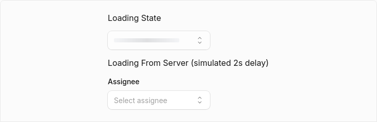
Select / Select Loading

0 px (0%) changed

Before After Diff
Before After Diff

Select (Open)

1,082 px (0%) changed

Before After Diff
Before After Diff
28 screenshot(s) unchanged
  • Button / Basic
  • Button / Variant: Primary
  • Button / Variant: Secondary
  • Button / Variant: Ghost
  • Button / Variant: Destructive
  • Button / Variant: Outline
  • Button / Variant: Secondary Destructive
  • Button / Sizes
  • Button / With Icon
  • Button / Icon Only
  • Button / Disabled State
  • Button / Title
  • Button / Link as Button
  • Button / Link with Tooltip
  • Button / Disabled Link
  • Dialog / Dialog With Actions
  • Dialog / Dialog Sizes
  • Dialog / Custom Max Width
  • Dialog / Dialog With Combobox
  • Dialog / Dialog With Dropdown
  • Select / Select Custom Rendering
  • Select / Select Multiple
  • Select / Select Complex
  • Select / Select Disabled Options
  • Select / Select Disabled Items
  • Select / Select Grouped
  • Select / Select Grouped With Disabled
  • Select / Select Long List

Generated by Kumo Visual Regression

@ask-bonk ask-bonk Bot left a comment

Copy link
Copy Markdown
Contributor

Choose a reason for hiding this comment

The reason will be displayed to describe this comment to others. Learn more.

The approach is clean and consistent across both Banner and Toast. Using a line-height-sized flex container with is a modern, minimal way to keep icons aligned to the first line without shrinking when text wraps. Tests cover the new behavior, and the docs preview is a nice addition.

@ask-bonk ask-bonk Bot left a comment

Copy link
Copy Markdown
Contributor

Choose a reason for hiding this comment

The reason will be displayed to describe this comment to others. Learn more.

The approach is clean and consistent across both Banner and Toast. Using a line-height-sized flex container with flex-none is a modern, minimal way to keep icons aligned to the first line without shrinking when text wraps. Tests cover the new behavior, and the docs preview is a nice addition.

@ask-bonk

ask-bonk Bot commented Aug 11, 2026

Copy link
Copy Markdown
Contributor

Approved PR #726 with the following comment:

The approach is clean and consistent across both Banner and Toast. Using a line-height-sized flex container with flex-none is a modern, minimal way to keep icons aligned to the first line without shrinking when text wraps. Tests cover the new behavior, and the docs preview is a nice addition.

Summary of the review:

Aspect Assessment
Banner icon alignment h-[1lh] wrapper + flex-none prevents shrink and pins to first line — correct
Toast parity Same pattern applied consistently — good
Tests New assertions cover h-[1lh], flex-none, size-[1em] — sufficient
Docs Before/after preview + copyable example — helpful
Visual regression 32 unrelated diffs flagged; suspect baseline flakiness rather than real regressions
Overall Approved — minimal, targeted fix with no structural concerns

github run

Comment on lines +148 to +163
it("aligns icons to the first text line without shrinking", () => {
render(
<Banner
size="sm"
icon={<svg data-testid="icon" className="custom-icon" />}
description="A DNS record already exists in this zone and may wrap onto multiple lines."
/>,
);

const icon = screen.getByTestId("icon");
const iconClassName = icon.getAttribute("class") ?? "";
expect(iconClassName).toContain("size-[1em]");
expect(iconClassName).toContain("flex-none");
expect(iconClassName).toContain("custom-icon");
expect(icon.parentElement?.className).toContain("h-[1lh]");
expect(icon.parentElement?.className).toContain("flex-none");

Copy link
Copy Markdown
Contributor

Choose a reason for hiding this comment

The reason will be displayed to describe this comment to others. Learn more.

nit: we shouldn't test on the existence of class names, it's brittle

Copy link
Copy Markdown
Collaborator Author

Choose a reason for hiding this comment

The reason will be displayed to describe this comment to others. Learn more.

truth! I will fix this

? cloneElement(iconElement, {
className: cn(
iconElement.props.className,
"size-[1em] flex-none leading-snug",

Copy link
Copy Markdown
Collaborator

Choose a reason for hiding this comment

The reason will be displayed to describe this comment to others. Learn more.

I checked downstream Stratus usage and this does have compatibility impact: there are at least 123 Banner usages across 90 files that pass explicit numeric icon sizes, including many 18px, 20px, and 24px icons. Appending size-[1em] overrides those sizes for Phosphor icons (for example, a requested 20px icon becomes the Banner’s inherited 1em size), while custom icon components that do not forward className may retain their original size, so the normalization is inconsistent across the current ReactNode contract.

Is taking ownership of all Banner icon sizing intentional here? If the goal is only alignment/non-shrinking, the outer h-[1lh] flex-none items-center wrapper appears sufficient without cloning or rewriting the supplied node. If normalization is intentional, I think it should be called out as an API/visual behavior change because Stratus currently relies heavily on explicit icon sizing.

Copy link
Copy Markdown
Collaborator Author

Choose a reason for hiding this comment

The reason will be displayed to describe this comment to others. Learn more.

Intentional. Custom sizes downstream is a defect (in my opinion), but point heard about the impact.

Sign up for free to join this conversation on GitHub. Already have an account? Sign in to comment

Labels

None yet

Projects

None yet

Development

Successfully merging this pull request may close these issues.

3 participants