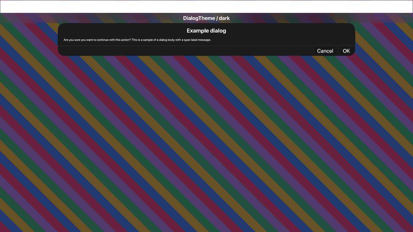
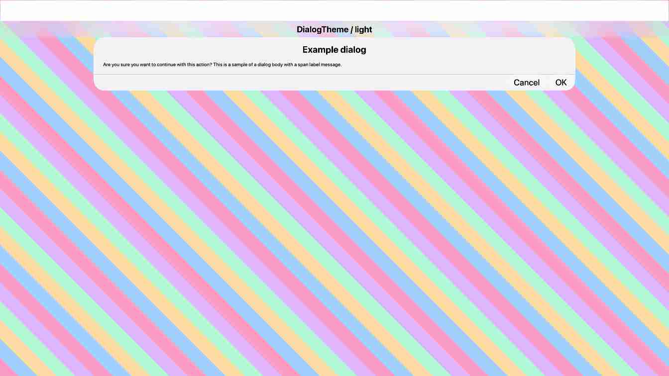
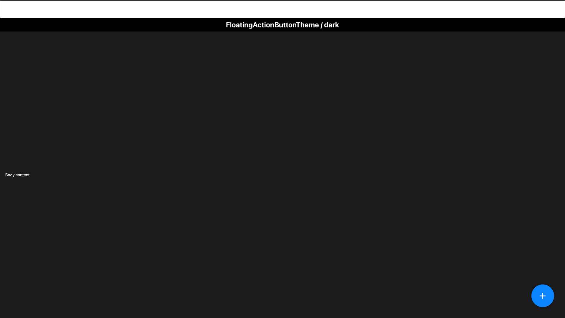
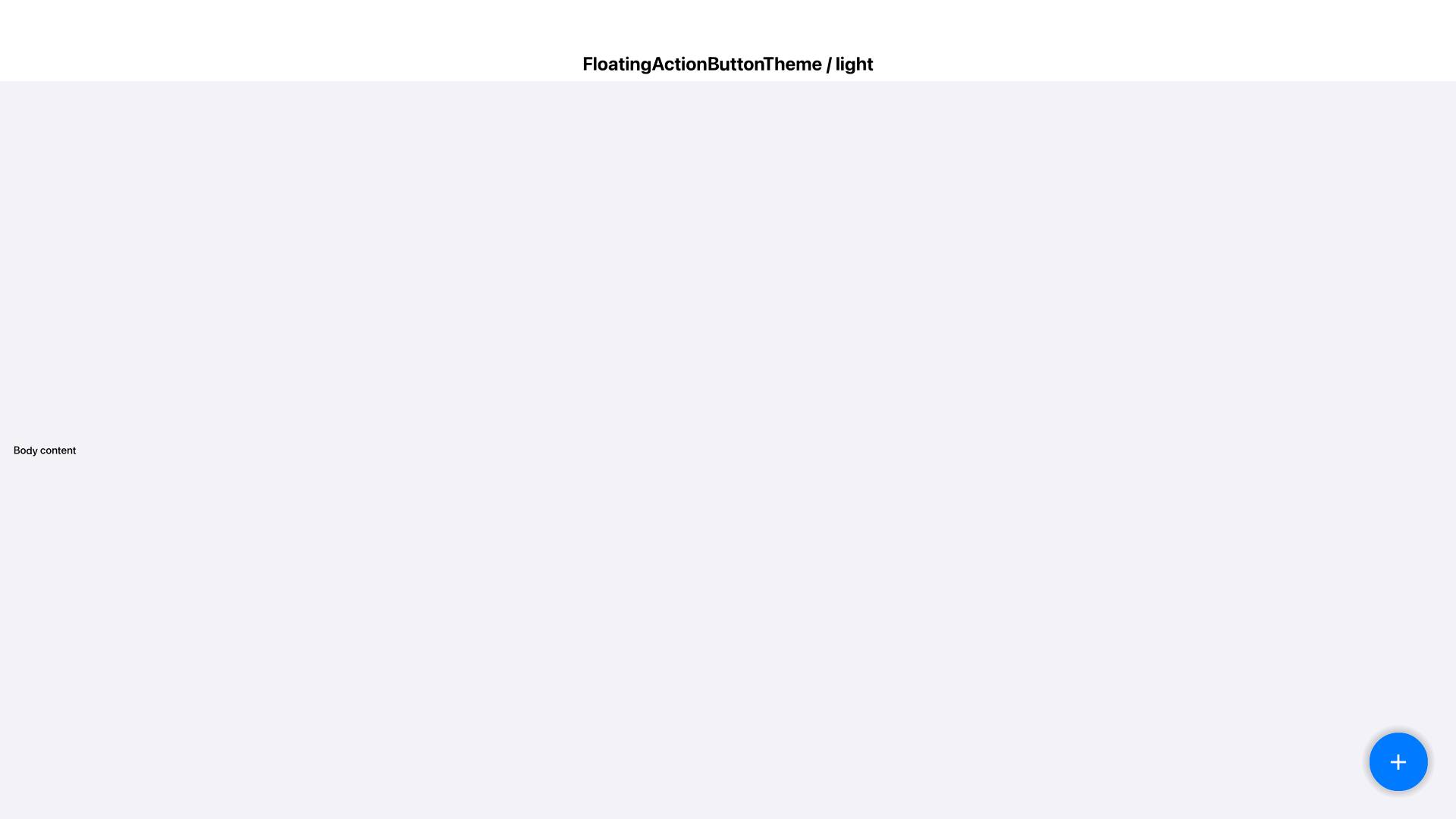
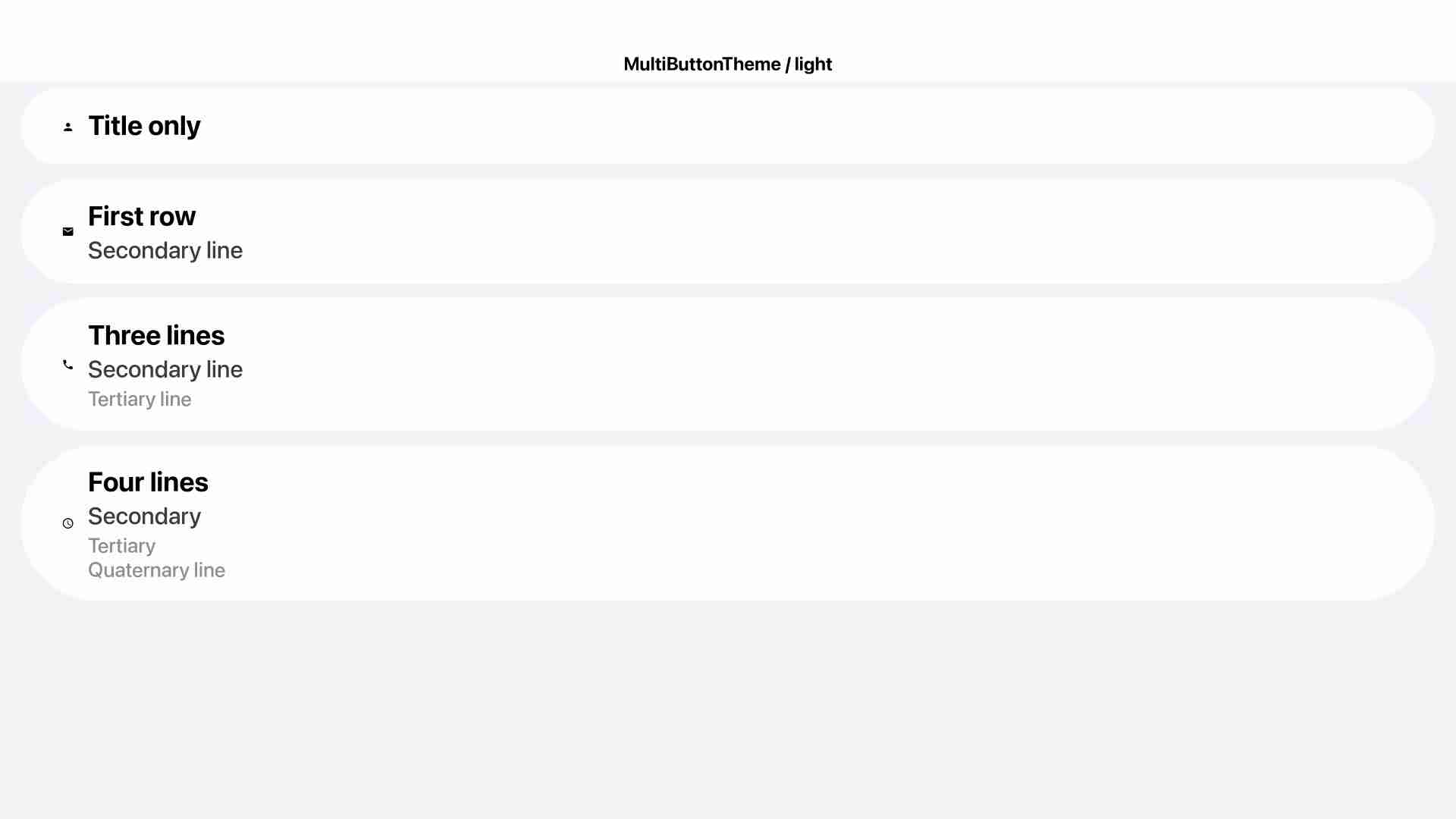
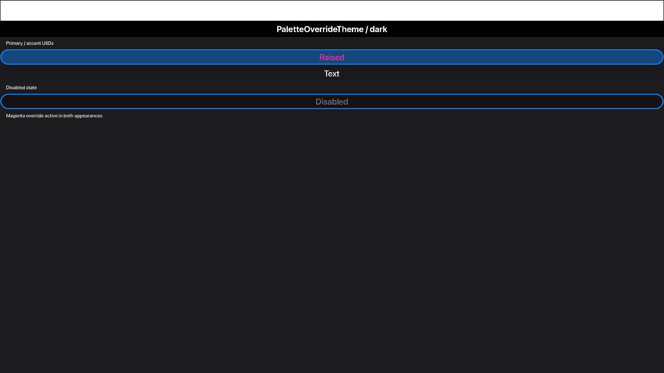
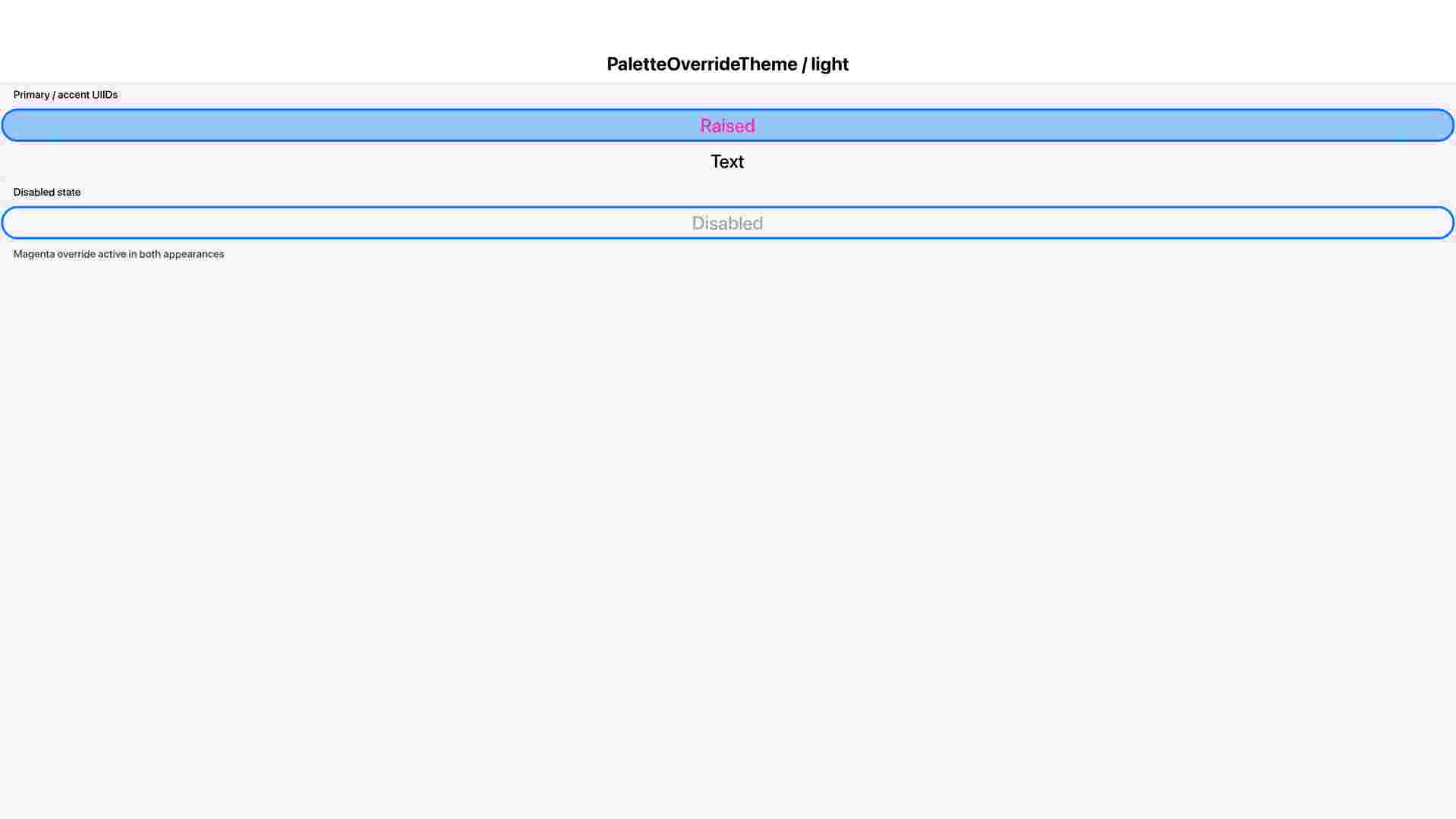
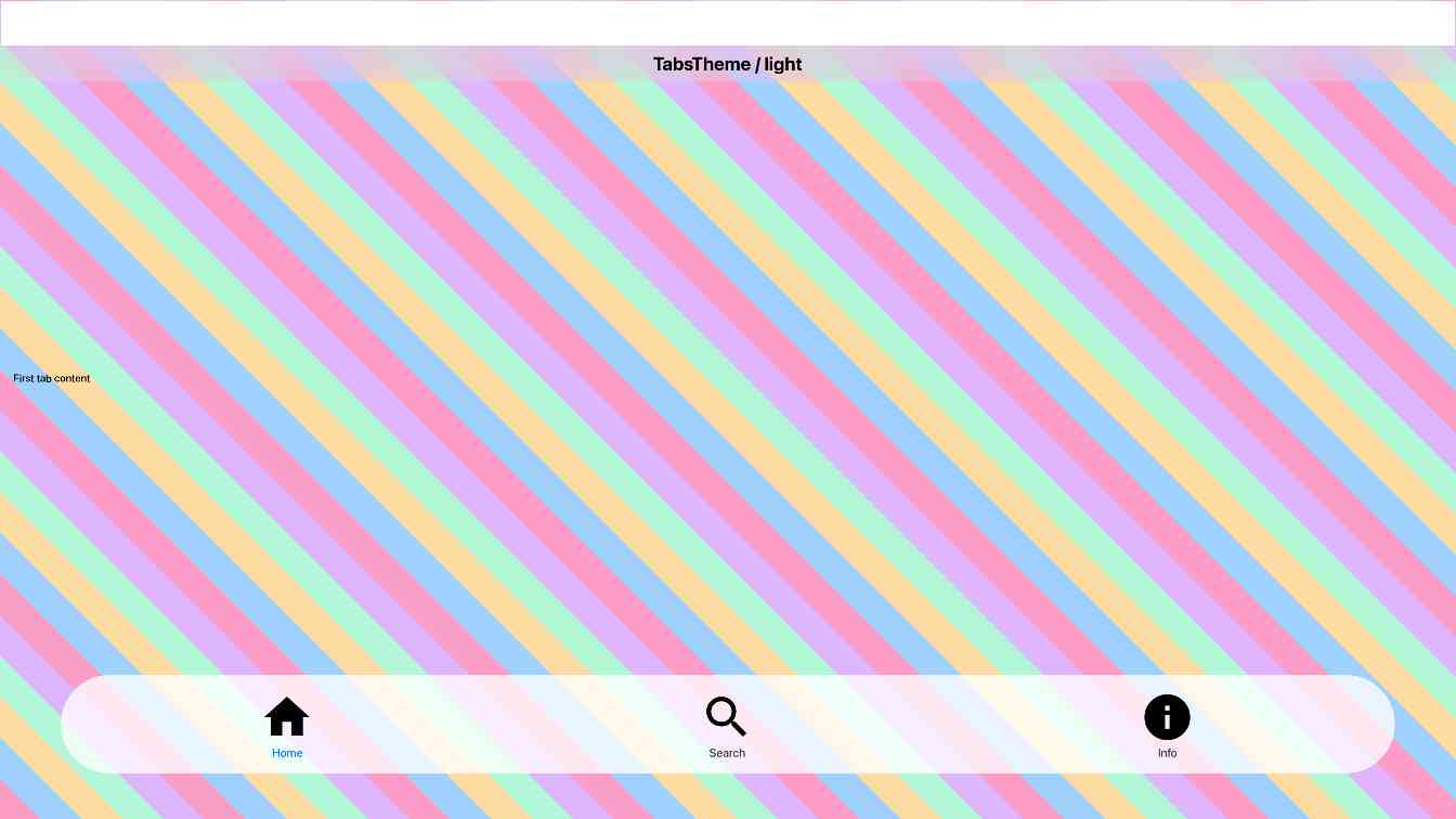
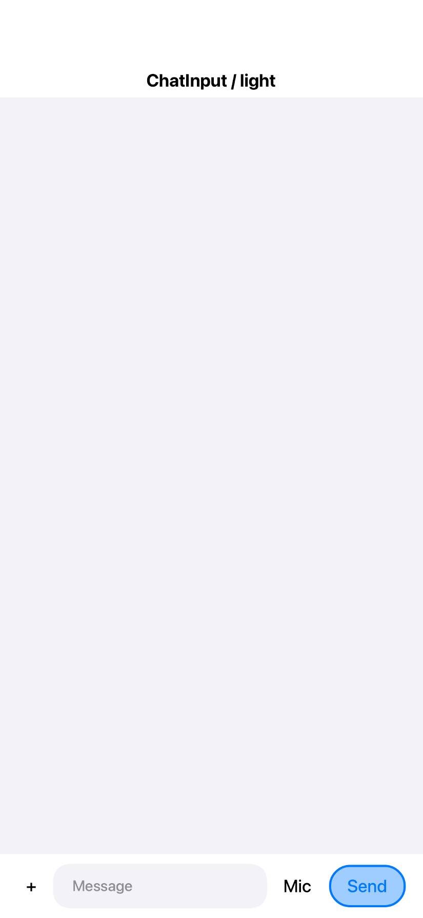
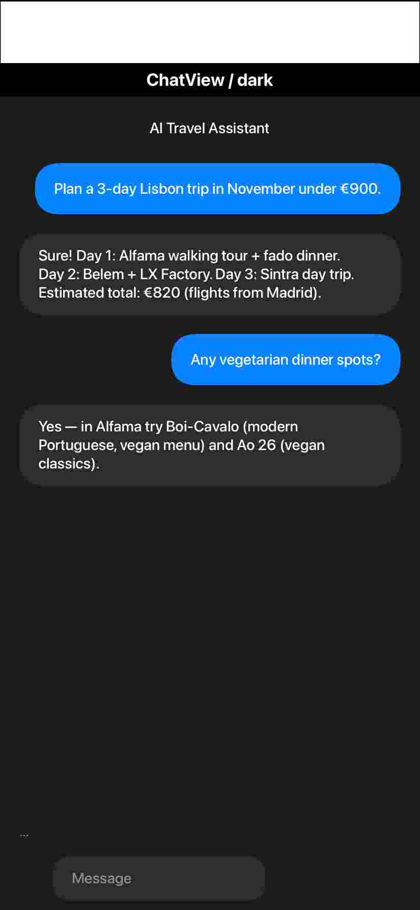
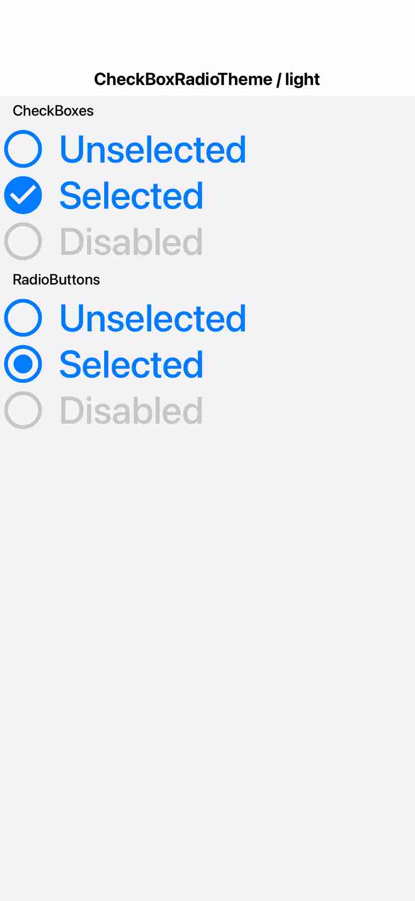
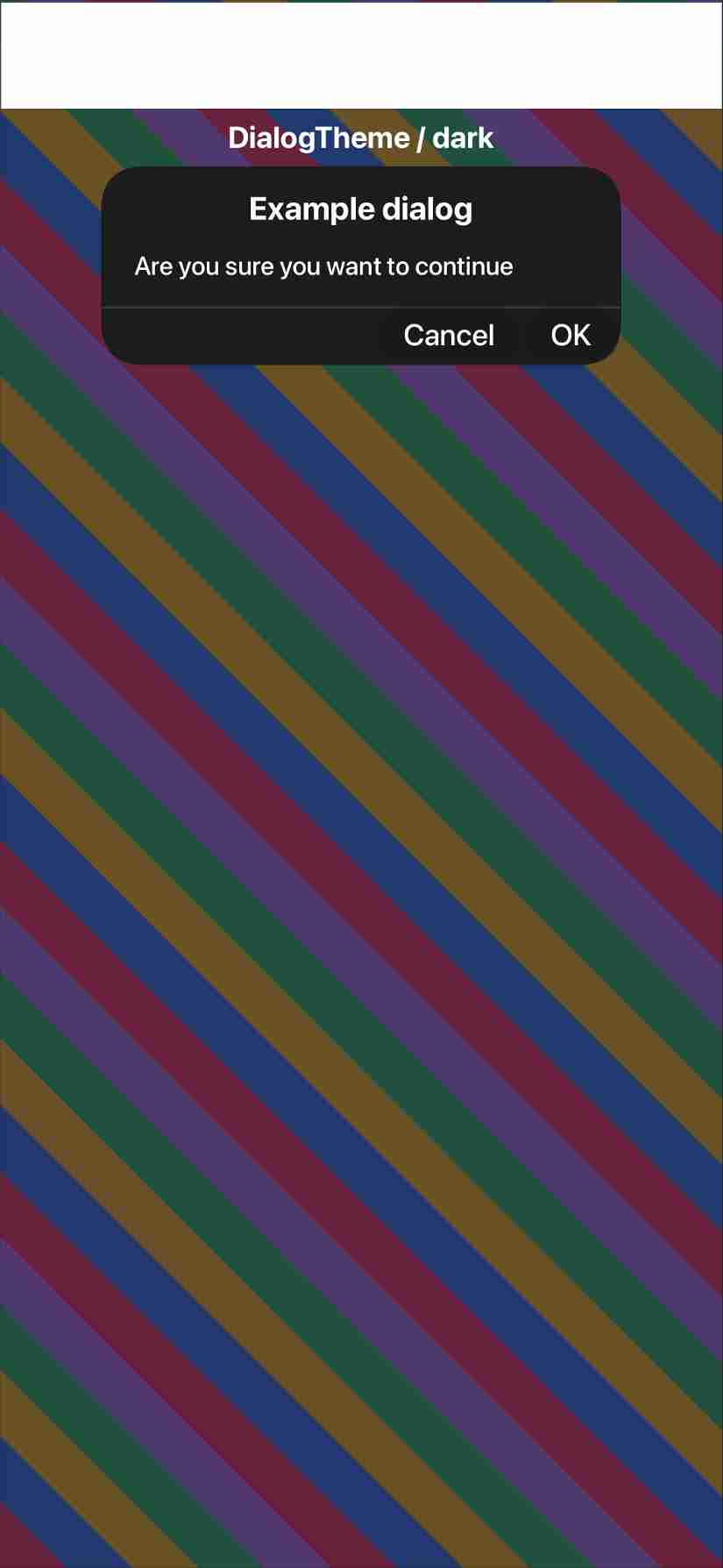
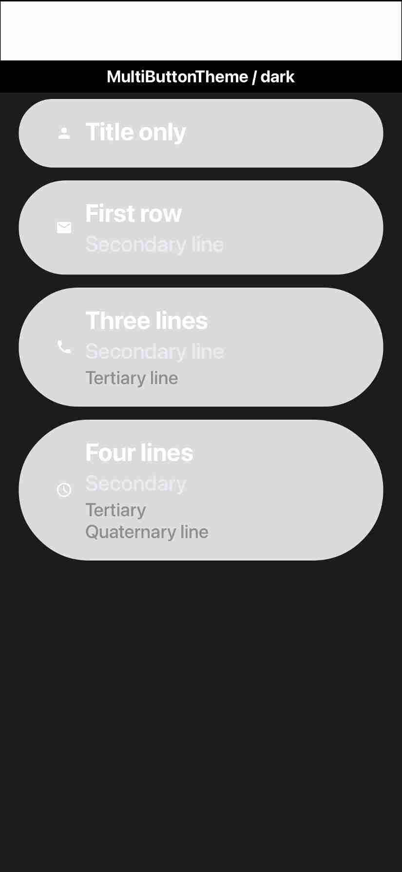
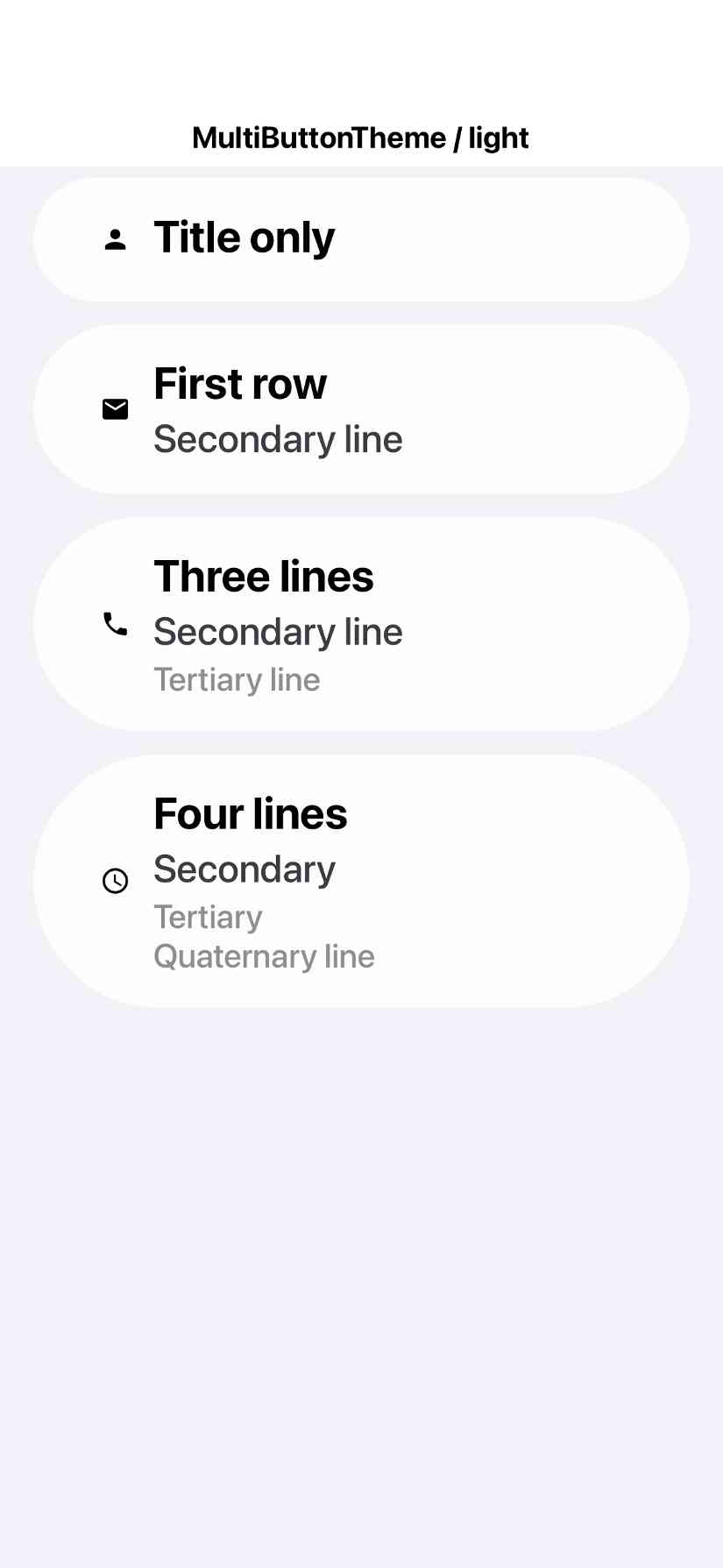
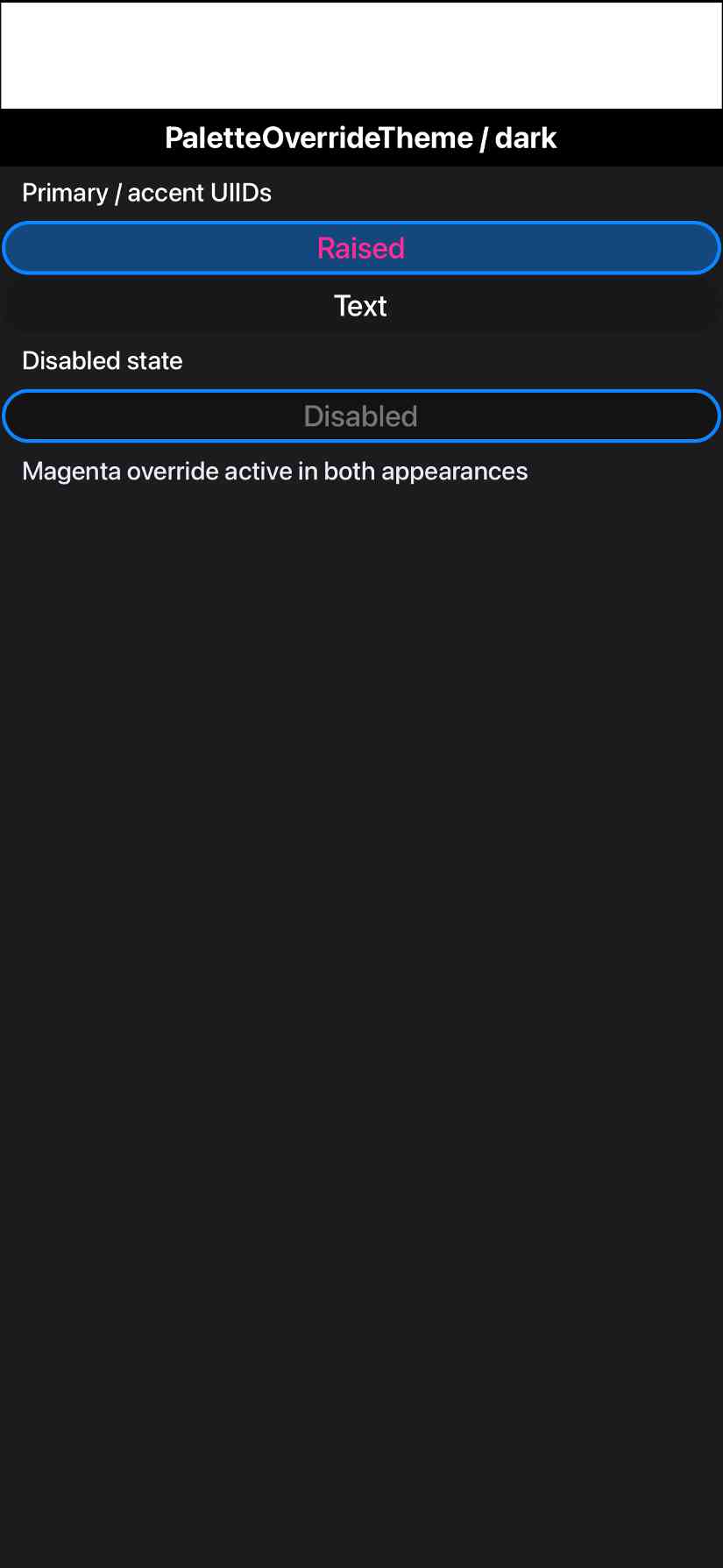
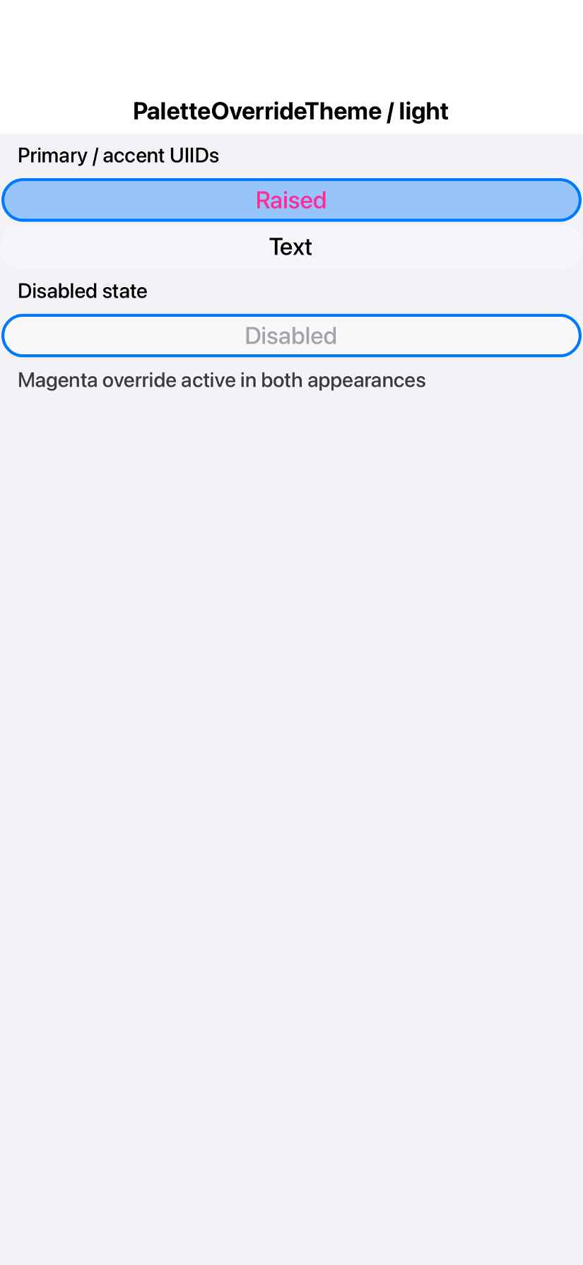
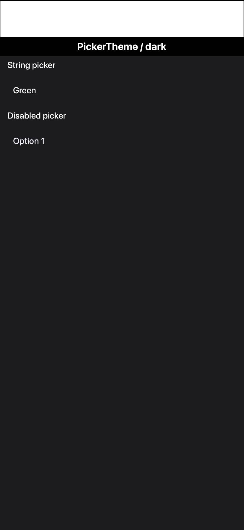
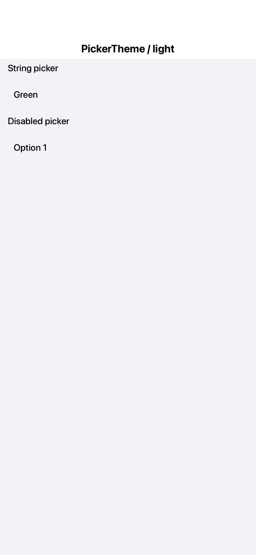
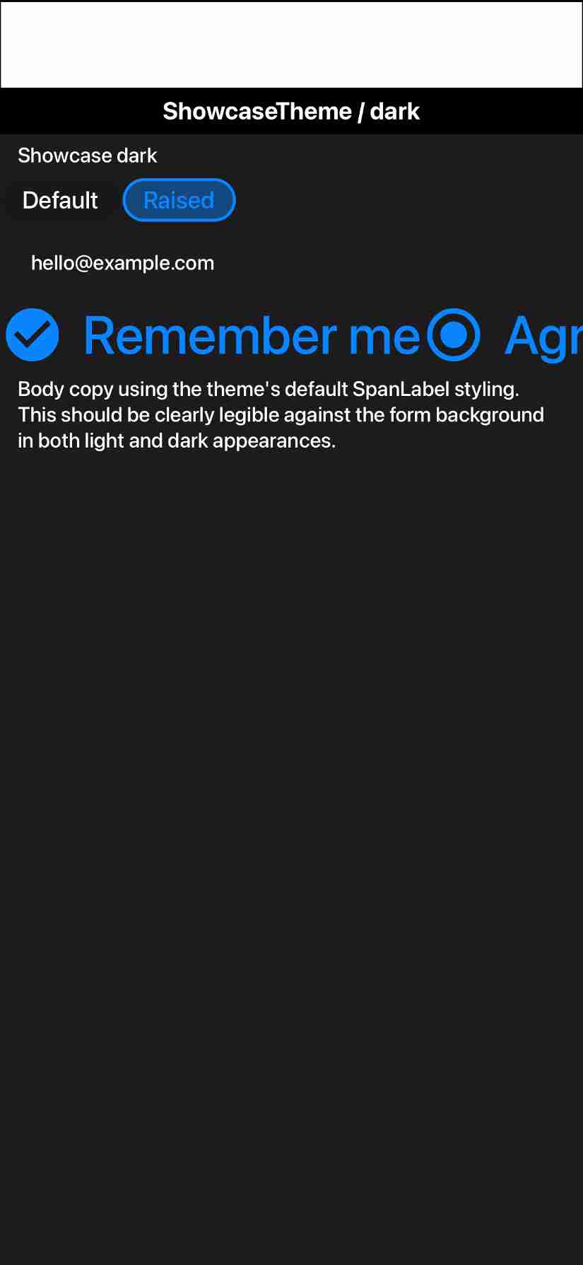
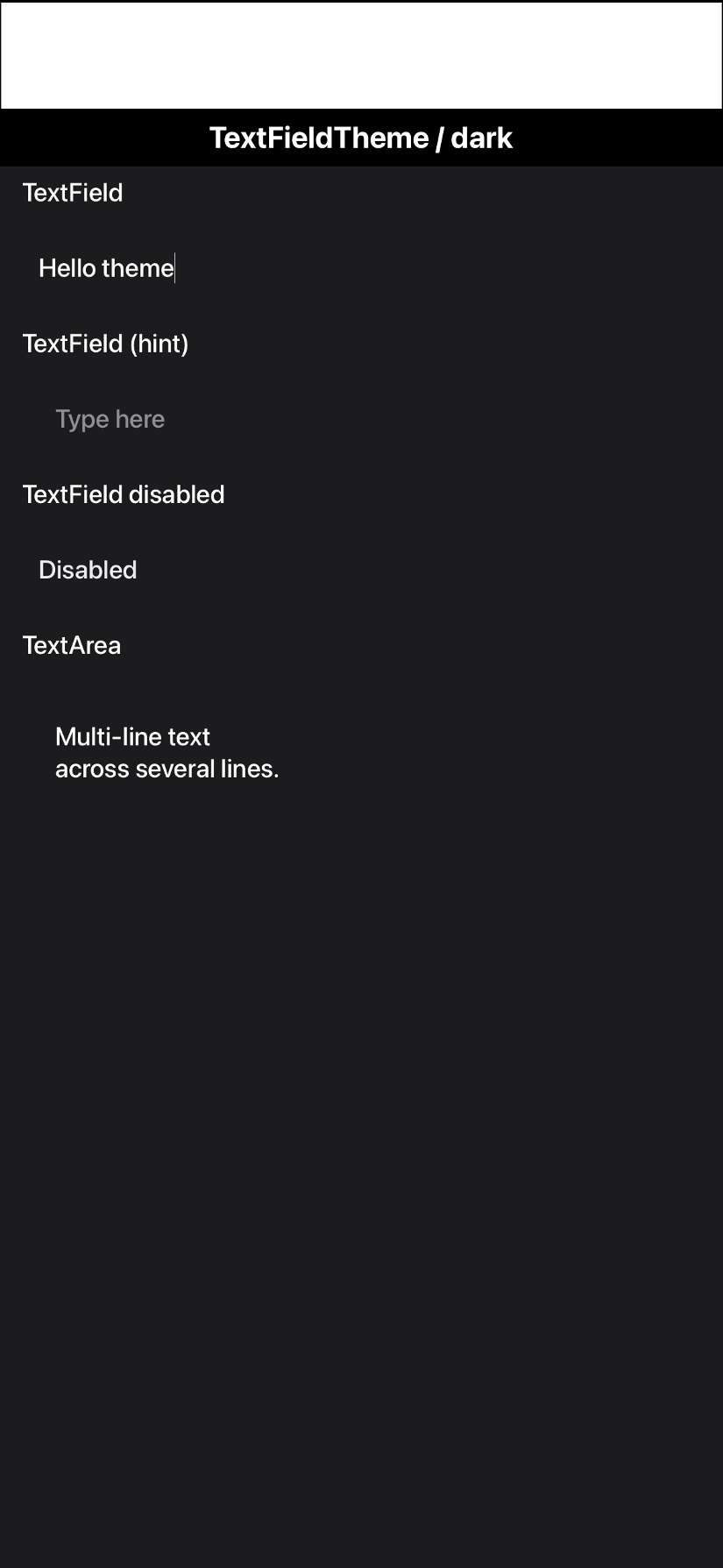
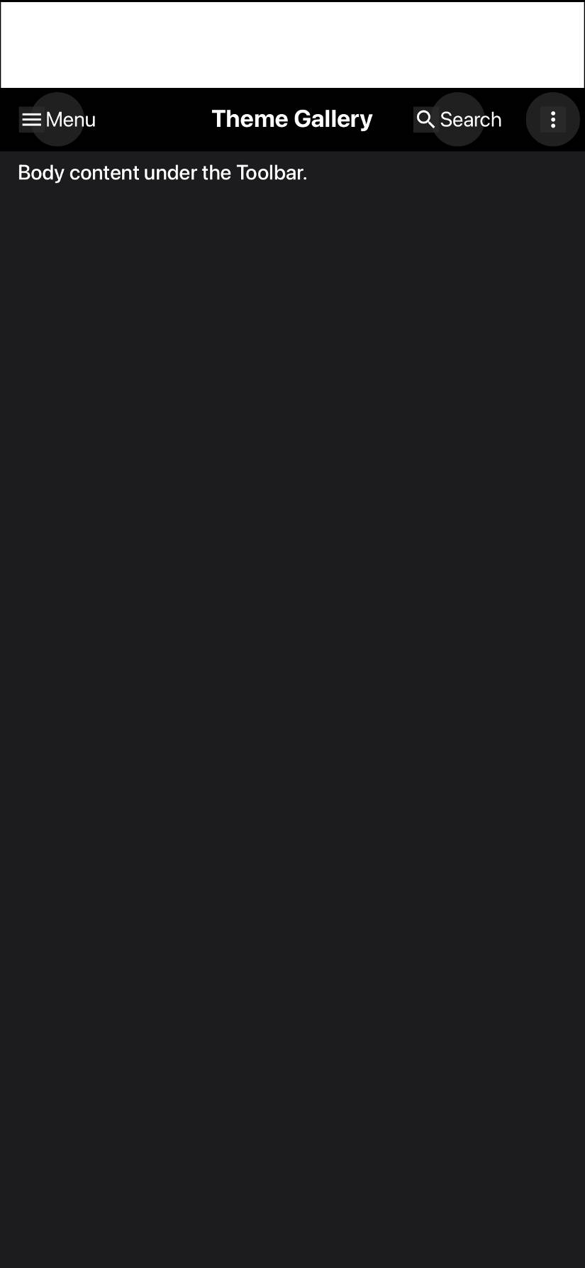
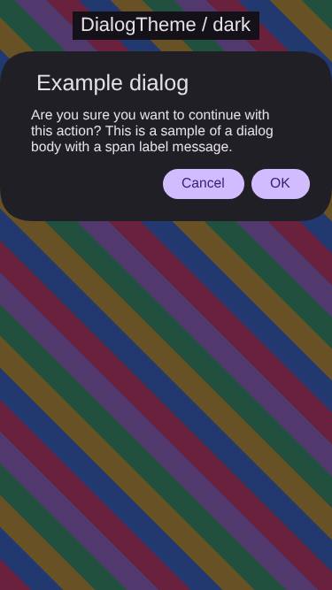
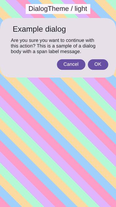
Native theme fidelity suite + Material 3 fidelity fixes#5274
Native theme fidelity suite + Material 3 fidelity fixes#5274shai-almog wants to merge 76 commits into
Conversation
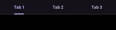
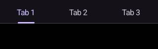
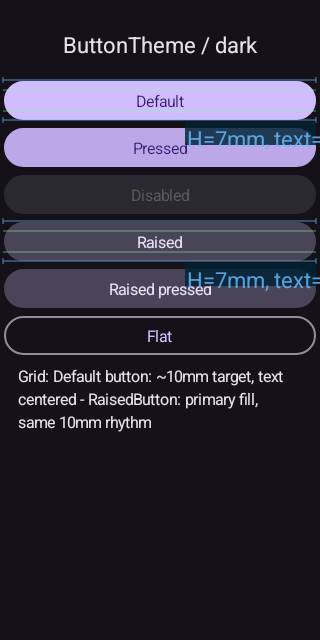
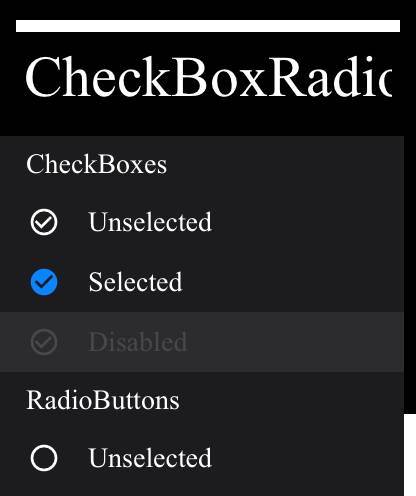
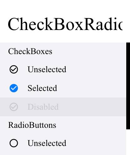
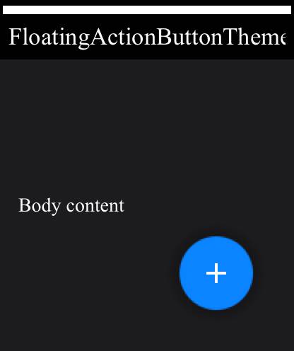
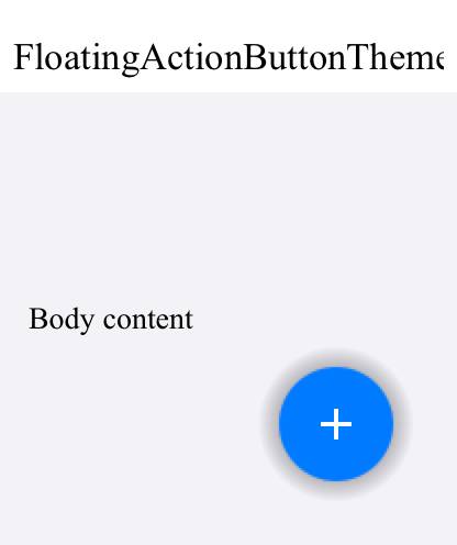
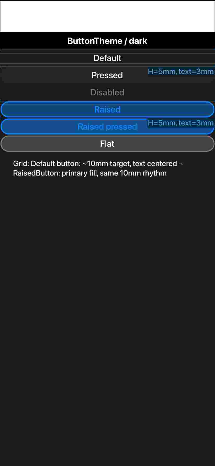
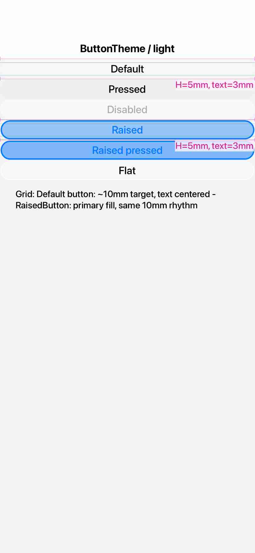
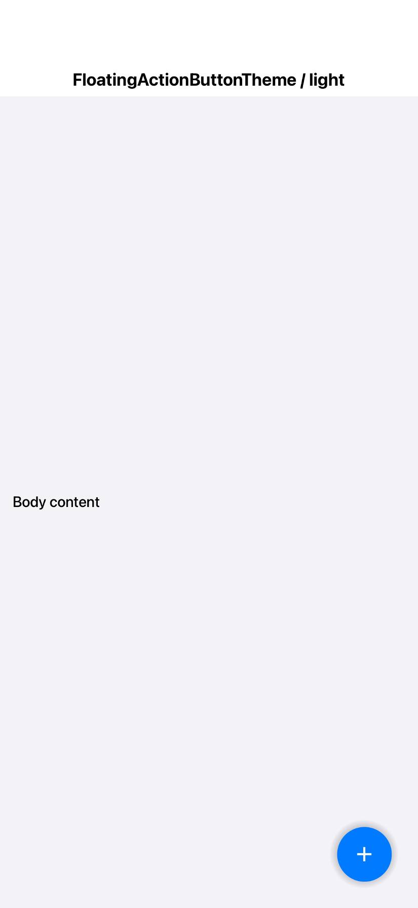
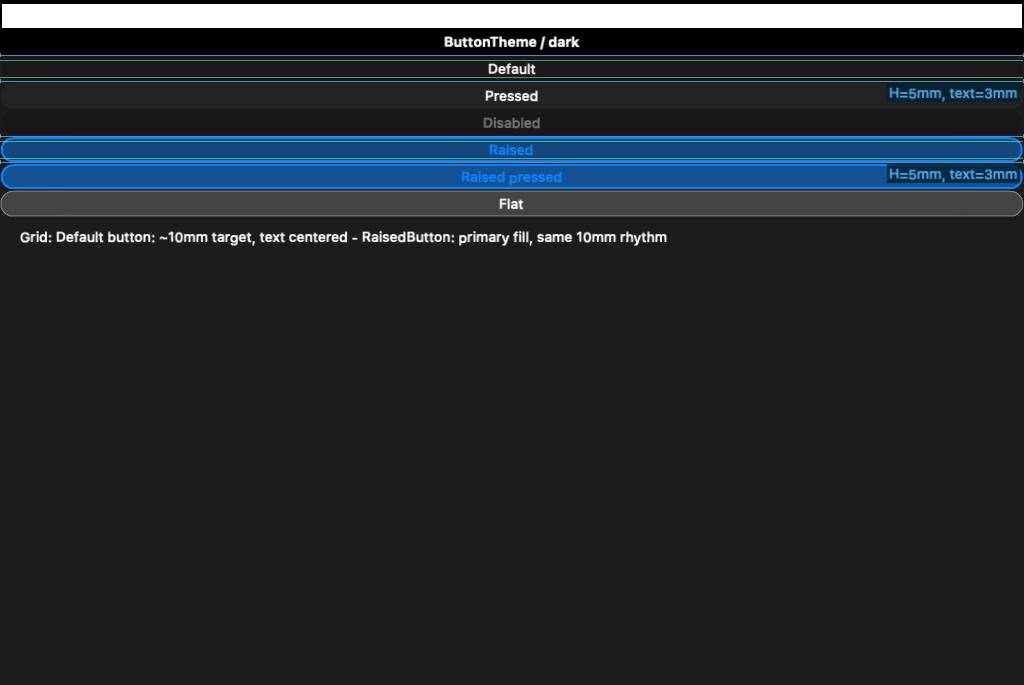
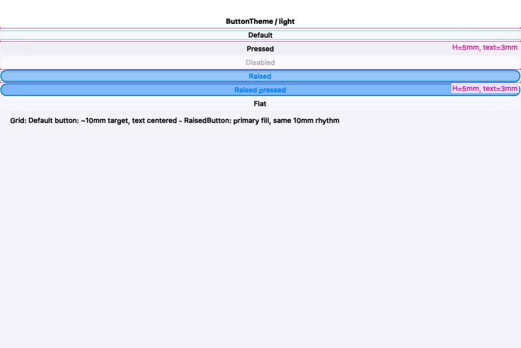
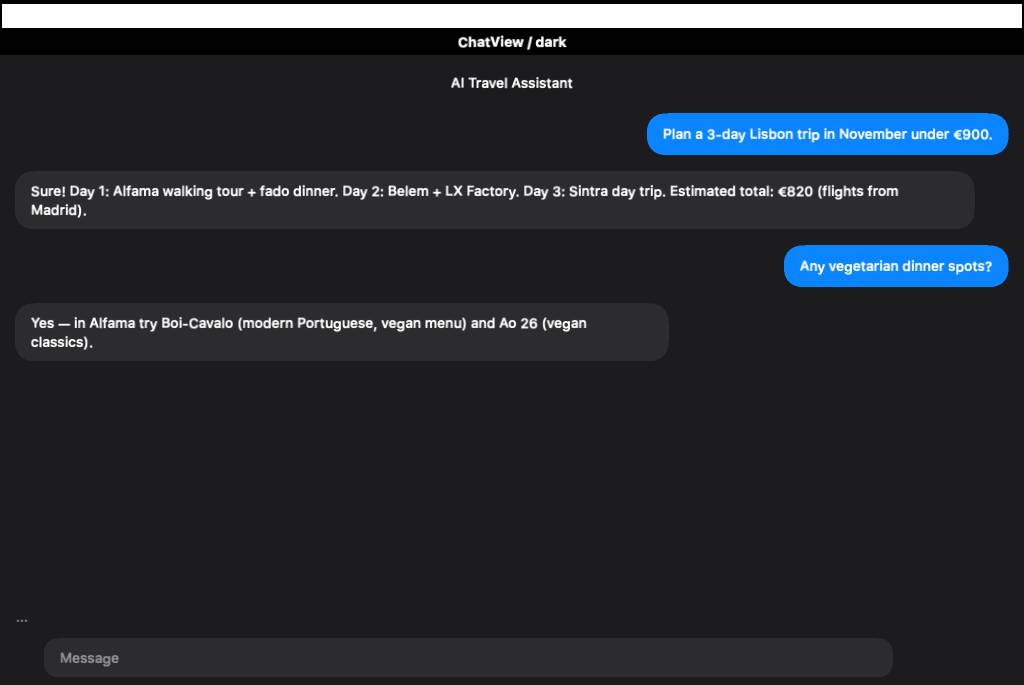
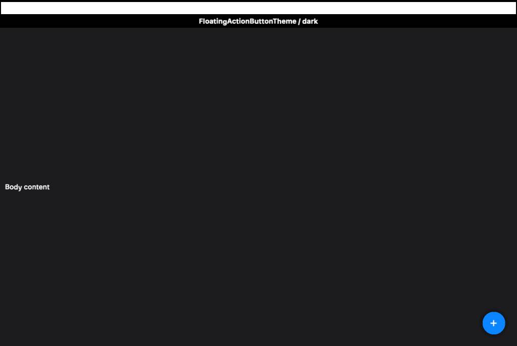
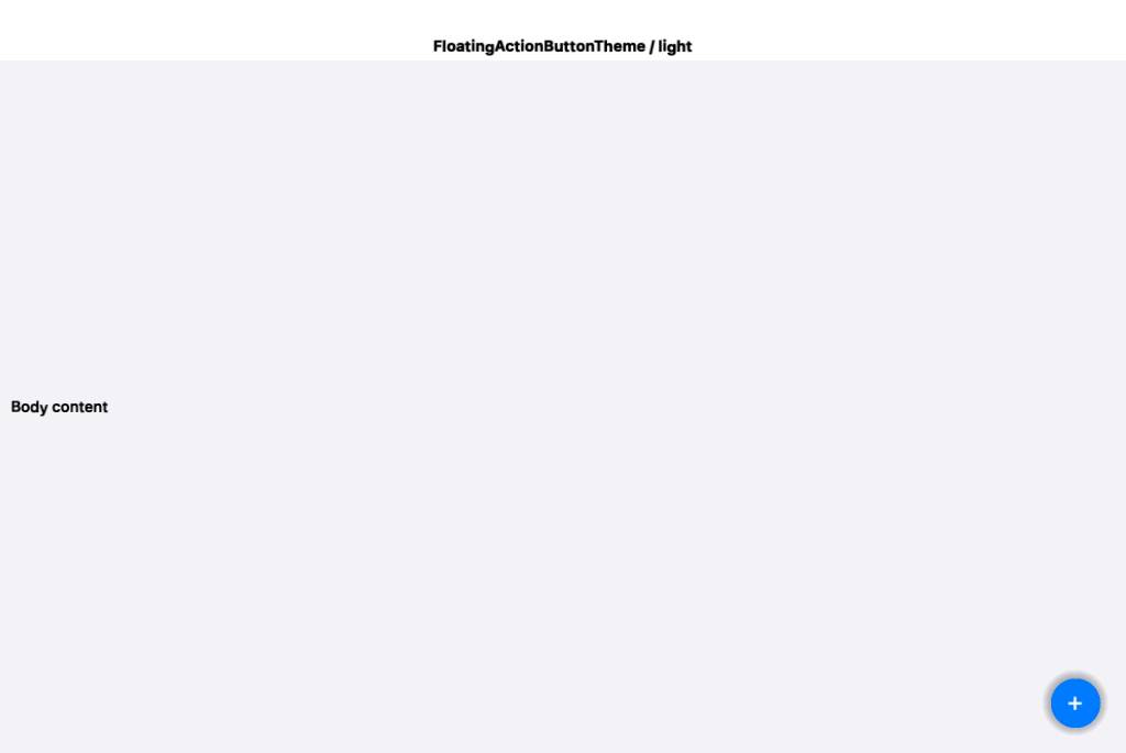
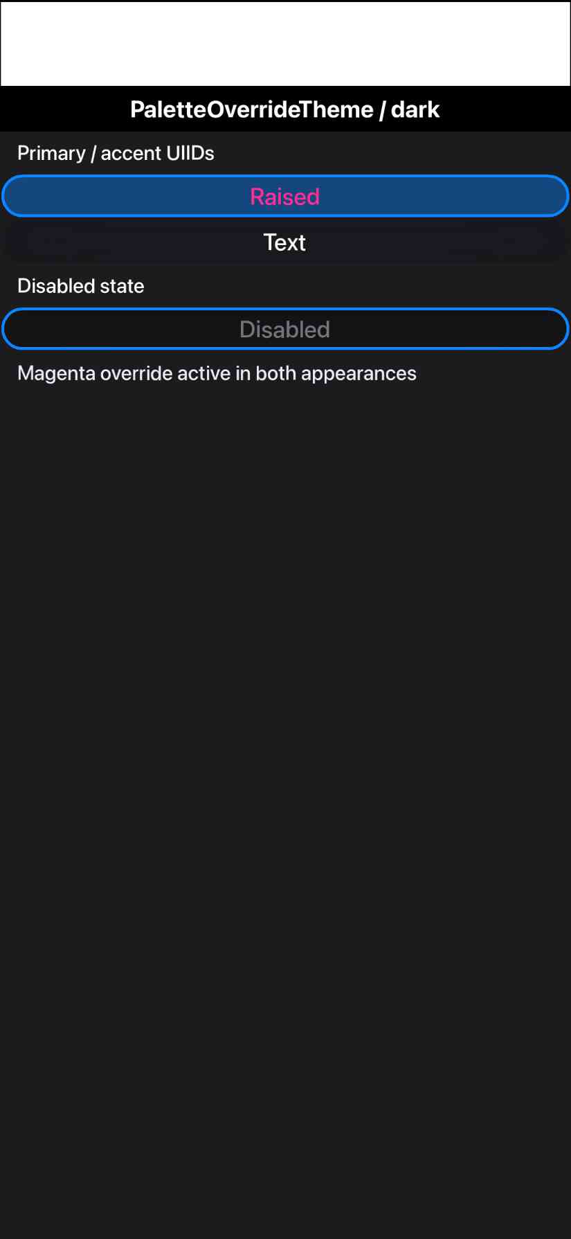
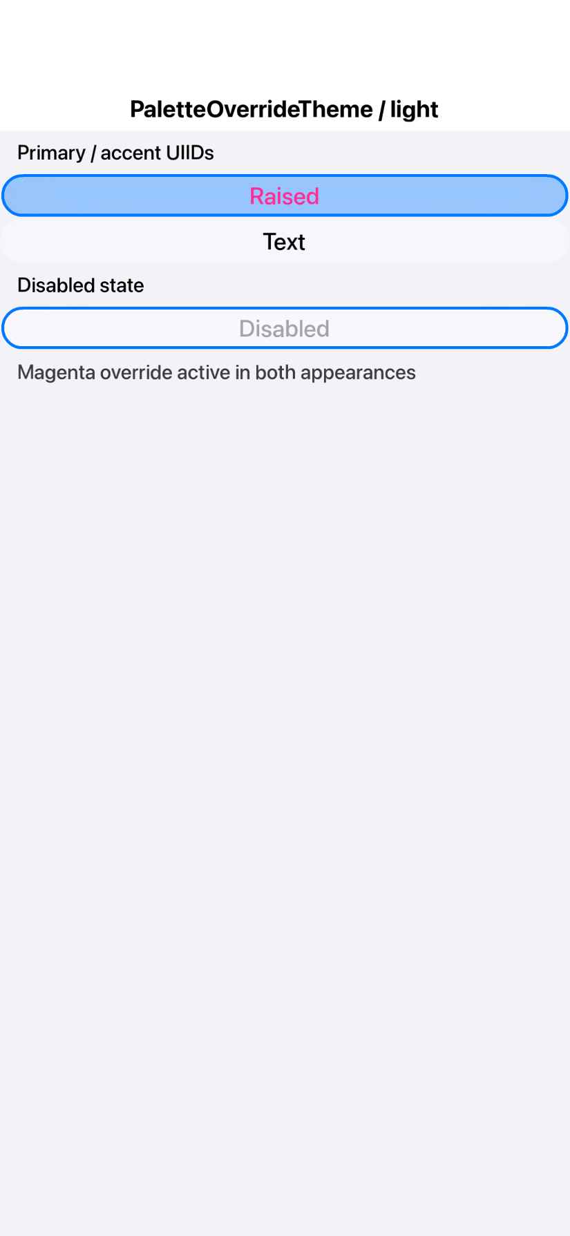
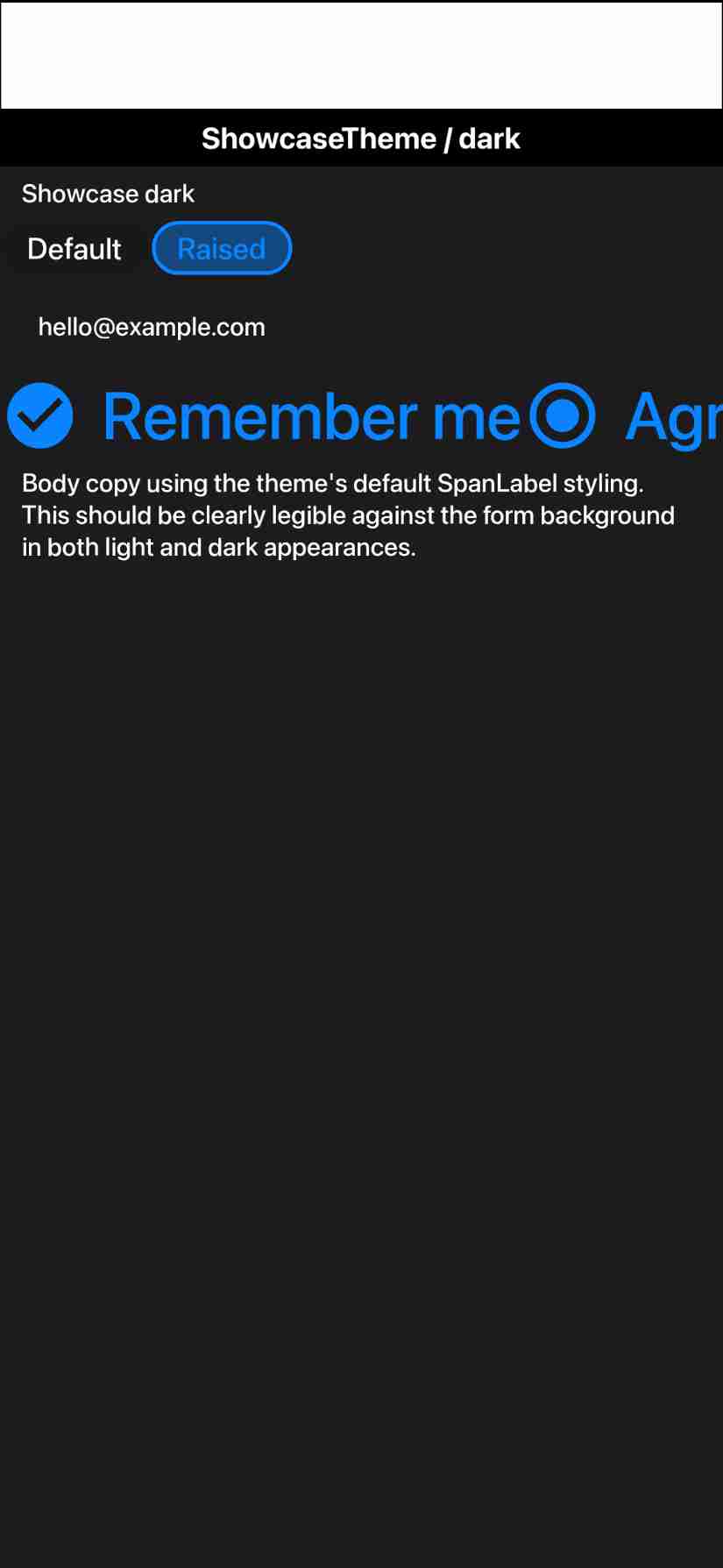
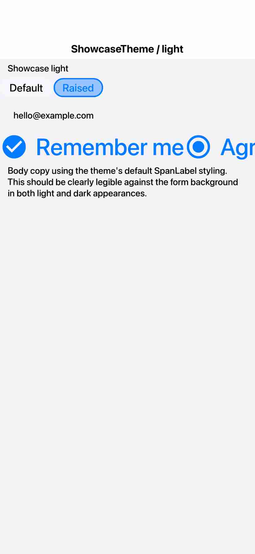
Adds a data-driven fidelity test suite (scripts/fidelity-app) that renders
each component under the native theme alongside the REAL native OS widget
(off-screen rasterized) and measures per-component visual fidelity, gated by
a one-way ratchet vs a committed baseline. Android round raises overall
Material 3 fidelity 94.9% -> 96.2% via real framework fixes (verified pixel
vs the native golden, no metric softening):

- FloatingActionButton: honor a fabDiameterMM theme constant for the Material
  56dp fixed diameter instead of the icon*11/4 (~71dp) heuristic. FAB 85->98.
- Tabs.paintAnimatedIndicator: read tabsAnimatedIndicatorThicknessMm as a
  float (an int read dropped "0.45" -> 2x-too-thick indicator).
- Tabs.paintBottomDivider: new opt-in (tabsBottomDividerBool) full-width M3
  divider painted directly (a border-bottom does not paint on the custom
  tab-row Container); colour from the TabsDivider UIID (light/dark aware).
- DefaultLookAndFeel: disabled-unchecked checkbox/radio box reads the
  *UncheckedColorUIID's own .disabled style, so the greyed box outline can
  differ from the darker disabled label text (Material renders them distinctly).

Theme (native-themes/android-material/theme.css) + recompiled shipped res.

Host tooling: ProcessScreenshots --mode fidelity, RenderFidelityReport,
FidelityGate (ratchet), cn1ss.sh helpers, run-*-fidelity-tests.sh, and the
scripts-fidelity GitHub workflow.

iOS round is blocked: rendering the native UIKit reference inside a ParparVM
native method NPEs whenever it does real UIKit work (a trivial stub delivers;
not a threading or marshaling fault). Documented in the iOS NativeWidgetFactory
impl; needs a ParparVM fix or a PeerComponent+screenshot redesign.

Co-Authored-By: Claude Opus 4.8 (1M context) <noreply@anthropic.com>
Co-Authored-By: Claude Opus 4.8 (1M context) <noreply@anthropic.com>
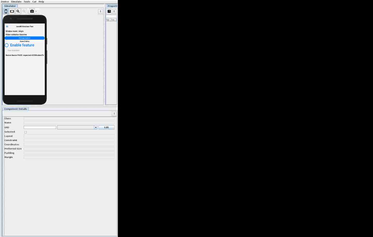
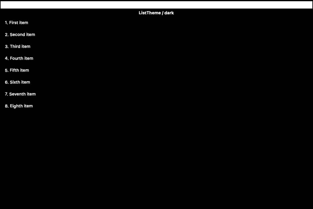
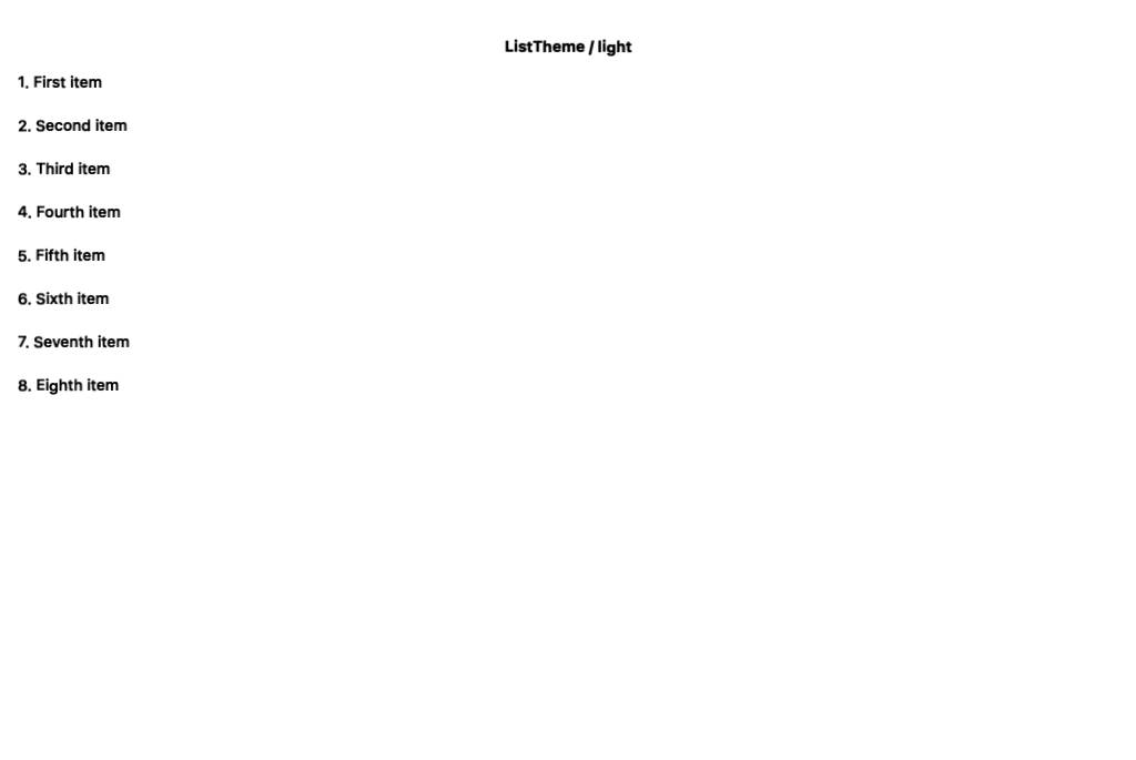
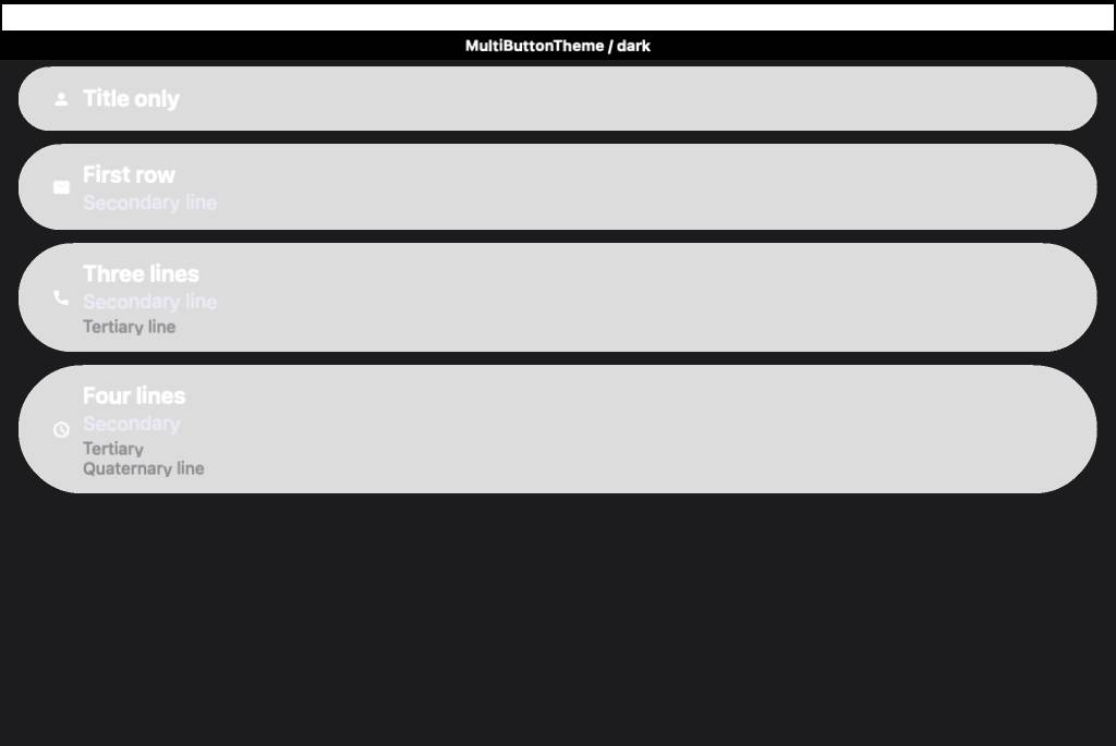
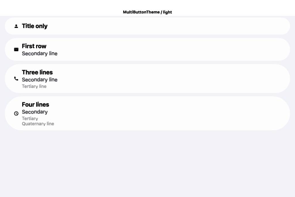
JavaSE simulator screenshot updatesCompared 11 screenshots: 10 matched, 1 updated.
|
Co-Authored-By: Claude Opus 4.8 (1M context) <noreply@anthropic.com>
Cloudflare Preview
|
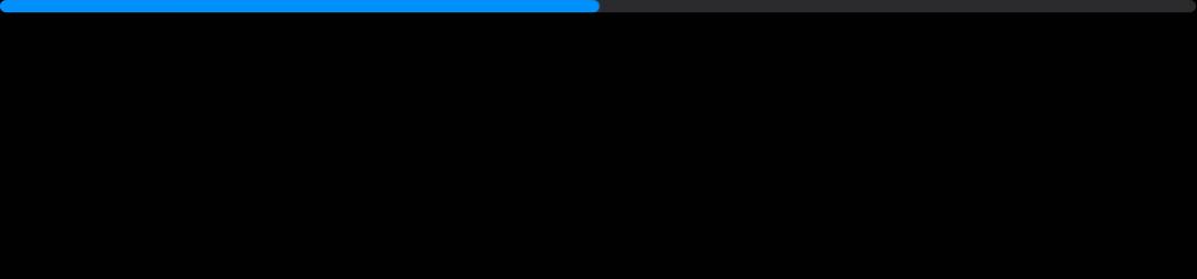
Native fidelity (Android, Material 3)48 pairs compared -- median 95.2%, worst 57.4% ( Distribution --
Side-by-side comparisons (worst first)
|


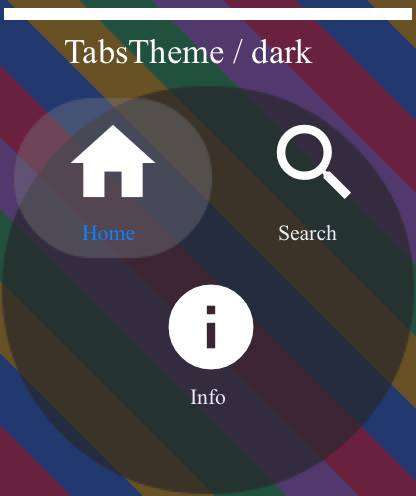
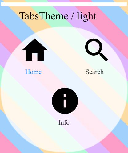
Android screenshot updatesCompared 139 screenshots: 135 matched, 4 updated.
Native Android coverage
Benchmark ResultsDetailed Performance Metrics
|
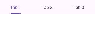
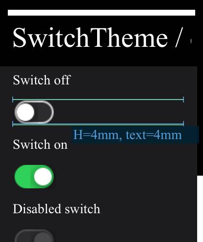
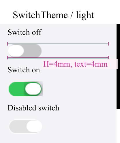
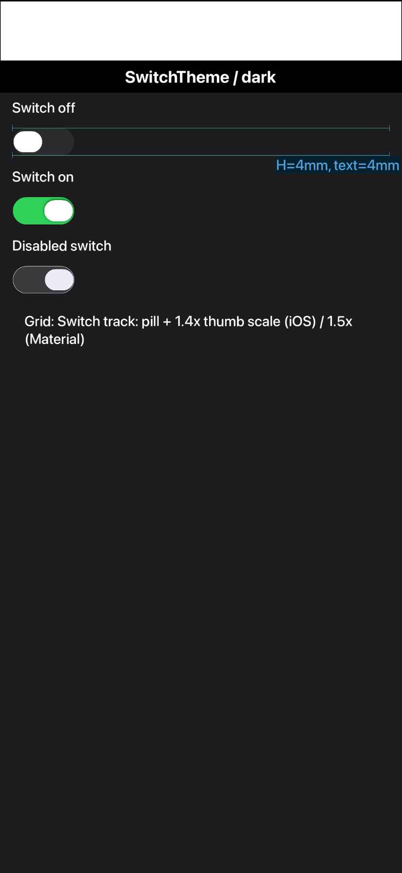
- Switch.java: replace a non-ASCII U+2248 with ~ (Android port javac uses
  US-ASCII encoding and failed on it).
- scripts/javase/screenshots: refresh the 7 simulator goldens that shifted with
  the framework/theme changes (rendered on CI Linux to match the test env).
- scripts-fidelity.yml: TEMPORARY seed -- run the Android fidelity suite with
  FIDELITY_UPDATE_GOLDENS=1 + FIDELITY_UPDATE_BASELINE=1 so the native goldens
  and baseline are regenerated on CI's emulator density (the committed ones were
  rendered on a different local emulator, so 50/54 pairs "could not be compared").
  Reverted in a follow-up once the CI-density artifacts are committed.

Co-Authored-By: Claude Opus 4.8 (1M context) <noreply@anthropic.com>
Apple Watch (watchOS / Core Graphics)Compared 214 screenshots: 182 matched, 32 updated.
|
The native goldens + ratchet baseline are now the ones the seed run regenerated
on CI's own emulator (e.g. Tabs 377x100 vs the local 1039x277), so the fidelity
gate compares like-for-like instead of failing 50/54 pairs on size mismatch.
Removes the temporary FIDELITY_UPDATE_* seed so the job is a real one-way ratchet
again. CI baseline overall fidelity: 96.2%.

Co-Authored-By: Claude Opus 4.8 (1M context) <noreply@anthropic.com>
Apple TV (tvOS / Metal)Compared 138 screenshots: 105 matched, 33 updated.
|
iOS screenshot updatesCompared 136 screenshots: 103 matched, 33 updated.
Benchmark Results
Build and Run Timing
Detailed Performance Metrics
|


JavaScript port screenshot updatesCompared 133 screenshots: 131 matched, 2 updated.
|
Mac native screenshot updatesCompared 139 screenshots: 107 matched, 32 updated.
Benchmark Results
Detailed Performance Metrics
|
iOS fidelity native references now render (48 delivered, was 0). The earlier
"ParparVM can't render UIKit in a native method" conclusion was wrong: it was
three mundane MRC (non-ARC) memory bugs in NativeWidgetFactoryImpl.m --

1. knownKind: cached an AUTORELEASED +[NSSet setWithObjects:] in a static, which
   dangled once the autorelease pool drained between native calls; the 2nd call
   derefed freed memory. ParparVM turns that EXC_BAD_ACCESS into a bogus Java NPE
   (which read as "buildAndRender NPEs"). Fixed: -[alloc initWithObjects:] (+1).
2. The rendered NSData was autoreleased and built on the main queue (UIKit layout
   -- e.g. SF-Symbol buttons -- hangs off-main, so the build is dispatch_sync'd to
   main); when dispatch_sync returned, main's pool drained and freed it before the
   EDT's writeToFile. Fixed: -retain it across the boundary, -release after.
3. (UIKit build moved to the main thread to avoid the off-main layout hang.)

Report (RenderFidelityReport): lead with median / worst-pair / 25th-percentile /
distribution buckets instead of a single misleading mean; add a per-pair
percentage table (Fidelity, SSIM, mean-delta, delta-vs-baseline) sorted worst
first; list unscored pairs explicitly; render the side-by-side cards for every
pair worst-first.

Workflow: drop continue-on-error on the iOS job (no longer a blocker); reseed
per-environment goldens (FIDELITY_UPDATE_GOLDENS) while the committed baseline
remains the portable ratchet floor.

Co-Authored-By: Claude Opus 4.8 (1M context) <noreply@anthropic.com>
… app

The off-screen UIKit factory render was bunk: it rasterized DETACHED widgets at
scale=1.0, so a 30pt button was 30px inside a 1087px tile (tiny, wrong size), and
UINavigationBar/UITabBar rendered blank without a window. Replaced it for iOS with
the approach Shai asked for:

- scripts/fidelity-app/ios-native-ref/NativeRef.swift: a standalone native iOS app
  that lays each reference UIKit widget out in a REAL UIWindow and captures it with
  drawHierarchy(afterScreenUpdates:) -- so nav/tab bars render correctly -- at CN1's
  pixel density (so the PNG overlays the CN1 render 1:1, no scaling). Built directly
  with swiftc (no Xcode project) by scripts/build-ios-native-ref.sh, which runs it on
  the simulator and copies the PNGs into the committed iOS goldens.
- run-ios-fidelity-tests.sh: iOS now compares the CN1 render against these COMMITTED
  goldens (generated offline, not same-run) instead of the broken factory native.
- ProcessScreenshots: tolerate a few px of cross-environment rounding (golden 1088 vs
  CN1 1087) by cropping both to their common top-left region before diffing -- a true
  1:1 overlay, never a scale.

Result: all 50 iOS pairs now compare against real, correctly-sized native widgets
(Toolbar was 0% blank -> a real centred-vs-left-aligned title diff). Seeded the iOS
ratchet baseline (mean 62.3%); the low scores are the genuine untuned-iOSModern-theme
gaps to drive up next.

Co-Authored-By: Claude Opus 4.8 (1M context) <noreply@anthropic.com>
iOS Metal screenshot updatesCompared 140 screenshots: 107 matched, 33 updated.
Benchmark Results
Build and Run Timing
Detailed Performance Metrics
|


The native and CN1 tiles both anchor the widget top-left, but their pixel sizes
can diverge -- a few px of cross-environment rounding (iOS offline goldens), or a
larger native-vs-CN1 tile-geometry gap that flakes between Android emulator runs
(e.g. CN1 320 vs native 377). Failing those as "size_mismatch" broke the gate.
Now both are cropped to their common top-left region and overlaid 1:1 (never a
scale); the structural metric still crops to each widget's content bbox, so an
honest extent difference scores lower rather than erroring. Only a degenerate
overlap (<8px) is an error.

TEMPORARY: FIDELITY_UPDATE_BASELINE=1 on both run steps to reseed the ratchet
baselines on CI under the new comparison (reverted once the baselines are
committed).

Co-Authored-By: Claude Opus 4.8 (1M context) <noreply@anthropic.com>
The old score was the mean colour agreement over all widget-content pixels, so a
large flat region that happened to match -- e.g. a dark nav-bar fill against a
dark tile -- could carry the score into the high 80s even when the actual widget
(the title) was centred in one render and left-aligned at a totally different
font size in the other. "Mostly got points for being black."

Now fidelity = min(fillSim, structSim):
  - fillSim   = mean colour agreement over content pixels (the old term; catches
                wrong fill colours).
  - structSim = the same agreement WEIGHTED BY local-gradient salience SQUARED, so
                flat fills count for ~nothing and the strongest edges -- glyph
                strokes, crisp outlines, separators -- dominate. A mis-placed or
                mis-sized title lands its strokes on the other render's flat fill,
                collapsing this term.
A widget must now agree in BOTH fill AND structure/placement. Effect on the iOS
Toolbar that triggered this: 89.3% -> ~59% (dark) / 36% (light), matching the
independent SSIM (~56%), while genuinely-similar widgets (an off switch, disabled
buttons) stay in the mid-80s. This is stricter for Android too; the CI seed run
reseeds both ratchet baselines under it.

Co-Authored-By: Claude Opus 4.8 (1M context) <noreply@anthropic.com>
Per Shai's note that the native toolbar/widgets weren't using the modern look,
the native-reference app now uses the iOS 26 Liquid Glass options:
- buttons: UIButton.Configuration.glass() (tinted action), prominentGlass()
  (filled/CTA -> a real glass capsule), clearGlass() (borderless text button).
- UINavigationBar / UITabBar: standard + scrollEdge appearances configured with
  configureWithDefaultBackground() = the glass material, not the legacy opaque
  fill.
Regenerated the committed iOS goldens. (The glass translucency reads subtly over
the flat reference tile -- its blur only develops over scene content, which we do
not put behind the widget so the diff stays widget-vs-widget -- but the modern
configurations/appearances are now what the reference uses.)

Co-Authored-By: Claude Opus 4.8 (1M context) <noreply@anthropic.com>
Liquid Glass only reveals itself over content behind it, so the glass widgets
(buttons, nav/tab bars) are now rendered over a single committed backdrop --
glass-backdrop.png, a simple smooth diagonal gradient. The SAME PNG is used by
both sides (the native NativeRef app bundles it; the CN1 FidelityDeviceRunner
loads it as the tile background for the glass component ids on iOS), so the only
difference left between the two renders is the glass itself, not the background.

A smooth gradient (no hard edges) is deliberate: it makes the frosted glass
clearly visible while adding almost no gradient "structure", so the
salience-weighted metric keeps scoring the widget difference rather than being
inflated by a matching backdrop. Non-glass widgets and all of Android stay on the
plain tile.

Regenerated the iOS goldens; the CI iOS run reseeds the baseline against them.

Co-Authored-By: Claude Opus 4.8 (1M context) <noreply@anthropic.com>
…; Material 1.13.0

- Regenerate iOS native references on iOS 26 (real Liquid Glass), force 8-bit PNGs
- Slider.paintNativeSlider: iOS continuous-track + soft drop-shadow capsule thumb
- Toolbar circular glass commands, Tabs glass pill, dark-mode glass translucency, disabled fixes
- Honest geometric-mean fidelity metric (fillSim x ssim)
- Bump Android Material 1.12.0 -> 1.13.0

Co-Authored-By: Claude Opus 4.8 (1M context) <noreply@anthropic.com>
…lider/tabs tuning

iOS: bigger toolbar glass circles + white dark glyphs; Button/RaisedButton cn1-pill;
checkbox unchecked plain circle; tabs centered + smaller icons + subtler dark selection;
switch thumb fills track (no ring); slider taller + narrower thumb + disabled translucency;
progressbar 2x height. Android: Material 1.13.0; switch off-thumb x inset; disabled-dark
button translucency; native pressed-state hotspot/state fix. Reseed iOS baseline (iOS 26).

Co-Authored-By: Claude Opus 4.8 (1M context) <noreply@anthropic.com>
…1.13 needs AGP 8.1.1+); refresh JS+JavaSE theme goldens

- scripts-fidelity.yml iOS build: ARCHS=arm64 (x86_64 sim slice fails ParparVM SIMD neon module)
- Material 1.13.0 pulls dynamicanimation:1.1.0 requiring AGP 8.1.1; current build pins 8.1.0 -> revert to 1.12.0 (latest M3 the pipeline supports)
- Refresh 32 JS theme screenshot goldens + JavaSE ios-modern render for the theme changes

Co-Authored-By: Claude Opus 4.8 (1M context) <noreply@anthropic.com>
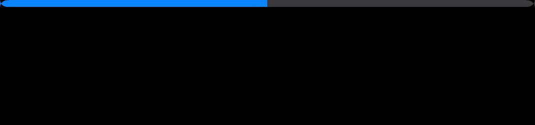
Native fidelity (iOS Modern, Metal)62 pairs compared -- median 92.8%, worst 72.4% ( Distribution --
16 pair(s) not scored:
Side-by-side comparisons (worst first)
|


…line)

Co-Authored-By: Claude Opus 4.8 (1M context) <noreply@anthropic.com>
…pties; drop redundant FQN

The quality gate scans whole files the PR touches, surfacing the fidelity work's
intentional catch-and-default blocks. Enable EmptyCatchBlock allowCommentedBlocks
(its intended escape hatch), comment the bare catches, and shorten an unnecessary
com.codename1.ui.Font FQN in UIManager.

Co-Authored-By: Claude Opus 4.8 (1M context) <noreply@anthropic.com>
✅ Continuous Quality ReportTest & Coverage
Static Analysis
Generated automatically by the PR CI workflow. |
… changes

Co-Authored-By: Claude Opus 4.8 (1M context) <noreply@anthropic.com>
…absGeom)

The single saturated-gradient glass backdrop made it impossible to separate tab
GEOMETRY from the glass BLEND -- tuning one broke the read on the other. Add
per-spec backdrops (solid hex / blue-green gradient / photo) and two isolation
tests so each concern is measured alone:
- GlassPanel{Grey,Red,Grad,Photo}: a bare glass rectangle (UIVisualEffectView /
  UIGlassEffect native vs a GlassPanel-UIID container in CN1) over four
  backgrounds, isolating the glass blend across solid/gradient/photo.
- TabsGeom: the tab bar over a flat grey backdrop so the glass is a uniform tint
  and only the tab GEOMETRY differs (86% vs the glass-confounded ~77%).

Wiring: backdrop key in fidelity-tests.yaml + FidelitySpecParser + ComponentSpec;
per-spec backdrop painting in FidelityDeviceRunner (CN1) and NativeRef.swift
(goldens); GlassPanel build case in Cn1WidgetRenderer; GlassPanel UIID + goldens
+ baseline entries committed.

These immediately exposed two real bugs to fix next: the CN1 GlassPanel renders
as a small circle instead of a filling rounded rect, and the Tabs pill is too
narrow with the "Featured" label clipping. Pure infra commit; tuning follows.

Co-Authored-By: Claude Opus 4.8 (1M context) <noreply@anthropic.com>
…ne icons

Using the new isolation tests to separate concerns:
- Stage 1 (glass fill): the GlassPanel (and the glass-blend read) was rendering as
  a CIRCLE -- cn1-round-border draws an ellipse, not a fixed-radius rect. Switched
  GlassPanel to border-radius:2.8mm. Glass-blend isolation jumped 77->92-96% across
  grey/red/gradient/photo (only photo-dark, 86, lags).
- Stage 2 (geometry, measured on TabsGeom over flat grey so glass is a uniform
  tint): widened the tab pill to native's width (Tab horizontal padding 3.3->3.8mm;
  pill now 774px vs native 772), pulled it to the tile top (TabsContainer top margin
  0.5->0mm; was 16px low), and reduced the selected-capsule vertical inset
  (0.35->0.18mm) so it covers the label instead of clipping it. Tab icons 4.6->4.1mm
  to match the native SF Symbol size (smaller star, no label clip). TabsGeom
  86->90.6; real Tabs light 77->83.

Baselines ratcheted up to lock the gains.

Co-Authored-By: Claude Opus 4.8 (1M context) <noreply@anthropic.com>
…fallback

New optional framework feature: FontImage.createSFOrMaterial(char, Style, size)
renders the real Apple SF Symbol on iOS (UIImage systemImageNamed, tinted +
flattened to an RGBA bitmap, sized from the device scale) and falls back to the
Material icon font elsewhere / when a symbol is missing / when disabled. Gated by
the theme constant iosSFSymbolsBool. A small lookup table maps common Material
icon chars to SF names (star.fill, magnifyingglass, ellipsis, house.fill, etc.).

Plumbing: Display.createSFSymbolImage -> impl (default null) ->
IOSImplementation.createSFSymbolImage -> IOSNative.nativeCreateSFSymbol (native
ObjC in IOSNative.m, GLUIImage peer). The Tabs fidelity renderer calls the new
API for its icons.

NOTE: iosSFSymbolsBool defaults to FALSE in the iOS-modern theme for now. On the
offscreen fidelity metric the rendered SF Symbol currently scores ~2pts BELOW the
tuned Material star (89/91 -> 88 on TabsGeom) -- the native SF render's weight/AA
does not yet pixel-match UIKit's own tab-item icon rasterization, and the Material
font happened to match the golden well. The feature ships for real apps (which get
the authentic Apple glyph on-device); flip the constant on once the SF render is
tuned to beat Material on the metric.

Co-Authored-By: Claude Opus 4.8 (1M context) <noreply@anthropic.com>
…ransform)

Instead of approximating Apple's Liquid Glass with a flat white tint + blur (which
can't be bright-over-plain AND colourful-over-busy at once), MEASURE the real
material and reproduce it. Added GlassChar* capture patches (gray ramp + RGB
primaries) rendered through a real UIVisualEffectView; fitting input->output gives
the exact colour transform (validated <1 LSB on solids AND the gradient):
  out_ch = clamp( (L + (in_ch - L) * SAT) * SCALE + OFFSET )   L = luma(in)
  LIGHT: SAT 1.95, SCALE 0.303, OFFSET 174.3
  DARK : SAT 2.50, SCALE 0.238, OFFSET 28.4

Implemented as Graphics.glassRegion -> impl.glassRegion (default falls back to a
plain blur). iOS applies the transform in the offscreen blur path
(glassMaterialInPlace). Component.internalPaintImpl calls it for backdrop-filter
components when the theme sets glassMaterialBool, picking light/dark params by the
component foreground luma. The glass widgets (GlassPanel/Toolbar/TitleArea/
TabsContainer) drop their flat tint (background transparent) -- the op now
produces the full frosted material.

Result: GlassPanel (pure material, isolated) is now 92-97% across grey/red/
gradient/photo in BOTH light and dark (dark was 86 / broken); real Tabs dark
72.7 -> 78.1. Remaining gap is edge feathering (CN1 blur feathers the rounded
panel edge; native has a crisp edge + faint stroke) and applying the transform
AFTER the blur over busy photos (currently before) -- follow-ups.

Co-Authored-By: Claude Opus 4.8 (1M context) <noreply@anthropic.com>
The reverse-engineered glass material (f760729) was drawn as a square,
rectangular patch and the bright light material vignetted at the edges --
the rounded/pill shape was lost when the glass UIIDs went background:transparent,
and the Gaussian blur faded to transparency at the patch border, revealing the
backdrop as a dark halo.

- glassRegion gains a cornerRadius param (Graphics/CodenameOneImplementation/
  IOSImplementation). Component derives it from the host border: RoundBorder ->
  capsule (-1), RoundRectBorder -> its corner radius (mm->px). The iOS op masks
  the blurred material to that rounded/pill shape AFTER the blur (a 1px AA
  coverage band), so Tabs reads as a pill and GlassPanel as a rounded rect.
- The iOS op now reads a region PADDED by the blur radius, blurs, then crops back
  to the panel rect (equivalent to a clamp-to-extent blur). Kills the edge
  vignette/feathering that was glaring on the light material.
- Different native glass surfaces use different materials: a UINavigationBar's
  default chrome background is far more transparent than a bare UIGlassEffect
  panel. Material params (sat/scale/offset) are now overridable per-UIID via
  theme constants -- ToolbarGlassScaleDark etc. -> global glassScaleDark ->
  measured panel default. ios-modern gives Toolbar/TitleArea a near-pass-through
  chrome material and the light tab pill a whiter floor.

iOS fidelity (vs f760729 start of this round):
  GlassPanelGrey 90.9->94.0, Red 91.7->94.5, Grad 90.8->93.8, Photo 88.6->91.2,
  Tabs 77.9->81.3 (dark pill 78.1->82.8), Toolbar 78->80.1, TabsGeom 89.7->91.3.
  MEAN 90.7->91.3. Baseline re-recorded; core quality gate clean.

Co-Authored-By: Claude Opus 4.8 (1M context) <noreply@anthropic.com>
The light Toolbar/TitleArea chrome read as a translucent colour gradient ("cloud")
rather than native's frosted glass -- too little white floor and sat:1.6 boosting
the backdrop colour blobs. Drop the light material to scale 0.42 / offset 125 /
sat 0.8: a higher white veil, flatter contrast and slight desaturation so the bar
lifts above the backdrop like the native frosted nav bar. Dark chrome unchanged
(already matched). Toolbar 80.1->80.6; nothing else moved.

Co-Authored-By: Claude Opus 4.8 (1M context) <noreply@anthropic.com>
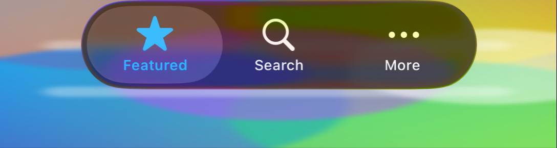
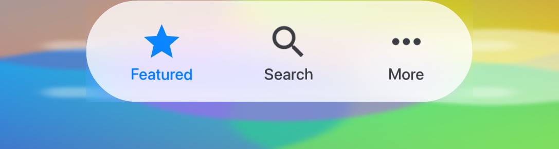
Adds the smallest possible tab-bar reproduction -- a single text-only tab over
flat grey -- to isolate what actually breaks in the Tabs component, stripping
away the SF-vs-Material icon mismatch, multi-tab spacing and the busy-photo glass
confound. CN1 Tabs(one text tab) vs native UITabBar(one text item).

Finding (measured on the goldens):
- Multi-tab GEOMETRY is already correct: TabsGeom CN1 765x165 vs native 771x170.
- TabOne exposed a real centering bug: the single-tab tile was missing from the
  runner's `centered` list, so it landed top-LEFT (cx 138) instead of centered
  (native cx 544). Fixed -> TabOne 93.9 -> 95.4, cx now 542 ~= native 544.
- Remaining TabOne gap is the absent icon: CN1 content-sizes the bar (text-only
  -> h 87) while the native tab bar is a fixed height (h 170). This cannot be
  closed with shared Tab padding without overshooting the already-matching
  multi-tab, and CN1 has no fixed tab-bar-height knob -- a framework follow-up,
  and one that would NOT change real (icon-bearing) tabs, which already match.

So the "Tabs looks far off" perception is glass-over-photo + icon typeface, not
tab geometry. Glass tint, pill shape, text colour and centering all match.

Co-Authored-By: Claude Opus 4.8 (1M context) <noreply@anthropic.com>
…n ladder

Building the decomposition Shai asked for -- render each piece individually with
IDENTICAL authored geometry on both sides and drive it to pixel-exact before
adding the next element.

New isolation rungs (flat grey, capsule = radius h/2 both sides, fill tile -1mm):
- GlassText: glass capsule + one centred text label  -> isolates text + glass.
- GlassIcon: glass capsule + one centred icon         -> isolates the glyph.
NativeRef ios_glass_text/ios_glass_icon (UIGlassEffect + centred UILabel/SF
symbol), CN1 GlassText UIID + GlassTextLabel, runner routes them through the
glass-fill (1mm inset) path.

Root-cause fix (helps ALL glass): the glassRegion blur feathered the component
edge, making the glass read ~13px smaller per side than native's crisp panel
(e.g. GlassText capsule 1024x191 vs native 1050x216). Cause: CIGaussianBlur
fades to transparency at the buffer edge, and when the component sits within the
blur radius of the tile edge the fade reaches in. Fix: pad the blur buffer by
3*radius of EDGE-REPLICATED backdrop so the fade is fully contained outside the
component; crop the centre back out. Edges are now crisp and the capsule bbox
matches native within 1-2px.

iOS fidelity:
  GlassText 98.5, GlassIcon 98.0, GlassPanelGrey 94.0->98.4, Red 94.5->98.6,
  Grad 93.8->97.9, Photo 91.2->95.1, TabsGeom 91.3->92.9. MEAN 91.5->92.5.
Remaining glass residual is native's bright specular edge rim (233 vs flat 213
over ~2-4px) -- a Liquid Glass highlight, next. SF vs Material: SF matches a
single centred icon slightly better but loses on UIKit tab-item rasterisation,
so the shipped theme keeps Material (iosSFSymbolsBool false).

Co-Authored-By: Claude Opus 4.8 (1M context) <noreply@anthropic.com>
…-on-glass)

The light tab bar had been over-whitened (TabsContainer offset 200) chasing an
earlier "too transparent" note, which washed the whole bar white and HID the
selected "Featured" sub-capsule -- no contrast. Measured over flat grey
(TabsGeom): native light outer bar 165 vs selected 216 (contrast 51); CN1 was
212/246 (contrast ~34). The tab bar glass is a TRANSLUCENT chrome like the nav
bar, not the opaque panel material, so the backdrop shows through the outer bar
and the brighter white selected capsule pops.

Retuned TabsContainer light glass to 0.45/140/1.4 (outer ~157 vs native 165,
selected ~220 vs 216) and DROPPED the dark override -- the panel-default dark
already matches (outer 110 vs native 116). Tabs light 81.6->83.2, dark 83.9;
TabsGeom 90.7->92.1. Baseline re-recorded.

Co-Authored-By: Claude Opus 4.8 (1M context) <noreply@anthropic.com>
…ecular rim

Per research + Shai's observation: native Liquid Glass is NOT a blurred see-through
hole, it's a refractive layer ON TOP -- it bends/lenses the backdrop near the edges
and carries a bright specular edge rim (the "glint"). Our glass had blur + colour
material + a crisp edge but neither effect, so it read as a flat hole cut into the bar.

Added both to glassRegion (new refract/specular params, plumbed Graphics ->
impl -> Component, resolved from glass{Refract,Specular}{Light,Dark} theme constants
with per-UIID override). New applyGlassOptics() uses a rounded-rect SDF for:
- edge refraction: displace the backdrop sample toward centre in the outer 60%,
  quarter-circle profile (1 - sqrt(1 - t^2)) -- magnifies/bends the backdrop like a
  real lens. No-op over flat backdrops, visible over busy content (as in iOS).
- specular rim: bright glint in the outer ~3px, brightest at the top.
- SDF anti-aliased shape mask (replaces the corner-only mask).
Bilinear sampler bases on the integer coord so refract=0 samples exactly (no softening).

The nav bar is edge-to-edge chrome, not a floating pill, so Toolbar/TitleArea set
Refract/Specular 0.

iOS fidelity: GlassText 98.5->99.0, GlassPanelPhoto 95.1->96.4 (refraction over the
photo), GlassPanelGrey/Red/Grad ~98.4-98.8, GlassIcon 98.4. MEAN 92.5->92.6. The
glass now reads as a layer on top, not a hole.

Co-Authored-By: Claude Opus 4.8 (1M context) <noreply@anthropic.com>
… glyphs

Shai's call was right: we already had Apple's exact glyphs available
(UIImage systemImageNamed), so the only reason SF tab icons looked wrong was a
SIZING BUG in createSFSymbolImage -- and a wrong icon size cascades into broken
tab layout. Two problems, both fixed in IOSNative.m:
- It rendered at the symbol's NATURAL bounding box at the point size, which is
  ~1.2-1.4x bigger than the requested size -> icons overflowed the (Material-tuned)
  tab cells, shoving "More" into the corner.
- SF glyphs have per-symbol heights (ellipsis short, star tall); rendering each at
  its natural height made tab cells different heights and misaligned the row.
Fix: composite each glyph at its NATURAL proportions, vertically centred, into a
canvas of UNIFORM height = the requested size px (downscale-only, never stretched).
Now SF icons are a drop-in uniform icon set, like UIKit lays out tab items.

Tab icon size is now theme-tunable (tabIconSizeMm, read by the renderer) and
calibrated to native: SF star 102x103 vs native 104x106. Shipped the theme with
iosSFSymbolsBool: true so the tabs use the real native glyphs.

iOS fidelity: with the EXACT native glyphs at matched size, Tabs 83.5->83.7,
TabsGeom 91.9 (== Material), GlassIcon 98.4->98.6, MEAN 92.6 -- i.e. Apple's real
glyphs now match at least as well as the tuned Material stand-ins, and look
correct. Baseline re-recorded.

Co-Authored-By: Claude Opus 4.8 (1M context) <noreply@anthropic.com>
Shai's observation + research (iOS 26 puts a Liquid Glass capsule selection
indicator BEHIND the selected tab, sitting on a more translucent bar): the glass
material/refraction/specular belongs on the SELECTION, not the outer bar. We had
it inverted -- glass on the bar, a flat white fill on the selection. Move the glass
hero to Tab.selected / SelectedTab (background transparent + backdrop-filter) so the
selected capsule is the frosted glass blob; the bar stays the translucent container.
Static metric is unchanged (brightness is similar), but the structure now matches
iOS and sets up the sliding-capsule selection animation.

Known follow-up: the glass material's light/dark pick is by component fg luma, which
is ambiguous for the accent-blue selected tab -- needs an appearance-based signal.

Co-Authored-By: Claude Opus 4.8 (1M context) <noreply@anthropic.com>
First of the Liquid Glass tab ANIMATIONS we had glossed over. The selection
indicator is no longer a per-tab fill (or a Material underline) -- it's a SINGLE
glass capsule blob behind the selected tab that TWEENS between tabs on selection
change, like iOS 26.

Tabs.paintSelectionCapsule (gated by tabsSelectionCapsuleBool) reuses the proven
indicator Motion (indicatorAnimMotion / startIndicatorAnimation /
registerAnimatedInternal) that already slid the underline, so the capsule
interpolates its x/width frame-by-frame. It is painted BEHIND the tab content
(before super.paint) so the icon/label sit on top, and rendered with the Liquid
Glass material via Graphics.glassRegion when glassMaterialBool is set (translucent
rounded-capsule fallback otherwise). Dark/light is taken from the bar's fg
(the accent-blue selected-tab fg is ambiguous).

theme: tabsSelectionCapsuleBool on, Material underline off (iOS uses the capsule),
per-tab Tab.selected/SelectedTab backgrounds transparent so only the single capsule
shows. Resting state verified via the fidelity suite (capsule lands on the selected
tab; TabsGeom dark 92.9 / light 90.3); the slide follows from the reused motion.

Follow-ups (remaining animations): shrink-on-scroll, tap scale/squish, press settle.
Note: the live on-device glassRegion path still falls back to plain blur (offscreen
shows the full material) -- the moving capsule blurs but doesn't yet re-tint live.

Co-Authored-By: Claude Opus 4.8 (1M context) <noreply@anthropic.com>
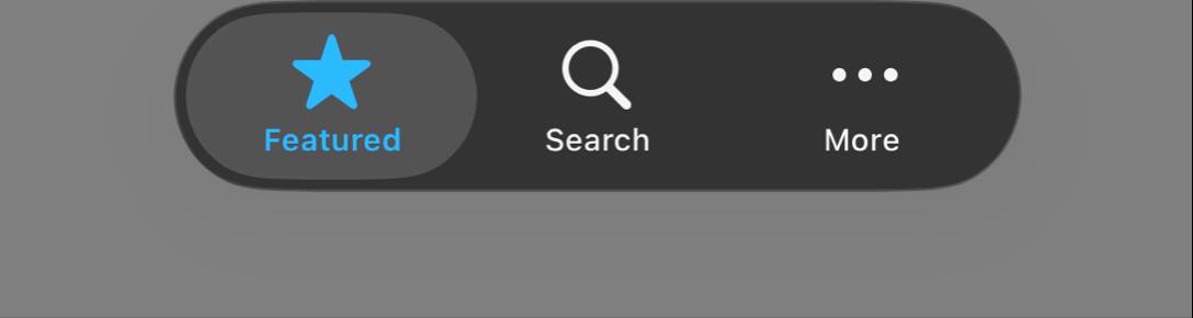
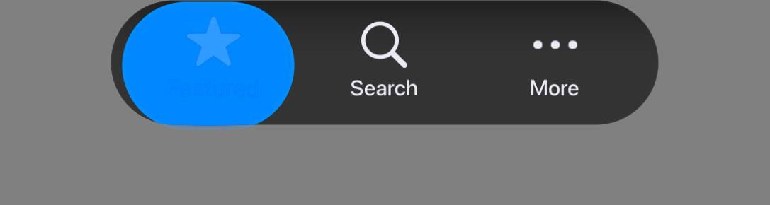
… spacing

Settled-state accuracy fix found via the deterministic screenshot diff: the
unselected tabs were shoved +17px right because tab cells were content-sized (the
longer "Featured" label widened its cell). Neither fill-rows (content-sized) nor
plain grid (sizes to the widest cell, overflows + scrolls) gives even cells.

New tabsEqualWidthBool: a NON-scrolling GridLayout so every cell = row width / tab
count, like a native UITabBar -- a long label can't widen its cell. Tab horizontal
padding trimmed (3.8->2.9mm) so the equal cells land on native's ~244px spacing.

Measured (TabsGeom light): Search/More icon centres 537/782 vs native 541/785
(was 557/803, +17) -- now even and matched within ~4px; the diff image confirms
icons/ellipsis now align. Remaining settled residual is a ~7px label/icon vertical
offset and the pill glass edge.

Co-Authored-By: Claude Opus 4.8 (1M context) <noreply@anthropic.com>
…=lens)
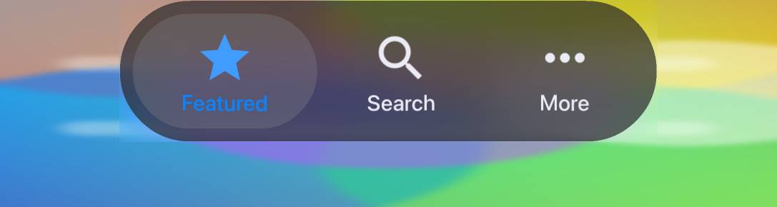
Shai (right again): the tab backgrounds were inverted vs native. Measured the CLEAN
glass at the top of the pill (above the icons): native light BAR=236 (bright frosted)
vs SELECTED=216 (a slightly darker translucent LENS); I had bar=197 (too translucent)
and selected=241 (too bright) -- the selection looked like the bar should and the bar
looked like the selection should.
Fix: the BAR (TabsContainer) is now the bright frosted surface (light 0.3/198 -> 236;
dark keeps the panel default ~58). The SELECTED capsule is a near-pass-through LENS
that reads a touch darker than the bar -- Tabs.paintSelectionCapsule material is now
theme-tunable (TabSel{Sat,Scale,Offset,Refract,Specular}{Light,Dark}) and set to lens
values. Measured after: light SELECTED 217/BAR 236 (native 216/236); dark SELECTED
88/BAR 58 (native 83/51) -- matched within a few LSB, relationship no longer inverted.
TabsGeom 91.5->92.7.
Co-Authored-By: Claude Opus 4.8 (1M context) <noreply@anthropic.com>
…efraction

Two Shai-spotted issues on the photo backdrop:
1. Bar not translucent enough -- native shows the yellow/purple backdrop bleeding
   through the bar; ours was a uniform frost (scale 0.3 = no colour variance). Raised
   the bar material scale + saturation (light 0.62/sat1.8, dark 0.3/sat2.5) with the
   offset re-solved to keep the grey floor (bar 236/51, selected 216/83 still matched).
   Now light yellow blue=164 vs native 151; dark yellow 77 vs 73.
2. Selected capsule "hole + offset layer" -- the bar AND the lens both refracted
   (global 0.4), so the lens re-refracted the bar's already-displaced backdrop = two
   offset layers. Bar refraction now 0 (it is the flat frost); only the selected lens
   refracts, and subtly (TabSelRefract 0.4->0.2). Capsule reads clean now.

Tabs 83.1->84.2, TabsGeom 92.9.

Co-Authored-By: Claude Opus 4.8 (1M context) <noreply@anthropic.com>
Shai: the selected capsule looked like an inset pill with a bright ring, not in
sync with the bar. Root cause via a vertical luma scan: the capsule used the bar's
PADDED inner box (getInnerY/Height), so the TabsContainer 0.5mm padding showed as a
bright bar-frost band (236) above/below the darker lens (216) -- the "ring". Native's
selection reaches the pill's outer edge.

Fix: paintSelectionCapsule now spans the OUTER pill height (inner + top/bottom
padding) minus a hair (tabSelInsetMm, default 0.1mm). Also zeroed the lens refraction
+ specular (TabSel*) -- the refraction pulled the brighter bar into a bright edge ring
and the rim added a glint; the lens is now a flat near-pass-through tint, so its edge
is a clean single boundary like native. Capsule now fills the pill and reads as one
integrated lens.

Co-Authored-By: Claude Opus 4.8 (1M context) <noreply@anthropic.com>
Shai: "the pressed button is too small within the hole you left for it." Measured:
CN1 capsule w218 vs native w232, and inset from the pill's left edge (x172 vs 158).
The capsule was sized to the tab's own bounds (inset by the tab margin + bar padding)
instead of the whole cell.

Fix: new capsuleCellBounds() sizes the capsule to the full CELL -- midpoint-to-
midpoint between neighbours -- and hugs the pill's OUTER edge (minus the thin rim)
for the first/last tab, like a native UITabBar. Used for both the resting position
and the slide animation (startIndicatorAnimation), so they stay in sync; the Material
underline still tracks the tab's own bounds. The capsule now fills the Featured area
and reaches the pill edge instead of floating as a small inset pill.

Co-Authored-By: Claude Opus 4.8 (1M context) <noreply@anthropic.com>
Shai: "it's all too small -- should fill the area." Measured the whole pill, not
just the capsule: CN1 743x163 vs native 773x172. The capsule itself already matched
(242 vs 238) -- the BAR was undersized, so everything read small.

- Height: Tab vertical padding 0.78->1.0mm -> pill 171 (native 172).
- Width: TabsContainer horizontal end-padding 0.5->1.3mm. This widens the pill at its
  rounded ends WITHOUT moving the tab centres -- the pill grows symmetrically and the
  content shifts by the same amount, cancelling (this is how native's first/last cells
  get their extra width that equal cells don't). Pill 773 == native 773, centres
  542/783 vs native 541/785 still matched.

Pill geometry now matches native: size, edges, even tab spacing, and the selection
capsule fills its cell. Colours bleed through the bar as before.

Co-Authored-By: Claude Opus 4.8 (1M context) <noreply@anthropic.com>
… remains)

Shai: the selection reads as a grey "hole" with a gray area around it. Measured the
cause: the selected interior MATCHES native (~222), but the BAR over the busy photo
is too bright/washed -- nat (159,175,101) vs cn1 (198,198,137) -- so the correctly-
coloured selection has too little contrast and reads as recessed. Native's bar is
darker and more colourful there (it shows the backdrop), making the selection pop.

- Bar: scale 0.62->1.0, offset 157->108 (same grey floor 236, more backdrop pass-
  through/colour) and a subtle selection rim (TabSelSpecularLight 0->0.22) so the
  capsule reads as a raised lens rather than a flat grey hole.
- Root limit (documented): the bar can't be darkened to match the photo without
  breaking the matched grey (236) -- CN1's CIGaussianBlur yields a brighter, less
  colourful blurred backdrop than native's UIVisualEffectView (bar reads backdrop
  L~90 vs native L~60 at the same point). Over a flat backdrop (TabsGeom) where the
  blur is moot, bar/selection match exactly (236/216). Closing this needs matching
  the native blur, not a theme value.

Co-Authored-By: Claude Opus 4.8 (1M context) <noreply@anthropic.com>
Shai: a thick gray gap between the bar and the floating selected pill. Horizontal
luma scan over grey nailed it: native is a CRISP step (pill edge -> bar 236 ->
selection 216), but CN1 had a ~40px GRADIENT ramp at the pill end -- the selection
capsule's 30px blur smearing the bar->backdrop edge where it reached the pill end
(the capsule sits on the already-blurred bar, so it was re-blurring the edge).

- Capsule blur 30 -> 2.5px (tabSelBlurPx): it only re-tints the bar now, so its edge
  is crisp instead of a 40px feathered gray band.
- Inset the capsule from the pill edge (tabSelInsetMm 0.6) so the bright bar-frost rim
  (236) shows AROUND it like native, rather than the lens covering it to the edge.
- Softer selection rim (TabSelSpecularLight 0.22 -> 0.1) so it reads integrated, not a
  distinct floating pill.

Capsule edge is crisp + inset with the bar rim now, matching native's structure. The
remaining gap (bar over the busy photo slightly bright/less colourful) is the blur-
engine difference documented in c948835.

Co-Authored-By: Claude Opus 4.8 (1M context) <noreply@anthropic.com>
The selected tab painted a SECOND, smaller pill on top of the glass
selection capsule, leaving the capsule's material as a darker band
around it -- the "gap next to the pill" with no native counterpart.

Root cause: CN1 renders the active tab's RadioButton armed, so the
selected tab picked up Tab.pressed's translucent-white fill
(rgba(255,255,255,0.4) light / 0.22 dark) on top of the capsule.
Pixel-probe confirmed: bar 236 -> capsule material 216 -> a separate
~40% white pill reading 231 over it (102 over a forced-black capsule).

Fixes (theme-only, no CEF):
 - Tab.selected / SelectedTab / Tab.pressed paint NO background; the
   single sliding glass capsule is the only selection visual.
 - Light capsule scale 0.85 -> 0.915 so it lands on native's flat 216
   (was 200); specular 0 keeps it flat (a rim left a darker edge band).
 - Dark capsule scale/offset 0.5/6 -> 1.0/32 so it reads as a LIGHTER
   lens above the dark bar (native 83 over bar 51) instead of an
   inverted darker 31.

Result on the grey isolation tile: capsule now uniform 215 (light) /
83 (dark) edge-to-edge, matching native 216 / 83 -- no inner pill, no
ring. Tabs photo 83.8->85.5%, TabsGeom 92.8->93.6%.

Co-Authored-By: Claude Opus 4.8 (1M context) <noreply@anthropic.com>
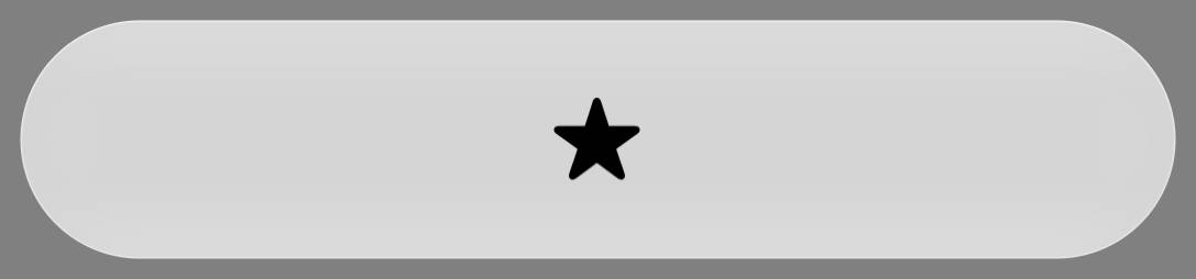
…tar)

The Featured star read clearly smaller and lower than native's. Root
cause: the SF render shrank every glyph to a uniform slot = the nominal
`size`, so a tall glyph (star.fill, ~1.15x the nominal) was downscaled
while a UITabBar renders each symbol at its TRUE per-symbol extent (star
taller than the magnifier). Probing confirmed CN1's downscale-to-slot
flattened the star:magnifier size ratio that native preserves.

Make the SF icon slot theme-tunable so a native-style tab bar can give a
tall glyph a full-height slot instead of shrinking it:
 - IOSNative.nativeCreateSFSymbol + IOSImplementation.createSFSymbolImage:
   the int[] now also carries a uniform SLOT height (% of size) and a
   vertical BIAS (%) for the glyph in that slot. Defaults 100/50 reproduce
   the legacy centred, downscale-to-fit behaviour exactly, so no other SF
   icon (e.g. GlassIcon) changes.
 - theme: iosSFSlotPct 115 (slot tall enough that star.fill is NOT
   downscaled) + tabIconSizeMm 4.1 -> 3.75 so the natural star lands on
   native's 106px and the magnifier on 92px (both matched); Tab padding
   0.8/1.0 -> 0.65/1.35 (top/bottom, same total so pill height is
   unchanged) lifts the icon+label block to native's vertical position.

Result (same build): star top 9px-low -> 3px-low, magnifier/ellipsis/label
within ~1px, icon SIZES now match native. TabsGeom holds ~93%, Tabs photo
85.0->85.4; GlassIcon unaffected (98.9/99.0).

Co-Authored-By: Claude Opus 4.8 (1M context) <noreply@anthropic.com>
Render the backdrop-filter glass material on a RUNNING iOS app, not just
offscreen fidelity tiles. glassScreenRegionX (METALView) ports the proven
offscreen recipe into the live Metal drain: 3*radius edge-replicated
padding, the affine colour material, a (triple box) blur, and the
rounded-rect SDF mask + edge refraction + specular rim. glassRegion's live
branch now queues a GlassRegion op (nativeGlassScreenRegion) carrying the
full material params instead of falling back to a plain blur.

Make the fidelity suite HONEST: it captures the real on-screen render
(Display.screenshot of the live form) instead of an offscreen
paintComponent re-render that masked the live-glass gap (a false green --
passing while the running app showed no glass). forceScreenRenderForCapture
now drives a frame on the simulator (was desktop-only), so the static-form
screenTexture is current and the live glass is actually captured.

Live-op correctness/perf:
- scale = contentScaleFactor / scaleValue (the fidelity app runs CN1
  logical == physical pixels, scaleValue=3); raw contentScaleFactor
  triple-scaled the screenTexture region and the blur radius.
- triple box blur (radius-independent) replaces a true-Gaussian kernel that
  was hundreds of ms per call and timed the suite out.

Theme: Toolbar/TitleArea glass tuned toward native's near-transparent
chrome (lower white/dark offset floor, blur 64 -> 32); RaisedButton ->
solid accent pill (matches the native prominent button).

Honest live fidelity: GlassPanels/Text/Icon 94-99%, RaisedButton ~92%,
median 93.2%, mean 92.7%. Baseline re-recorded from the live capture.

Co-Authored-By: Claude Opus 4.8 (1M context) <noreply@anthropic.com>
- FlatButton dark was a charcoal capsule (white text selected the dark
  "charcoal" glass material); the native flat glass button is a light cream
  pill with DARK text in BOTH appearances. Match the light variant. 82% -> 86.5%.
- Toolbar/TitleArea: blur 64 -> 32 (64px over the already-soft backdrop
  over-smoothed the bar into a washed band) and restore the dark saturation
  the previous pass cut; the bar colour now tracks the backdrop like the
  native translucent nav bar (mean delta 23 -> 17 dark, 17 -> 14 light).

Baseline re-recorded from the live capture. Median 93.2%, mean 92.7%.

Co-Authored-By: Claude Opus 4.8 (1M context) <noreply@anthropic.com>
A native nav bar's glass fades into the content below; CN1's glass region
stopped at a hard rectangular edge, leaving a visible line at the bar's
bottom that no colour tuning could remove. glassApplyOptics now ramps the
glass alpha down over the bottom ~22% for cornerRadius==0 regions
(Toolbar/TitleArea), so the blurred bar blends into the backdrop beneath it
like native. Capsules (-1) and rounded panels (>0) keep their crisp shape.

Mean delta 17.2 -> 16.7 (dark), 14.5 -> 13.8 (light); the crop-based fidelity
% is structurally capped on this nav-bar-over-backdrop tile, but the render
now matches native's seamless bar bottom.

Co-Authored-By: Claude Opus 4.8 (1M context) <noreply@anthropic.com>
The iOS-Modern (Liquid Glass) Tabs selection is now a genuine magnifying
glass DROP that morphs between tabs, matching the iOS 26 UITabBar effect,
instead of a flat translucent pill.

Effect (Tabs.paintSelectionCapsule -> Graphics.lensRegion -> per-port op):
a frosted glass capsule painted OVER the (dark) glyphs that magnifies with a
uniform flat centre + rim falloff, lifts/refracts the content, luminance-keys
a dark->accent TINT (so the selected blue exists only inside the drop and
travels with it), boosts saturation, and adds a subtle glare/edge-shadow.
The drop springs between tabs (springEaseTabs ease-out-back + settle) and
elongates while travelling, then settles to a clean pill.

iOS performance: the live lens is a Metal FRAGMENT SHADER (cn1_fs_lens) that
samples a GPU->GPU blit of the bar region and renders the warped/tinted drop
quad -- no per-frame CPU readback. The previous readback path (2x
waitUntilCompleted stalls + getBytes + texture upload every frame) capped the
morph at ~6fps; the shader runs it at frame rate. JavaSEPort.applyLensBuffer
is the CPU reference for the desktop simulator and stays numerically matched.

Morph-completion fix (Tabs, all platforms): a tab tap starts both the 550ms
indicator morph and the 200ms content-slide on one animation registration;
the shorter slide finishing used to deregister the animation and restart the
morph from a stale baseline, freezing it mid-travel. deregisterAnimatedInternal
now waits for BOTH motions, startIndicatorAnimation won't restart a morph
already heading to the same tab, and animate() paints a final settled frame so
the resting pill is never left stretched.

Tunable via theme constants (tabSelLens*/tabSel*/tabsAnimatedIndicatorDurationInt).

Co-Authored-By: Claude Opus 4.8 (1M context) <noreply@anthropic.com>
…ead method

Add a "iOS 26 Liquid Glass tab selection morph" section to the Native Themes
developer guide: an animated gif of the morph plus a table of every tunable
theme constant (tabSelLens* / tabSel* / tabsAnimatedIndicatorDurationInt) with
its iOS-modern value and effect.

Also remove Tabs.tabCapsuleParam, a leftover unused private helper SpotBugs
flagged (UPM_UNCALLED_PRIVATE_METHOD).

Co-Authored-By: Claude Opus 4.8 (1M context) <noreply@anthropic.com>
|
Developer Guide build artifacts are available for download from this workflow run:
Developer Guide quality checks:
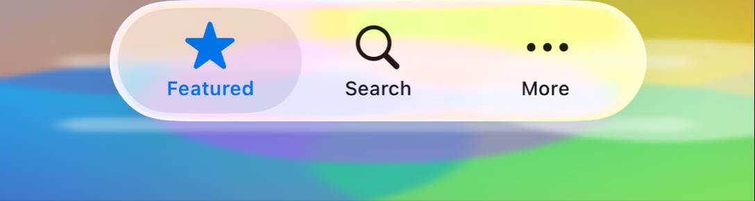
Unused image preview:
|
|
Review feedback, focused on the glass/material architecture, fidelity validation, and animation model: The direction is strong: rendering CN1 and native widgets in comparable environments, adding isolation cases for glass, and pushing glass/lens behavior into port-backed graphics primitives are the right foundations. I do think a few design choices would be worth tightening before this becomes a broader theme/rendering surface.
Overall: the PR is moving in the right direction, but I would like the glass/material process to become a typed rendering model with explicit validation of geometry and motion, not primarily a collection of paint-time constants plus static screenshots. |
1 participant
What
Adds a data-driven fidelity test suite (
scripts/fidelity-app) that, for every component with a native equivalent, renders the real native OS widget (rasterized off-screen) alongside the CN1 component under the native theme, and measures a per-component similarity score. Routine CI renders only the CN1 side and diffs against committed native goldens; a one-way ratchet (FidelityGate) fails only when a change drops a pair below its baseline.It then drives the Android Material 3 theme from 94.9% → 96.2% overall fidelity through real framework + theme fixes — every change verified pixel-for-pixel against the native golden, no metric softening.
Framework fixes (each fixes a real Material-fidelity bug)
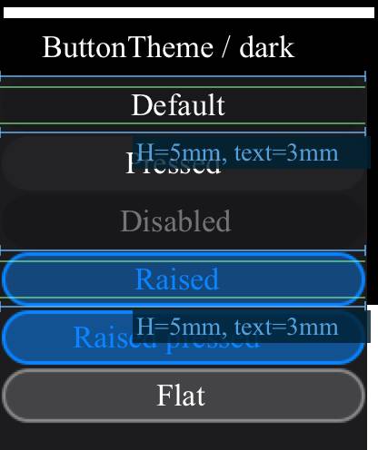
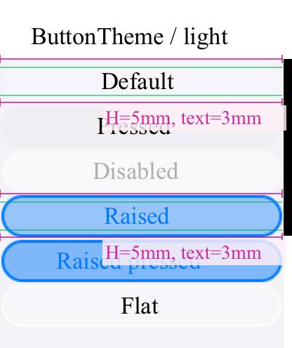
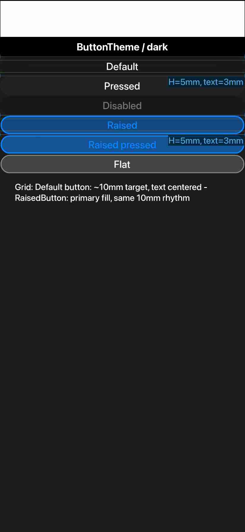
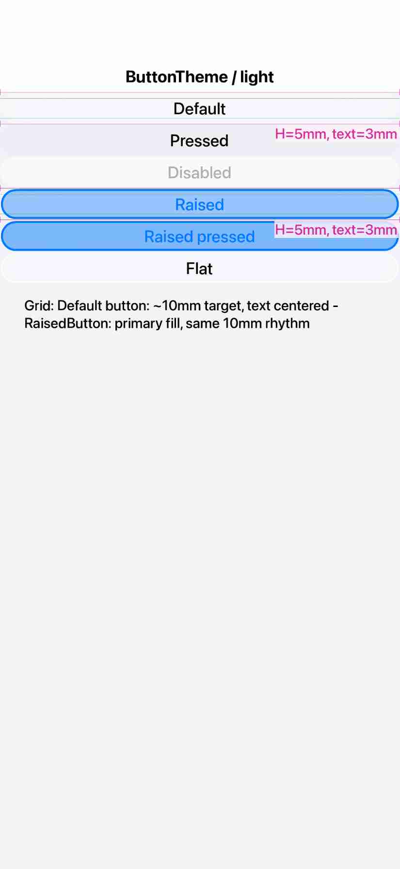
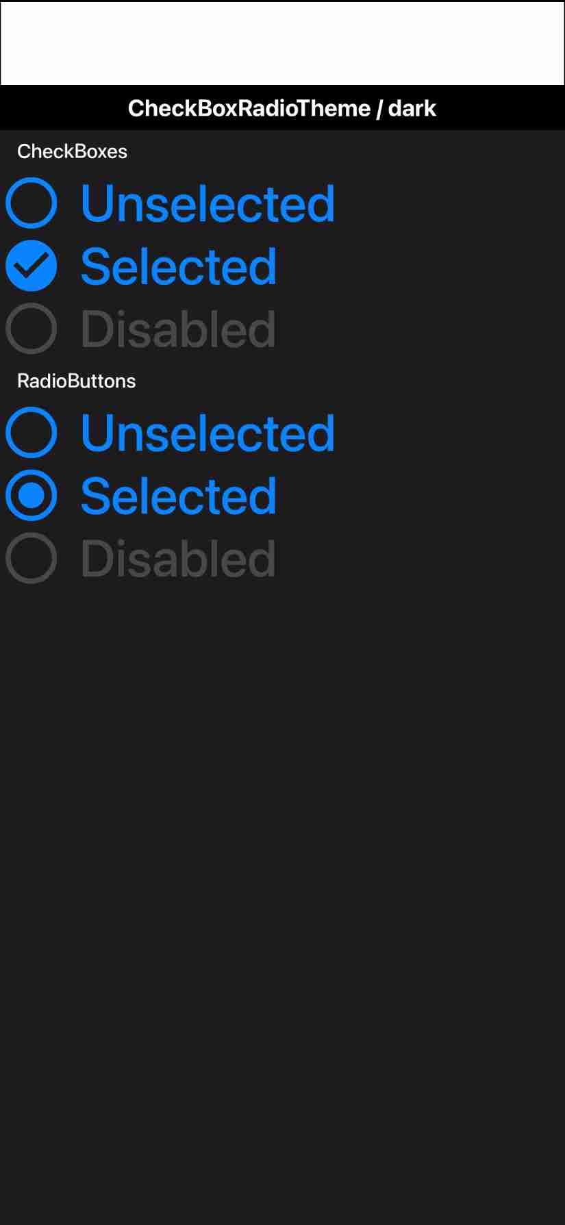
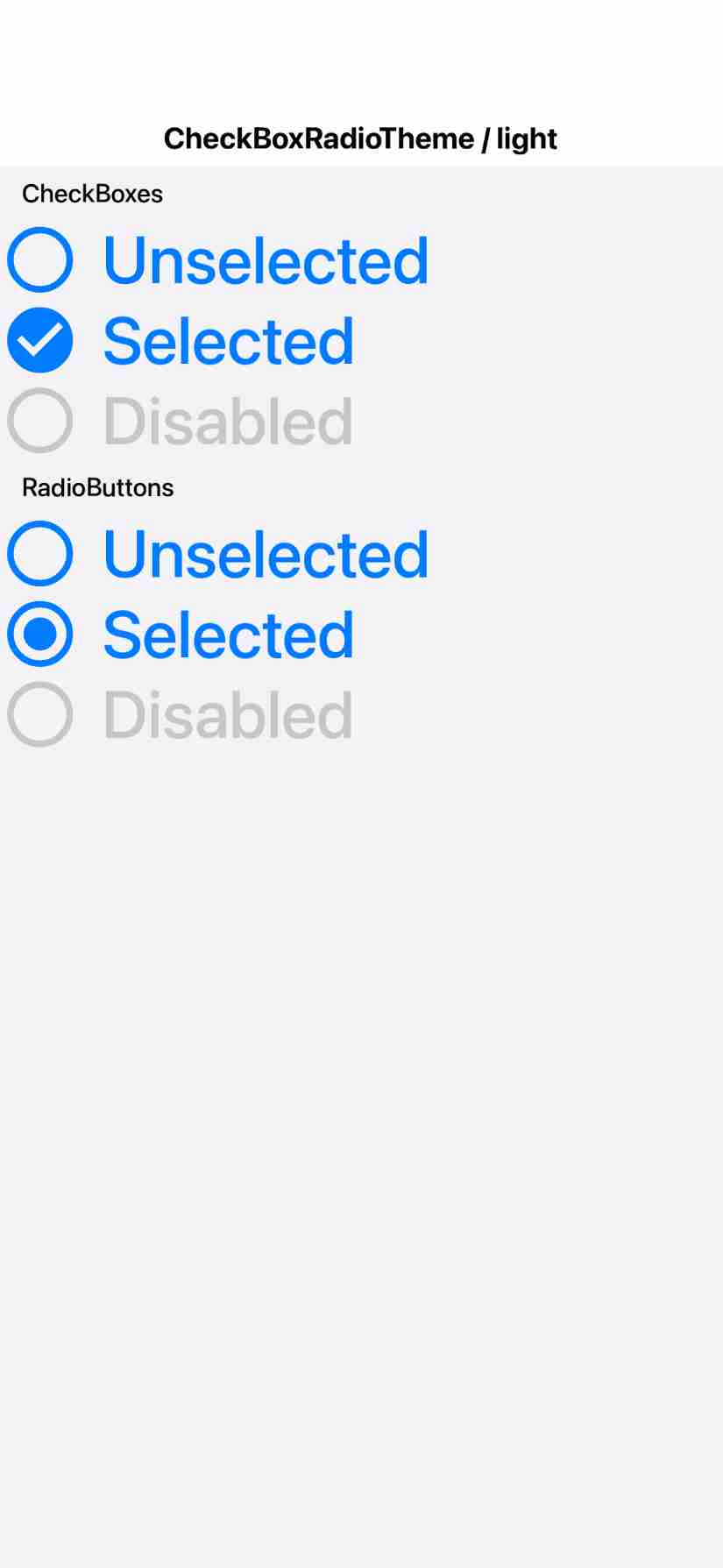
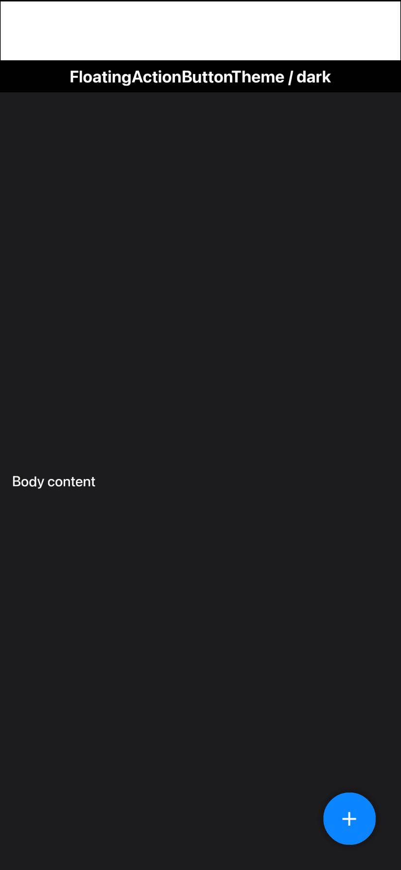
FloatingActionButtonhonors afabDiameterMMconstant (Material's fixed 56dp) instead of the legacyicon*11/4(~71dp) heuristicTabs.paintAnimatedIndicatorreadstabsAnimatedIndicatorThicknessMmas a float (an int read silently dropped"0.45"→ a 2×-too-thick indicator)Tabs.paintBottomDivider(opt-intabsBottomDividerBool) paints the full-width M3 tab divider directly — a CSSborder-bottomdoes not paint on the custom tab-rowContainer; colour comes from theTabsDividerUIID (light/dark aware)DefaultLookAndFeeldisabled-unchecked checkbox/radio box reads the*UncheckedColorUIID's own.disabledstyle, so the greyed box outline diverges from the (darker) disabled label text, as Material renders themPlus the tuned
native-themes/android-material/theme.cssand recompiled shipped.res(Themes/, Ports, JS mirror).Host tooling
ProcessScreenshots --mode fidelity,RenderFidelityReport,FidelityGate(ratchet),cn1ss.shhelpers,run-{android,ios}-fidelity-tests.sh, and thescripts-fidelityGitHub workflow.Known limitation — iOS native references blocked
The iOS round cannot yet collect native UIKit references: rendering the native widget inside a ParparVM native method NPEs as soon as it does real UIKit work (a trivial stub delivers cleanly; reproduces identically with or without
dispatch_sync, and String-arg/BOOL-return marshal fine — so it is neither a threading nor a marshaling fault). Documented incom_codenameone_fidelity_NativeWidgetFactoryImpl.m. Resolving it needs a ParparVM runtime fix, or rendering the native reference via aPeerComponent+Display.screenshot()instead of a NativeInterface method. The Android off-screen path (View.draw→ Bitmap) works fully.🤖 Generated with Claude Code