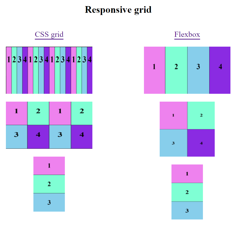
It is an example of responsive grid using CSS Grid and flexbox, following the next rules:
- When the size of the screen is greater than 720px shows 4 columns and 1 row.
- When is less than 720px shows 2 columns and 2 rows.
- When is less than 360px shows 1 column and 4 rows
In Css Grid, there is an inner grid for each cell.