


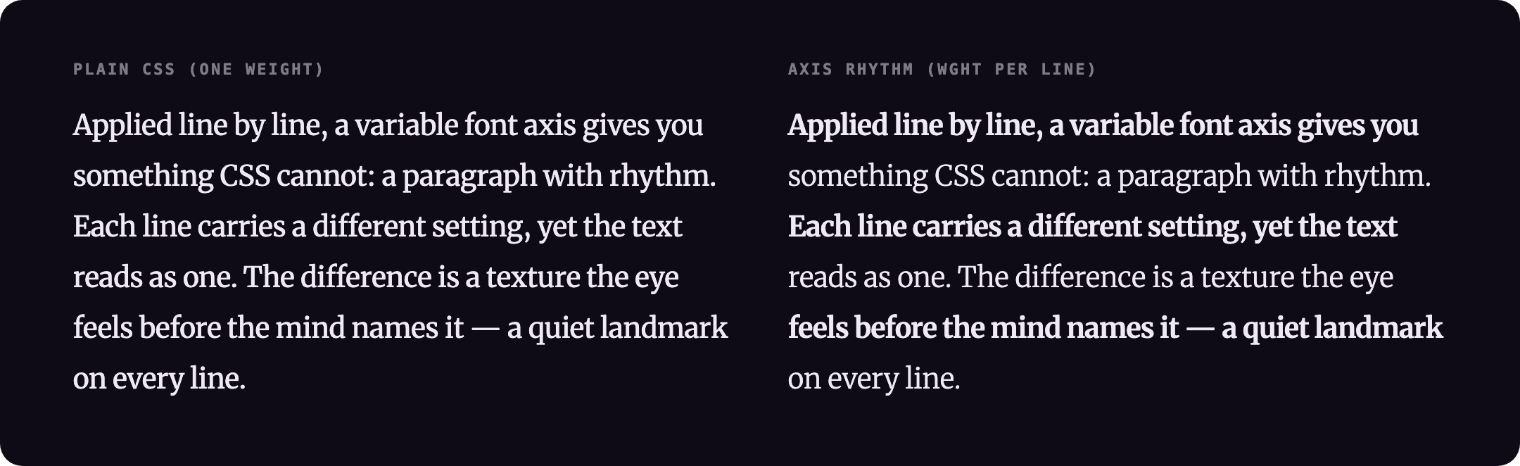
CSS applies font-variation-settings to the whole element — every line gets the same axis value. Axis Rhythm works line by line, cycling any OpenType axis through a sequence of values across paragraph lines. The result is a texture the eye reads as rhythm, not noise. Like column highlighting for text.

axisrhythm.com · npm · GitHub
TypeScript · Zero runtime dependencies · 6.6 kB gzipped (vanilla), 8.4 kB with the React component · React optional · Vanilla JS
npm install @overpunch/axisrhythmNext.js App Router: this library uses browser APIs. Add
"use client"to any component file that imports from it.
Variable font required: Axis Rhythm sets
font-variation-settingsper line. The target font must support the axis you specify (e.g. a font with awdthaxis foraxis: 'wdth'). The effect is invisible with fonts that do not have variable axis support.
Load a variable font with the axis you want to cycle, and request its axes explicitly so a static instance does not load. With a CSS @font-face:
@font-face {
  font-family: "Merriweather VF";
  src: url("/fonts/Merriweather.woff2") format("woff2");
  font-weight: 300 900;       /* declares the wght axis range */
  font-stretch: 87% 112%;     /* declares the wdth axis range */
  font-display: swap;
}.rhythm { font-family: "Merriweather VF", serif; }Declare the range for whichever axis you cycle (font-weight for wght, font-stretch for wdth); other axes are reached through font-variation-settings. With Google Fonts, include the axes in the URL — ...family=Recursive:wght@300..900 — or the browser fetches a single static instance and the effect is invisible.
import { AxisRhythmText } from '@overpunch/axisrhythm'

<AxisRhythmText axis="wdth" values={[100, 88]} period={2} linePreservation="spacing">
  Your paragraph text here...
</AxisRhythmText>
linePreservation="spacing" prevents line overflow by compensating each line's width with letter-spacing. For display or headline text where overflow is acceptable (or part of the effect), omit it or set linePreservation="none".
In the App Router, put it in a client component and use that from your page:
// components/RhythmParagraph.tsx
"use client"
import type { ReactNode } from 'react'
import { AxisRhythmText } from '@overpunch/axisrhythm'

export function RhythmParagraph({ children }: { children: ReactNode }) {
  return (
    <AxisRhythmText className="rhythm" axis="wght" values={[460, 380]} period={2} linePreservation="spacing">
      {children}
    </AxisRhythmText>
  )
}
Add animate for the moving wave (waveShape and speed tune it):
<AxisRhythmText axis="wght" values={[300, 700]} period={4} linePreservation="spacing" animate speed={0.5}>
  Your paragraph text here...
</AxisRhythmText>
The component and the hook clean up after themselves: the animation stops and observers disconnect on unmount. When the children change, the component re-measures the new text.
import { useAxisRhythm } from '@overpunch/axisrhythm'

// Inside a React component:
const ref = useAxisRhythm({ axis: 'wdth', values: [100, 88], period: 2 })
return <p ref={ref}>{children}</p>
The hook re-runs automatically on resize via ResizeObserver and after fonts load via document.fonts.ready. It re-measures when the element's width changes, in static and animated mode (an animation restarts from the beginning of its cycle).
import { applyAxisRhythm, startAxisRhythm, removeAxisRhythm, getCleanHTML } from '@overpunch/axisrhythm'

const el = document.querySelector('p')   // in TypeScript: querySelector<HTMLElement>('p')!
// Take the snapshot once, before the first apply; pass the same string to every later call.
const original = getCleanHTML(el)
const opts = { axis: 'wdth', values: [100, 88], period: 2 }

// One-shot apply (you manage ResizeObserver and fonts.ready yourself):
applyAxisRhythm(el, original, opts)
document.fonts.ready.then(() => applyAxisRhythm(el, original, opts))

const ro = new ResizeObserver(() => applyAxisRhythm(el, original, opts))
ro.observe(el)

// Or use startAxisRhythm for an animated wave — returns a stop function.
// Note: startAxisRhythm does NOT wire up ResizeObserver or fonts.ready;
// add those yourself if needed (see applyAxisRhythm example above).
const stop = startAxisRhythm(el, original, { ...opts, animate: true })

// Later — stop observing and restore original markup:
// stop()            // when started with startAxisRhythm
// ro.disconnect()   // when using ResizeObserver manually
// removeAxisRhythm(el, original)import type { AxisRhythmOptions } from '@overpunch/axisrhythm'
const opts: AxisRhythmOptions = { axis: 'wdth', values: [100, 88], period: 2 }| Option | Default | Description |
|---|---|---|
axis |
'wdth' |
Variable font axis tag, e.g. 'wdth', 'wght', 'opsz' |
values |
[100, 96] |
Axis values to cycle through across lines. Set period equal to the number of values for all values to appear exactly once per cycle |
period |
2 |
Lines per cycle. Set equal to values.length — if smaller, trailing values are never reached; if larger, values repeat within the cycle |
align |
'top' |
'top' | 'bottom' | 'end'. 'top' counts from the first line; 'bottom' counts from the last; 'end' is direction-aware — equivalent to 'bottom' in LTR text and 'top' in RTL text |
lineDetection |
'bcr' |
'bcr' reads actual browser layout — ground truth, works with any font and inline HTML. 'canvas' uses @chenglou/pretext for arithmetic line breaking with no forced reflow on resize (npm install @chenglou/pretext). Falls back to 'bcr' while pretext loads |
linePreservation |
'none' |
'none' — no compensation; line widths vary with the axis value (best for display type where reflow is part of the effect). 'spacing' — adjusts letter-spacing per line to match natural widths; prevents overflow; recommended for body text. 'scale' — applies a GPU scaleX transform per line; no letter-spacing changes, slight horizontal glyph compression at large axis ranges. For Arabic and other joined scripts use 'scale' (see Scripts) |
source |
'fixed' |
'fixed' — cycle through values in order. 'syllable-density' — per-line syllable density drives the axis value; values[0] → simplest lines, values[last] → most complex. Requires the optional syllable package: npm install syllable |
animate |
false |
Turn the static snapshot into a continuous ambient wave via startAxisRhythm. Each line is offset in phase so the wave drifts across the paragraph over time |
waveShape |
'sine' |
Wave shape for animated mode: 'sine' (smooth), 'triangle' (linear in/out), 'spring' (sine with slight overshoot) |
speed |
1 |
Animation speed multiplier. At 1 one full cycle takes 4 seconds. Use values below 1 for imperceptible background motion |
syncTo |
— | Synchronise phase with another animated element's loop. The target element must already have startAxisRhythm running on it |
intersect |
false |
Defer the layout pass until the element enters the viewport (static mode), or pause/resume the rAF loop when off/on-screen (animated mode). Uses IntersectionObserver internally |
as |
'p' |
HTML element to render, e.g. 'h1', 'div', 'li'. Accepts any valid React element type. (React component only) |
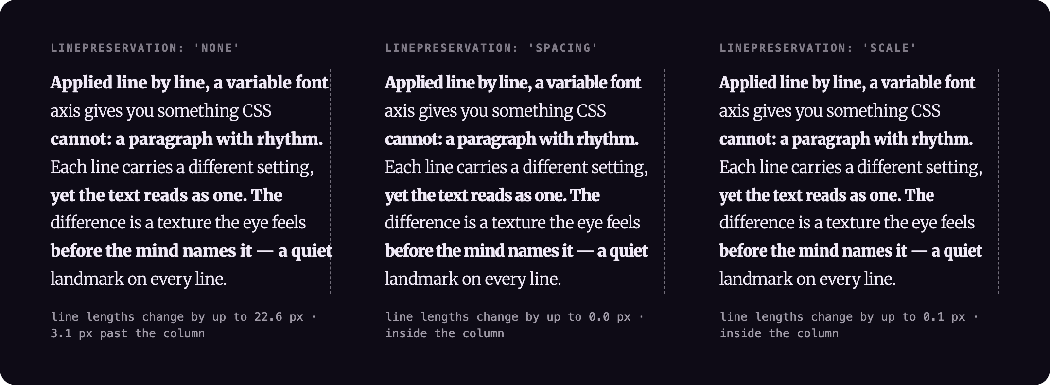
linePreservation on a 287 px column (Merriweather 17 px, wght 900 / 300 per line on a 300 base, headless Chromium, npm run capture): with 'none' line lengths change by up to 22.6 px and the widest line ends 3.1 px past the column; with 'spacing' they change by 0.0 px and with 'scale' by 0.1 px, and nothing passes the column.
The algorithm detects visual lines by measuring word span positions with getBoundingClientRect(), then styles each line with its own font-variation-settings: the line's text is wrapped in .ar-line spans in place (one per element the line passes through, all with the same data-ar-line index), and a <br> at the start of each line keeps the lines where they fall. The injected value overrides only the target axis — all other axes set on the parent element are preserved by reading and patching the computed fontVariationSettings string before writing. Runs on mount and on every resize via ResizeObserver (width changes only). Re-runs when fonts finish loading (document.fonts.ready). Under prefers-reduced-motion: reduce the static texture is kept and only the animation (startAxisRhythm) is skipped; turning the setting on mid-animation stops it and leaves the static texture.
Line break safety: Each run starts from the original HTML, detects lines at the element's natural layout (words are measured inline, with the spaces between them left in the text flow), then locks them with white-space: nowrap. The axis variation doesn't move line breaks. Text without spaces between words (Chinese, Japanese, Korean, Thai) breaks between characters, as it does in normal layout.
Limits: a word the browser itself breaks (after a hyphen, or a long URL with overflow-wrap) is split at that break and keeps it. Automatic hyphenation (hyphens: auto, ­) is turned off while lines are measured, because a locked line can't hyphenate: such a word moves whole to the next line. If the web font hasn't loaded when the effect runs, the lines are measured in the fallback font; the React hook and the Webflow embed wait for document.fonts.ready, and vanilla callers should too.
Markup: inline elements (<em>, <a>, <strong>…) are kept as they are. An element that runs across a line break stays one element, with the line break inside it, so a link over two lines is still one link (one tab stop, one name for screen readers). Lines are held in place with text-wrap-mode: nowrap on the element (or white-space: nowrap in browsers without it), removed again by removeAxisRhythm. With linePreservation: 'scale', each line needs its own box for the transform, so an element that crosses a line break is copied into each line (only the first copy keeps its id). Your own <br> tags are kept; getCleanHTML() returns the original markup.
Width overflow: Applying different axis values per line alters character widths, so lines may grow wider or narrower than the container. linePreservation: 'none' (default) is appropriate for display or headline type where the axis range is large and overflow is intentional. For body text — or any context where line edges must stay flush — use linePreservation: 'spacing' (adjusts letter-spacing to compensate) or 'scale' (GPU scaleX transform).
The linePreservation pass measures each line's natural width before applying the axis value, then applies axis and measures again. The delta becomes either a letter-spacing correction ('spacing', added on top of any letter-spacing you've set) or a scaleX transform ('scale') per line. While animating, each line is measured once at the lowest and highest axis values and the correction is interpolated per frame. Both modes also hold inside an element with CSS zoom.
Scripts: Japanese, Chinese, Korean and Thai wrap between characters and take the axis like any other text. Right-to-left text works too: align: 'end' follows the reading direction, and 'scale' puts each line back exactly where it was, whatever the direction or text-align. Arabic and other joined scripts are the exception for 'spacing': browsers put no letter-spacing between joined letters, so it recovers only part of the width. Measured in Chromium on the site demo (Noto Sans Arabic 18 px, wght 700 on a 300 base, 1024 px column): the bold line ends 87.9 px past the column with 'none', 69.1 px with 'spacing', 0 px with 'scale'. Use 'scale' there. The font needs the axis in every script you set: Merriweather has no Japanese or Arabic glyphs, so the fallback font decides whether anything changes.
Cost: one apply resets the element, measures every word once and styles the lines: reads are batched before writes. On the 49-word, 8-line paragraph above it took 0.5 to 0.6 ms depending on the mode (median of 25 runs each, under 2 ms worst, headless Chromium on a busy laptop, npm run capture). It runs once per width change, not per frame; the animation measures each line at the two ends of the range once and then only writes styles each frame. lineDetection: 'canvas' avoids the layout read on resize if you install @chenglou/pretext.
- Runtime: any browser with variable-font and
font-variation-settingssupport (all current evergreen browsers). The effect is purely visual and degrades to plain text everywhere else. - React is optional. It is an optional peer dependency, needed only for the
AxisRhythmTextcomponent anduseAxisRhythmhook. The main entry point also exports those, so it importsreact; without React installed, import the vanilla API from the React-free subpath:import { applyAxisRhythm } from '@overpunch/axisrhythm/core'. - Zero runtime dependencies. Size, from
npm run buildandgzip -9on the ESM output:dist/core.js(the vanilla API, what/coregives you) 6,578 B; the default entry addsdist/index.js, 1,809 B, for the React hook and component.sideEffects: false.@chenglou/pretextandsyllableare optional peers, pulled in only forlineDetection: 'canvas'andsource: 'syllable-density'respectively. - SSR / first paint: line spans are computed in the browser from measured layout, so server-rendered markup ships as a plain paragraph and the rhythm appears after hydration and
document.fonts.ready. Expect a brief flash of unstyled (un-rhythmed) text on first load; pair it withfont-display: swap/block. Server-side stable spans are on the roadmap (see Future improvements). - Accessibility: under
prefers-reduced-motion: reducethe animation is skipped and the static per-line texture stays (it isn't motion). Line wrapping keeps the text, including its spaces, so copy-paste and screen readers get the original words. A link that wraps stays one link (except withlinePreservation: 'scale', see Markup above). The injected line breaks are not hidden from screen readers: the space before a forced break collapses, so the break is what keeps the words apart in a wrapped link's name. On displays that reportupdate: slow(e-ink), the effect is skipped and the text is left as written. - Is it safe for body text? The texture is a design choice, not a tested reading aid: nobody has measured whether it helps or hurts reading, so keep the range small for long text (the alternating lines in the images above are deliberately strong so they show at README size) and check contrast on the lightest lines. Lines are locked where they were measured and re-measured when the element's width changes, which covers window resizes and, in a fluid layout, browser zoom. A change of font size alone (text-only zoom, a user stylesheet) leaves the width the same and is not detected, so the locked lines can run past the column until the next resize; call
applyAxisRhythmagain if you change the font size yourself. Screen-reader behaviour was checked in Chromium's accessibility tree (a wrapped link is one link with one name), not with JAWS, NVDA or VoiceOver. - Webflow embed:
source: 'syllable-density'andlineDetection: 'canvas'need the optional npm packages, which the script-tag embed can't load; it falls back to'fixed'and browser line detection.
npm install
npm run test:run   # 80 unit tests (vitest + happy-dom)
npm run build      # dist/ (ESM + CJS + types)
npm run capture    # rebuilds assets/*.png from scripts/capture.html and prints the measurements quoted above
The demo site is in site/ (Next.js). Bugs and questions: github.com/over-punch/AxisRhythm/issues. Licence: MIT.
package.json at the repo root lists next as a devDependency. This is a Vercel detection workaround — not a real dependency of the npm package. Vercel's build system inspects the root package.json to detect the framework; without next present it falls back to a static build and skips the Next.js pipeline, breaking the /site subdirectory deploy.
The package itself has zero runtime dependencies. Do not remove this entry.
- Multi-axis variation — cycle more than one axis simultaneously per line (e.g. alternate both
wdthandwghtindependently) - SSR hydration — generate stable line spans on the server to eliminate the flash-of-unstyled-text on first paint
- Smooth re-layout — animate axis values on resize instead of snapping, for a less jarring transition when viewport width changes