Tutorials Sequential Analysis
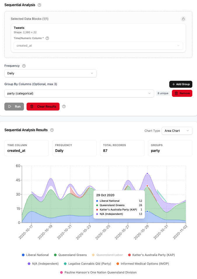
The Trends tool counts documents over time (or over any ordered numeric axis) and plots the result as a chart. It is useful for seeing how activity, mentions, or any measurable quantity rises and falls across a corpus.
You can break a single trend into multiple lines by grouping on one or more category or text columns, then zoom into and select specific periods for closer inspection.
Use the Data Block selector to pick the corpus you want to analyse. Only one Data Block can be selected at a time.
The Time or number column dropdown lists every column in the selected Data Block that holds a date and time, date, whole number, or decimal value. Pick the column that represents the order or time axis you want to plot along.
- Date and time columns are grouped by a calendar period (hourly, daily, weekly, and so on). A date column (no time of day) offers daily and longer periods only.
- Number columns (whole number or decimal) are grouped by a fixed width you specify (the Step).
The tool detects the column type automatically and shows the relevant configuration controls below.
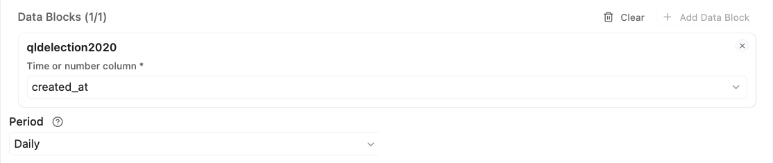
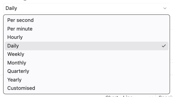
When a date and time column is selected, choose a Period: how records are grouped into time periods.
Standard periods
| Option | Groups records by |
|---|---|
| Per second | Each second |
| Per minute | Each minute |
| Hourly | Each hour of the day |
| Daily | Each calendar day |
| Weekly | Each week (Mon–Sun) |
| Monthly | Each calendar month |
| Quarterly | Each quarter (Q1–Q4) |
| Yearly | Each calendar year |
Customised interval
Select Customised to bucket by a fixed duration you define: enter a positive whole number and choose a unit (seconds, minutes, hours, days, or weeks). For example, Every 30 minutes groups records into half-hour windows.

- Smaller intervals show more detail but may produce many sparse buckets.
- Larger intervals smooth the trend and reduce noise.
When a whole number or decimal column is selected, two fields appear:
Start: where the first group begins. Leave blank to start at the smallest value in the data.
Step: the width of each group (required). For example, a step of 10 gives 0–9, 10–19, 20–29, and so on.
To split the trend into multiple lines (one per category), add up to three columns as grouping conditions. Each added column should have a small number of distinct values; these become the separate series in the chart.
Click Add group to add a column selector row. A badge next to each selector shows the number of unique values in that column, which helps you judge how many series will be produced. Remove takes that column out again.

When multiple grouping columns are added, categories are combined across all columns. Be aware this multiplies the number of series: three platforms × four genres = twelve combined series. Too many series can make the chart unreadable.
Trends retains exact group values in its result. After the analysis finishes, use Ignore capitals beside the result legend when values that differ only in capitalisation should be displayed and filtered as one group.
Choose Run to start. Settings are locked while it works. After it finishes, Run turns on again only when you change a setting that affects the counts. Minimum group count, Chart, Spacing, Normalise to 100%, selection, visibility, and Ignore capitals only change what is shown, so they do not turn Run on. See How Preview, Run and Clear work.
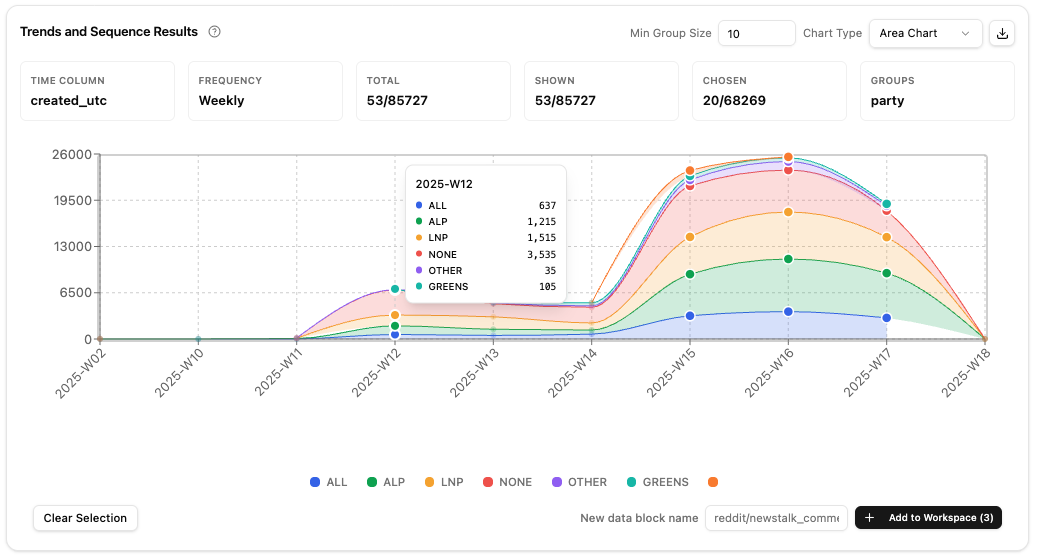
The result panel follows the Concordance dispersion layout: result actions in the header, chart presentation controls directly above the plot, then the chart and its legend card. The legend card keeps Ignore capitals, minimum group count, and period-selection controls together. Time column, period or interval, and Group By settings remain visible in the parameter panel instead of being repeated in the result.

For grouped results, Minimum group count hides any group whose total count across the complete result is below the entered value. The default is 10; enter 0 to show every group. A group whose count equals the threshold remains visible. The control appears in the legend card immediately after Ignore capitals.
The filter removes small groups from the chart, legend, chart export, displayed counts, and Add to Project. It does not change manual legend visibility: if a filtered group was struck out, lowering the threshold restores it still struck out. Selected periods do not change which groups meet the threshold. With Ignore capitals enabled, case variants are merged before their total is compared with the threshold.

Four plot modes are available in the Chart list:
- Line: best for continuous trends across time, especially when groups overlap or you want to compare rates of change.
- Bars: best for highlighting contrast between groups at each period. Each period's groups sit side by side, and every other period has a light background so its bars read as one group.
- Stacked bars: stacks each period's groups into one bar. Shows the total per period and its make-up, and fits many more periods than side-by-side bars. With Normalise to 100% every bar reaches 100%. The first group in the legend is at the top of each bar, so the bar, the legend and the tooltip read in the same order.
When there are too many periods to draw bars at a readable width (side-by-side bars need more room than stacked ones), the chart shows only as many periods as fit and says so: drag the slider under the chart to move through the rest, or choose Line or Area to see every period at once.
- Area: stacks all groups on top of each other. Works best when groups emerge or disappear over time and you want to see total volume alongside composition.
The Spacing list next to Chart sets how periods are placed along the horizontal axis. Hover the ? beside it for a short reminder, or click it to open this section.
- Even (hide empty periods) (default): every period with data gets the same width, whatever the real time between periods. Periods with no data are left out. Best when periods are dense and you want a clean view. When the chart is too narrow for every label, some labels in the middle are hidden, but the first and last periods are always labelled.
- To scale (show gaps): periods are placed by their real time or value, so empty periods show as gaps. Useful for spotting uneven events or comparing rates of change across long spans.
Which to choose. Start with Even to read the shape of the data. Switch to To scale when the time between periods matters. For example, monthly posts with data in January, February and June: Even shows three equal steps, January, February, June, so the four quiet months vanish; To scale leaves room for March to May, so the June posts appear after a visible pause. With a number column (such as a page or chapter number), To scale spaces the values by their size, so 1, 2 and 10 do not sit at equal distances. Spacing changes only the chart: the counts, the legend and Add to Project are the same in both.
Dates on the chart and in its tooltip read the same in both spacings, in the time column's own time zone: 18 Oct 2020 for days (a week shows its Monday), 18 Oct 2020 14:05 for hours and minutes, Oct 2020 for months, 2020 Q4 for quarters and 2020 for years. Tables and downloads keep the year-first form, for example 2020-10-18. In To scale mode the tool aims for about ten labels across the visible range, dropping labels automatically if the chart is too narrow.
Empty periods. A period with no rows at all is hidden in Even spacing and leaves a gap on the axis in To scale spacing. Within a period that is shown, a group with no rows counts as zero, so its line dips to zero rather than breaking: "no occurrences" is genuinely zero, not unknown.
The vertical axis shows counts of rows and has no title (percentages when Normalise to 100% is on). When nothing is grouped, the single series is named after the Data Block.
Periods often hold very different amounts of data, for example many more tweets in an election week than in the month before. Select Normalise to 100% next to Spacing to show each group as a percentage of all rows in the same period instead of as a count. The groups in each period then add up to 100%, so you can compare how the mix of groups changes over time whatever the amount of data. Hover the checkbox for a short reminder.
- The option appears when at least two groups meet the minimum group count. With one group every period would read 100%.
- Each period's total counts every group listed in the legend, including hidden groups. Hiding a group therefore does not change the other percentages. Groups below the minimum group count are not counted, so changing that number can change the percentages.
- A period whose listed groups have no rows at all has no percentage: the line breaks and no bar is drawn.
- The tooltip shows each group's colour, and its count with its percentage, for example 412 (37.5%).
- In Area charts the stacked groups fill the chart up to 100% when none are hidden. Bars stay side by side.
- The counts themselves do not change: the legend, Add to Project and selected periods still use counts of rows. A downloaded chart notes that its values are percentages.
The setting is kept for the tab while the Project is open, like Chart, and is off by default.
Click the download button (↓ icon) in the results header to export the chart. A dialog lets you choose SVG, PNG, JPEG or Interactive HTML. An image download has a header with the Data Block name, time column, period and groups, plus a legend; long headers wrap onto a second line. When Normalise to 100% is on, the header also says the values are percentages of all rows in each period.
Interactive HTML saves the chart as one web page that opens in any browser, offline: it shows the chart exactly as it is on screen (the same groups, selected periods, zoom and theme colours), and keeps its tooltips, a legend whose entries hide or show groups, and the zoom slider (hold Command on a Mac or Control on Windows while scrolling to zoom; plain scrolling moves the page). Its last line links to the Wordflow home page. It is a picture you can explore, not a copy of Wordflow: it cannot change the Period, stop words or groups, or add anything to a Project.
The legend below the chart lists groups that meet the minimum group count, with their colours, full-result count, and share of the counts across every listed group, hidden ones included, for example Speeches (40 · 30.0%). Hover the ? at the start of the legend for a reminder of this format, or click it to open this section. Percentages use one decimal place and do not change when periods are selected or groups are hidden. When periods are selected, each visible label shows selected/total before the percentage, for example (12/40 · 30.0%). Click any legend item to hide or show that group. Hidden groups retain their count and share, show Hidden, and use a strikethrough label with reduced opacity.
Reading an entry. Say the legend lists three groups with 40, 80 and 13 rows: 133 rows in all. Speeches (40 · 30.1%) means 40 of those rows are speeches, 30.1% of the 133. The counts come from the whole result, not from the visible part of the chart, so zooming does not change them. Hiding Speeches keeps it at 40 and 30.1%, and the other shares stay the same too, so the percentages always describe the same total. Raising Minimum group count above 13 removes the smallest group from the legend; the shares are then counted from the 120 rows that remain. Selecting periods adds the rows in those periods before the slash: (12/40 · 30.1%) means 12 of the 40 speeches fall in the selected periods.
Use this to focus on a subset of groups. Hidden groups are not plotted and are marked hidden in chart exports, while their legend entry retains its full-result count.
Select Ignore capitals beside the legend to merge case variants without rerunning
the analysis. For example, jobs and Jobs become jobs/Jobs, with their
per-period values, totals, percentages, tooltip values, and export entry
summed. Changing this checkbox restores all hidden groups while preserving
selected periods, zoom, chart type, and axis mode.
Drag the ends of the slider under the chart to zoom along the horizontal axis, or drag its middle to move the zoomed range. The shape inside the slider is an overview of the whole result: the total of the groups shown, for each period, laid out like the chart, so with To scale spacing empty periods show as gaps there too. With Normalise to 100% on, the overview still shows counts. The toolbar also provides keyboard-accessible Zoom in, Zoom out, and Reset zoom buttons. A plain scroll with the mouse wheel or trackpad scrolls the page, even over the chart. To zoom with the wheel, hold ⌘ on a Mac (Ctrl elsewhere) while scrolling over the chart. Zoom changes only the viewport: it does not change the analysis result or clear selected periods.
Click anywhere inside the plot to select the time period nearest the vertical axis pointer. You do not need to target a line point, bar, or area segment. Selected periods are shaded with a soft band across the chart, and in line and area charts their points become large solid dots while the other points stay small hollow circles; in bar charts, unselected bars are dimmed to 25 % opacity.
Click a selected period again to deselect it. To select a range, click one period then Shift-click another: all periods between them are selected. A reminder of this sits under the chart.
With keyboard focus on the chart, use Left Arrow, Right Arrow, Home, and End to inspect points. Press Enter or Space to select the focused point, or Shift+Enter to select every period between it and the last one you selected.
Use Clear selection to deselect all periods without losing any other settings.
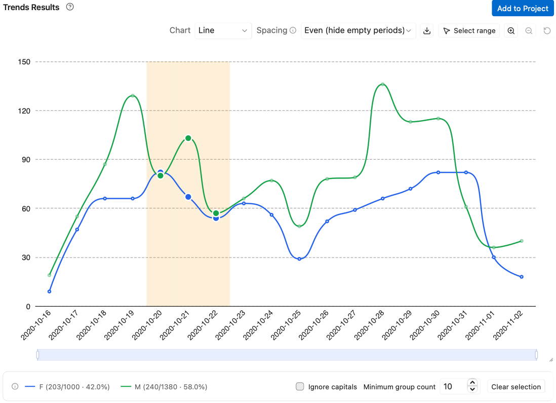
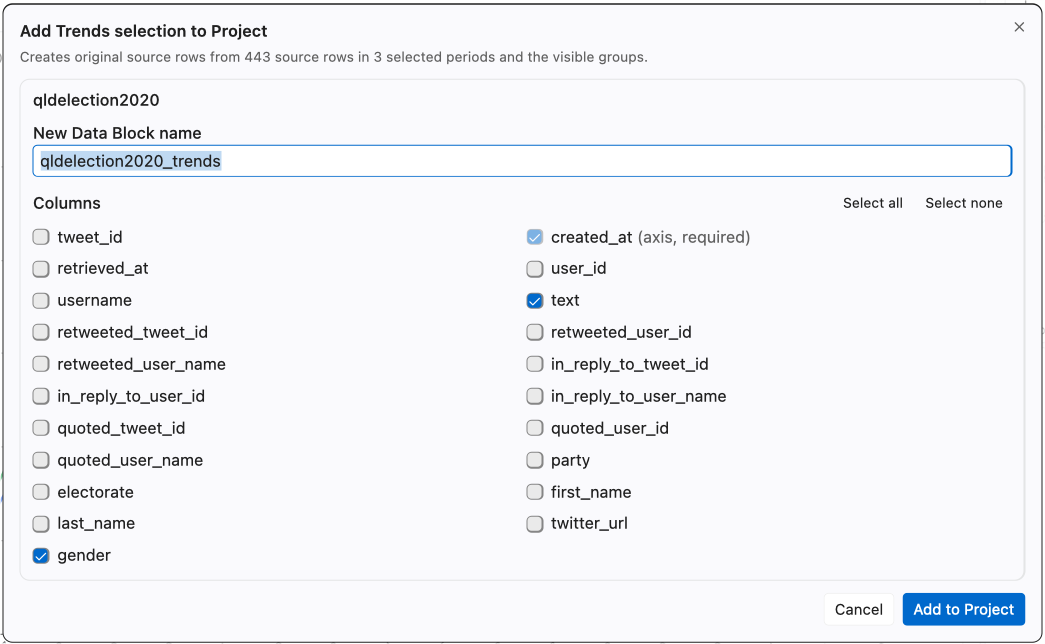
Click Add to Project to create a Data Block containing original source rows represented by the current Trends result. If periods are selected, only those periods are included; with no selection, all periods are included. Groups removed by Minimum group count and groups hidden through the legend are always excluded. Zoom changes only the viewport and never the rows added to the Project.
When Ignore capitals is on, hiding a merged legend entry excludes every exact spelling represented by that entry.
The time or numeric axis column is required. The source Document Column and
Group By columns start selected but remain optional, while other source columns
start unselected. The dialog preserves source-column order and defaults the new
name to the source name followed by _trends. Its description says how many
source rows and selected periods will be added.
The tab keeps its result when you move to another tool or reopen the Project. Clear removes it and resets the tab. After a failure or a stop, the settings stay editable but Run stays off until you choose Clear. See How Preview, Run and Clear work. Clearing or replacing the result restores Minimum group count to 10 and clears manual legend visibility.
| Symptom | Likely cause | What to try |
|---|---|---|
| Chart shows only one bar or point | Period too coarse for the date range | Try a finer period (for example Daily instead of Yearly) |
| Too many series, chart is unreadable | Too many distinct values in group-by column(s) | Remove a group-by column, or filter the Data Block first |
| No groups meet the minimum group count | Every grouped total is below the filter | Lower Minimum group count, or enter 0 to show all groups |
| "No Trends data available" | Column type or interval is incompatible with the data | Check the column contains valid dates or numbers; check the interval is > 0 |
| Setting | Default | Notes |
|---|---|---|
| Period (date and time) | Monthly | Any standard or custom interval works |
| Custom interval | 1 minute | Enter a positive number and choose a unit |
| Start | Smallest value | Leave blank unless you need a specific start |
| Step | 1 | Required; must be > 0 |
| Group By | None | Up to 3 columns |
| Ignore capitals | Off | Beside the legend of a grouped result; merges case variants of a group |
| Minimum group count | 10 | Grouped results only; enter 0 to show all groups |
| Chart | Line | |
| Spacing | Even (hide empty periods) | Switch to To scale to show gaps in time |
| Zoom | Full range | Use Reset zoom to restore the complete result |
- Select a Data Block that has a date and time column.
- Run the analysis with the Monthly period to see the overall trend.
- Switch to Weekly and compare the granularity.
- Add a category or text column (e.g. author, genre, or platform) as a Group By column and choose Run again.
- Zoom into a period of high activity, click one period, then Shift-click another to select every period between them.
- Download the chart in the format you need and compare it with the monthly view.